
Brand DNA | The Narrative of Design Patterning
in Placemaking, Objects and Experientiality
As designers, we stand up to build environments, messaging and visual expressions, to enable ideas, impressions, textual content and visualizations. And they are patterns—a patterning of recognition, patterned pathways, patterning constructions.
We create code, don’t we? Or perhaps find the code to change planes of experience.
When you were in one place—you had the perceptions of that moment, then a new pattern emerged—and your awareness of the place that you were in changed.
Everything. That was there, then, this is the new now.
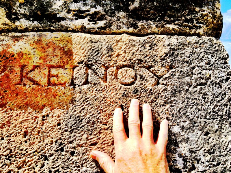
You walk into an environment—a place—and you’re looking for, you’re sensing patterning, the sound of the floor in your footsteps. You run your hands on the rhythm of the wall, over the table, and you’ll feel their patterning, sensationally.
In this—the idea of the pattern becomes a metaphor, an allegory of touch and perception. And, as designers, we make patterns.
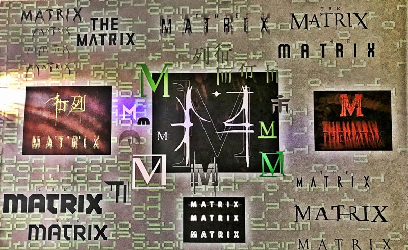
We design perceptual rhythms, as in our Brandcode® for The Matrix.
There are theories about the patterns in making a city, the home—even patterning in guest sequencing for, imagine, a resort, retail compounds, a café or dining pathways.
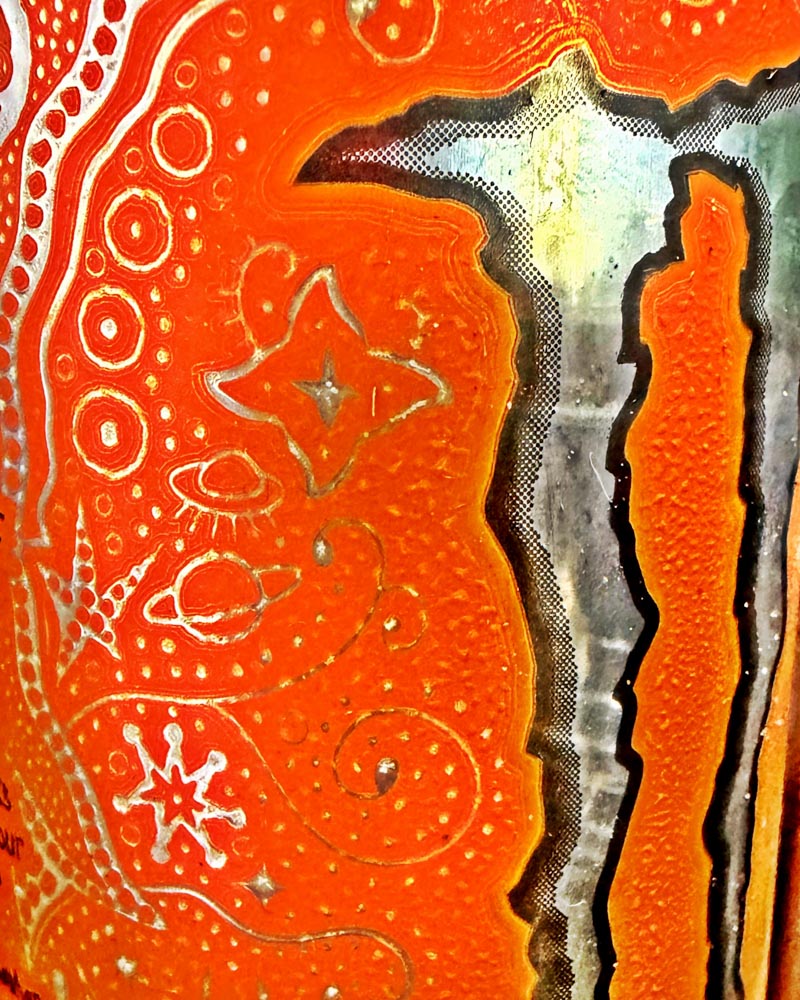
Monster textured brand pattering on a can in my refrigerator.
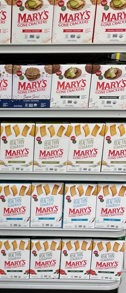
Packaging, for example, there are strings of patterned expression—one, to brand messaging and visual cues, and the other, in the patterning of products on shelf.
Earlier, working at Nabisco, we designed the sequence of packaging products as a patterning, for passing aisle customers—as a merchandising bullseye, gravitating around the Ritz centerpoint, the other brand palettes and principles flowed in a radiant arrays.
So too, our work on Mary’s. A visual rhythm packages the brand. At shelf.
You might ask, “wait, just what is a pattern?” It’s an ancient phrasing to the notion of a sequencing—something right, as a portrayal, an outline, a plan, a modeling—to that of principle, and yes, a principal. Could be true as a patron, as in the Latin “patronus” — that would be a 14th century appropriation, “the one to follow, as in a model.”
What if you could design a single mark, that then would be the centering point of a strategy to design, literally, everything?
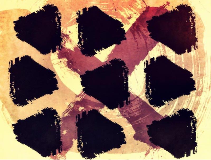
Logo first, designed — outwardly?

Start close-in, then move out to everything.
Interiors, signing, packaging, lighting, products.
Just do it all, applicably.
Kris Ruhs did.
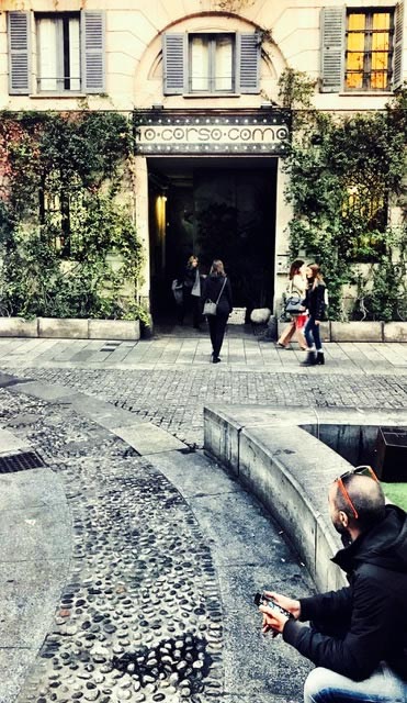
Everyone knows about 10 Corso Como.
You too, right?
As a reminding, that
would be this visioning.
I was there, looking at environments, walking them, studying them, photographing them.My own history lies in that selfsame exploration—how could you design a mark that becomes the center of an experiential universe?
You could, like this, start with the walk-in
and see how it works.
It’s this mark, though—in this instance—this is one of the strokes from my designer’s grimoire—the seed stroke.
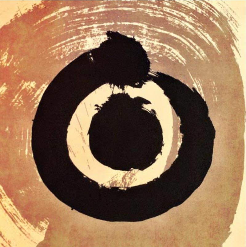
Chris developed his own, and used it as a core start-up, then as a patterning, as you can see below.
The dot reveals itself, with Chris’s direction.
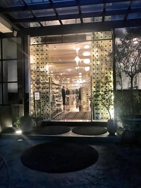
And in a sign and font treatment.
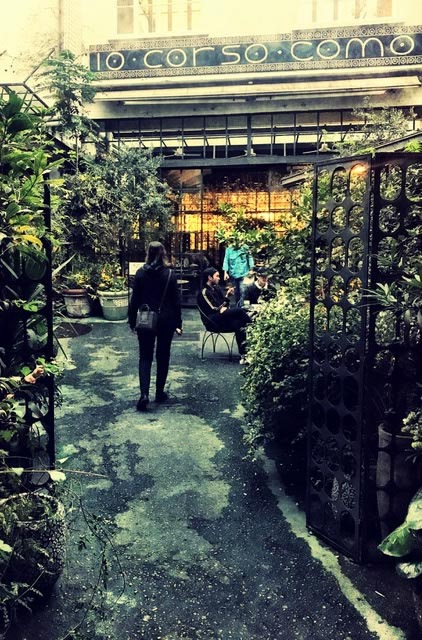
And a mnemonic tilework array.
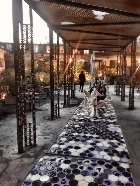
And a design studio, at 10 Corso Como.
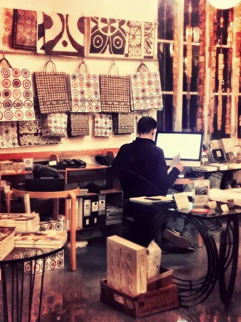
An expression of the device as a code in merchandising patterning.
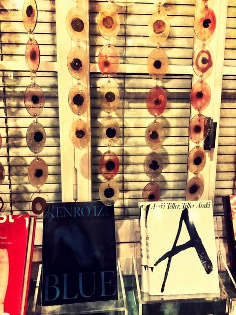
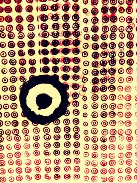
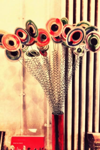
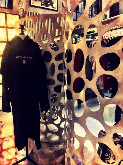
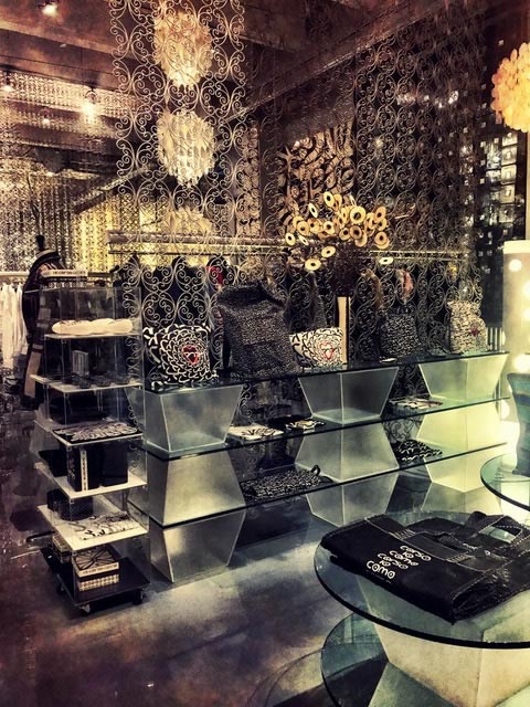
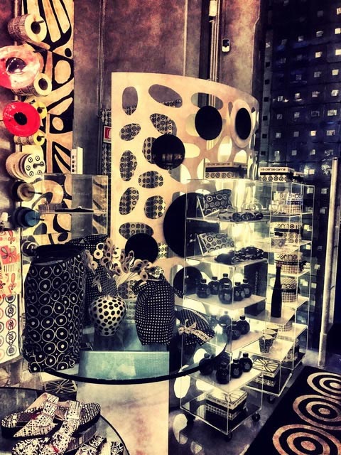
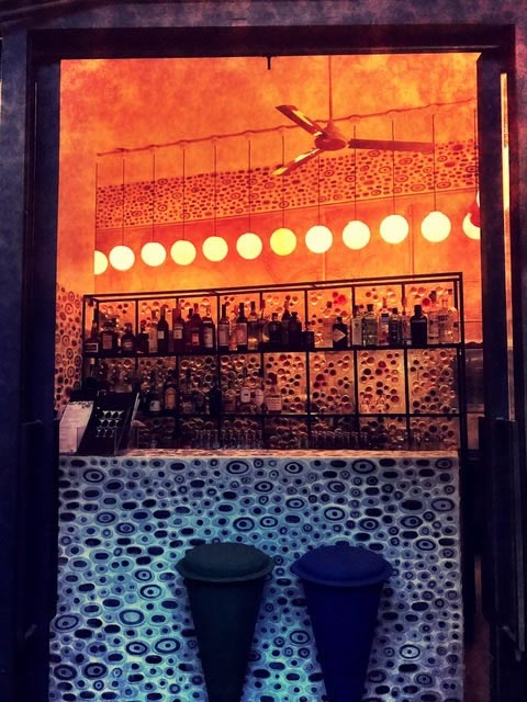
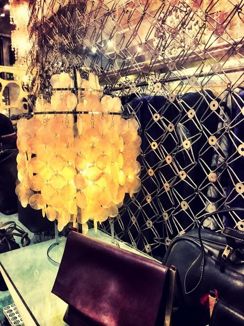
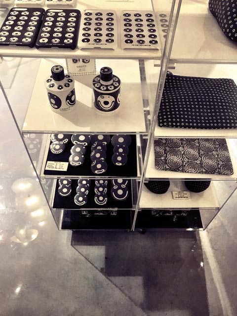
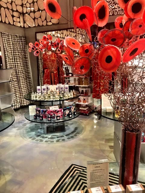
And packaging, patterning.
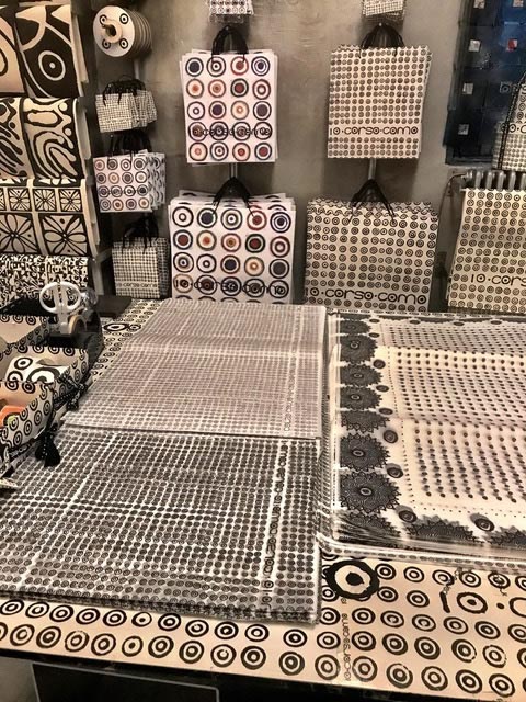
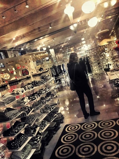
While this might be an obvious statement, the use of patterning, of the theory of a visual sequencing in brand-related design, it’s an interesting exemplar—you can find it in Milano, IT.
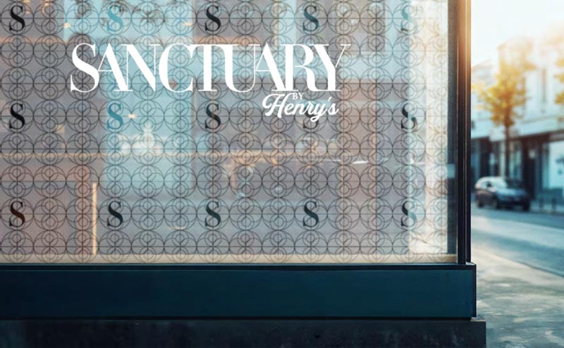
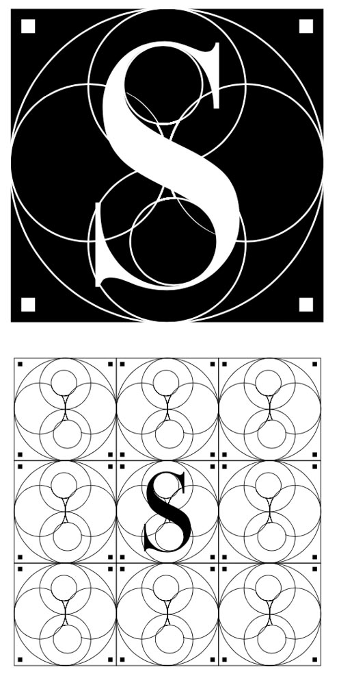
Some expressions of a pattern language, for GIRVIN?
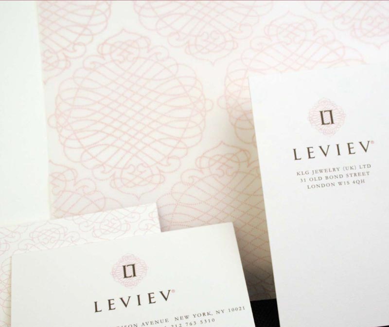
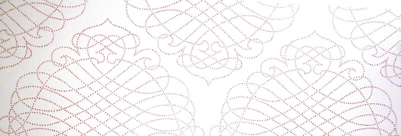
Or Leviev, a constellation of jewels as a brandcode of patterning.

Each dot, a jewel form.
And some others, in collaboration with artist / designer Dawn A. Clark, AIA Leed AP. For patterning, check out Sogo, Seibu, and Harvey Nichols. And Nordstrom.
A brandcode for retail renovation, Nordstrom, Irvine.
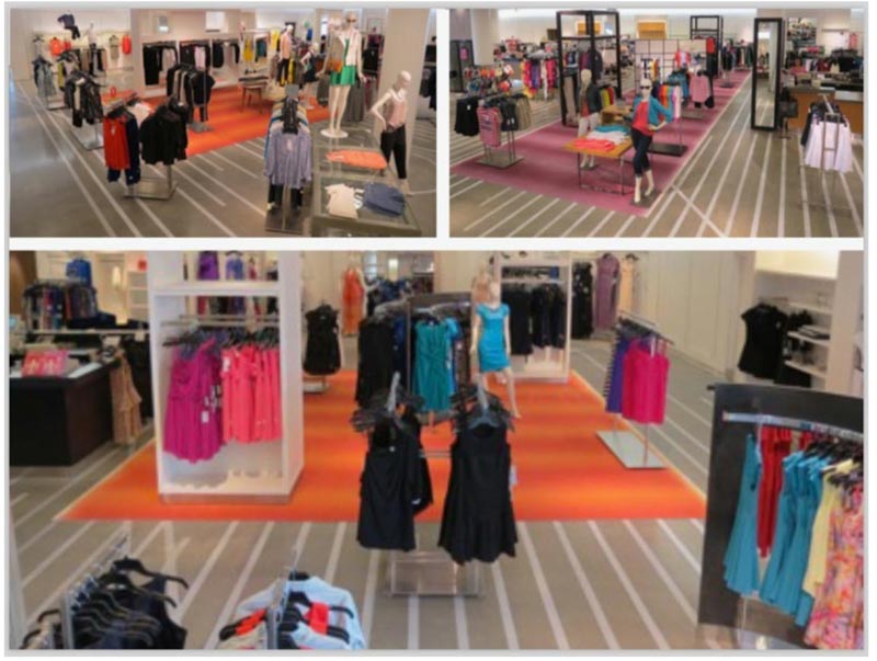
Or Sogo, Osaka, Japan—a patterning of gingko and cherry blossoms.
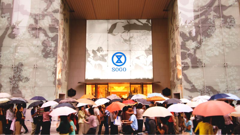
I believe that you, brand steward, designer, brand marketing manager can think of patterning as, in a manner, a psychic code—layered as a substrate, a touchpoint in memory, or for the observer—visual narratives, graphical storytelling that might be subtle, but unforgettable as a detail in the customer journey.
Eyes on the patterning.
T | West Queen Anne Offices
––––––––––––––––––––
Girvin | Osean | Tim.Girvin | Wanderer
Follow Us:
Facebook LinkedIn Instagram Behance
Discover more from Girvin | Strategic Branding & Design
Subscribe to get the latest posts sent to your email.