DESIGNING LOGO ART IN THE CONSTRUCT OF PALÆOGRAPHY AND LETTERFORM CHRONOLOGICAL SEQUENCE.
GIRVIN MOVIE LOGOS
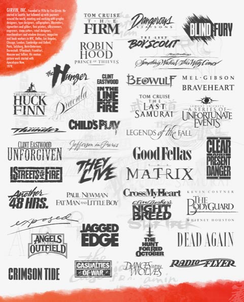
In a string of presentations in LA, as well as other parts of the country, I’ve spent time walking our process to motion picture studios, advertising agencies and in-house design teams and theatrical producers—which is, on the one side, a strategically-motivated marketing foundation.
What is the positioning of the film, to what audience? For who and where—what storytelling to be told, and what could it look like, as an exemplar to the entire marketing package?
People read, and therefore, there needs to be an opening stanchion or bridge from the story to the visualization, the brandcoding® that speaks to the DNA of the narrative and the holism of the storytelling. That would be the logo, the grouping of characters that, somehow, lustrates the proposition of the pitch to the audience—that’s the cinch-pin of the merchandising.
Obviously, all of these variables come into play in designing the identity treatments. Who’s in the film? Who’s the film for? Where is it told? What’s the character of the telling? Thus begins the complex intricacies of how that message and core visual should be “packaged.” And since 1979, I’ve been offering this premise as an ongoing study.
Below, one of a string of leave-behinds in our workshop demonstrations—the play is diversity in vocabulary. But this essay in particular explores the idea of a palæography of design—the history of writing, the heritage of the alphabet,
a kind of design archæology.
That study of design and alphabetic history can lend itself to studies of more recent typographic scenarios—to, in film-worlds—design that is speaking to solutions of two thousand years back.
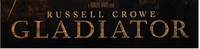
For example, my consultative recommendation to Ridley Scott for “Gladiator” was a hand-drawn Roman epigraphic treatment—
a 1st century CE rendering of classical stone cut lettering—
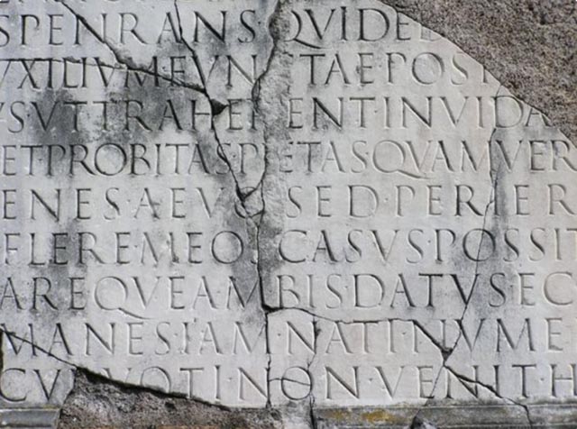
that’s history then,
portrayal now.
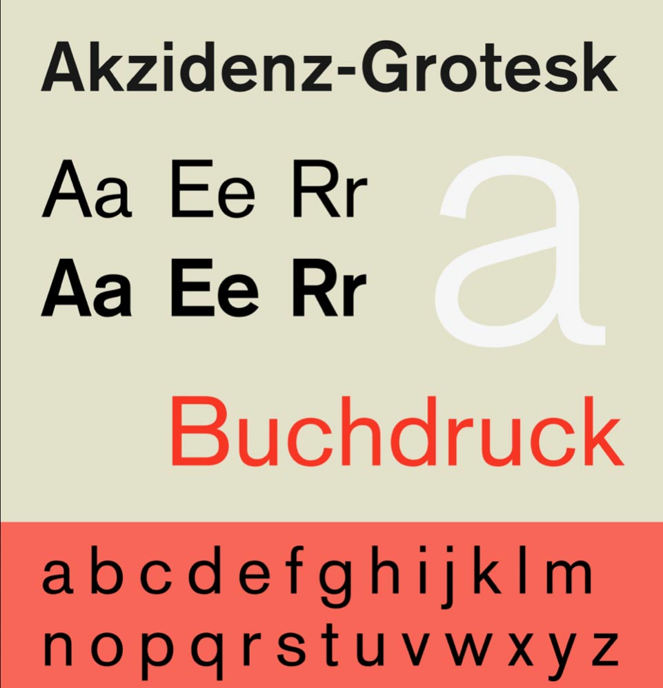
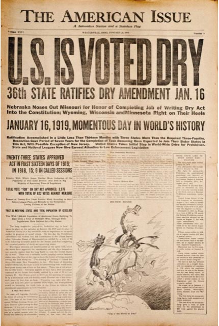
In some contexts, the modernist layering of the narrative would presume a contemporary stance. Modern portrayal intimates a design with a modernist language—even if, as a typographical historian, the font is based on design concepts from 124 years ago, the Victorian [late 19th century, early 20th century:1837-1901] san serifs, post-industrial font linguistics—that would be of this categorical expression. Here is, for example, a early industrial font from Germany, 1898—the foundation for many san serif fonts that have established the use of typographical systems of a leanly assertive typographic vocabulary.
This vocabulary of approach led to a modeling that formed the visual strategy for the narrative illustration of this filmic marketing study, and its outcomes.
STORYTELLING DNA
FINALIZED BRANDCODE®
TITLE, CENTER BELOW
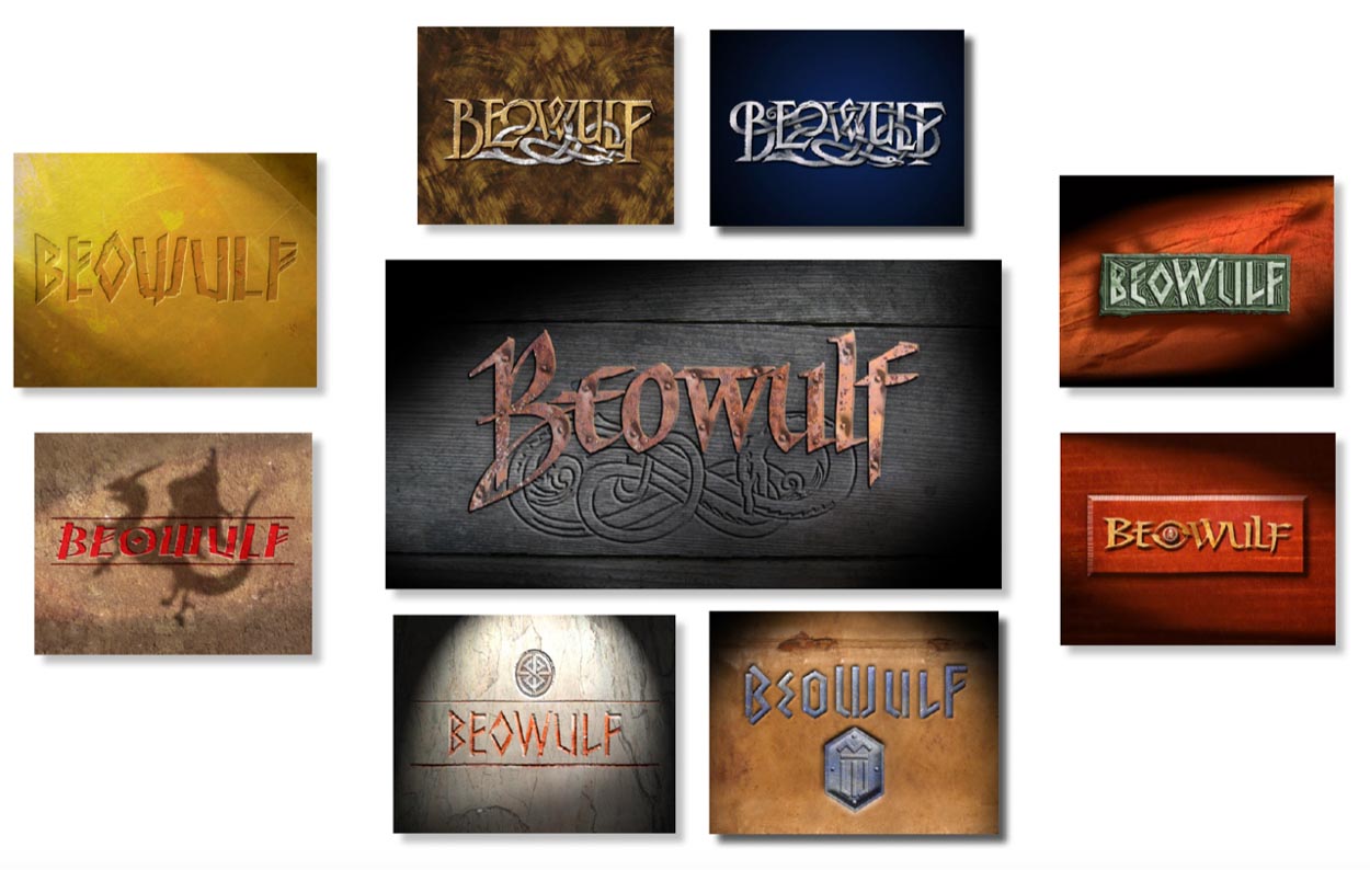
While others, leaning to a particular antiquity in the tale-spinning—what paleography would you consider in the development of marketing imagery around a 6th century proposition? That would be particular to location, cultural implications, artistic legacy. So in a Scandinavian narrative, then, what legacies to study? I walk back, walk in, walk around—wander and look–see what I can see, what I can find. And I excavate, like an archaeologist—to know that world:
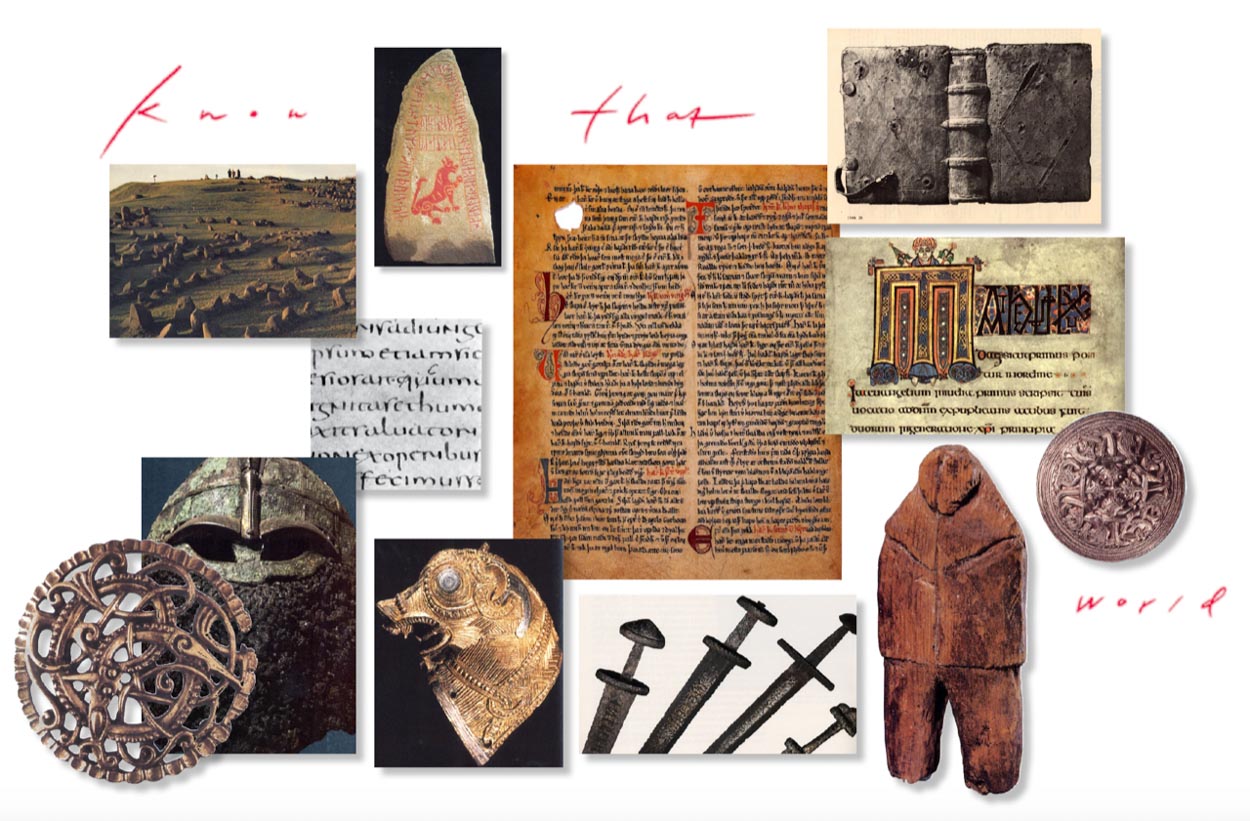
Alphabetic vocabularies—
what, to time, to culture, to art,
and how can they be intertwined?
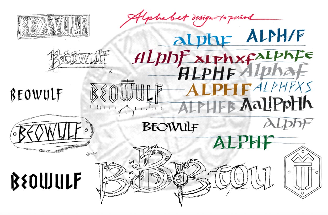
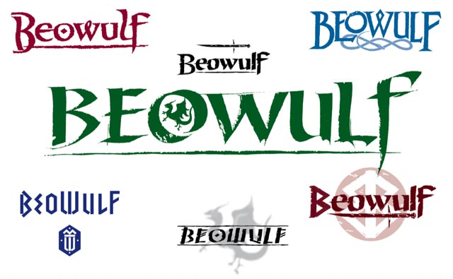
That lends itself to a stringing of characters,
representative to period, as an identity cluster.
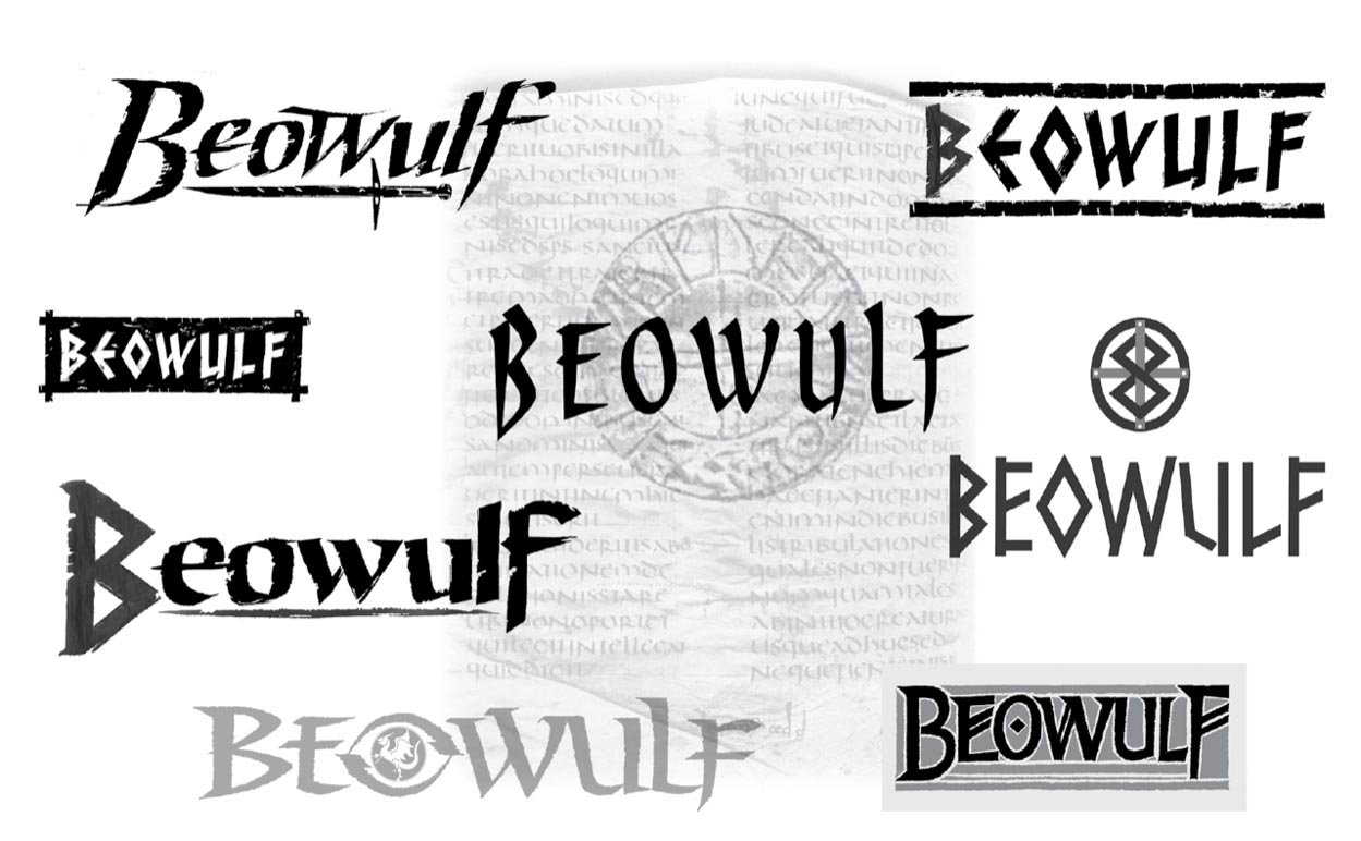
And other palæographic references—bespoke renderings:
Environmental renderings—a narrative continued, deeper illustrative expressions:
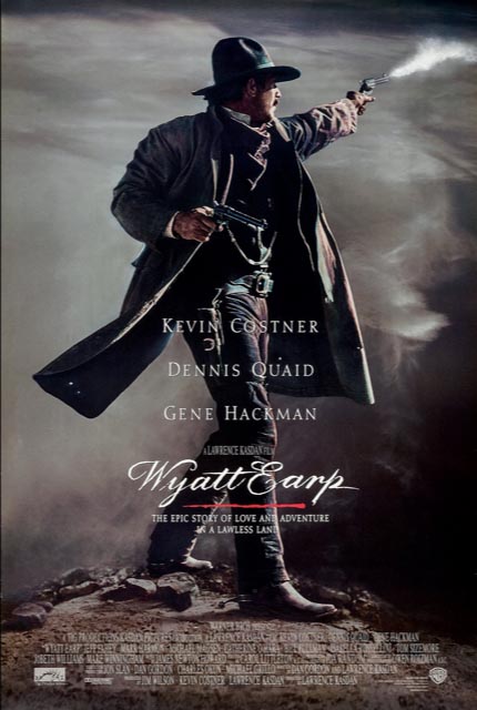
When I was in college, I had a goal, to draw every single form of alphabet from 500 BCE to the 19th century. These investigations that could find a later exploratory range. For example: from walking back into the research on martial matériel, like the signature engraving of Wyatt Earp’s pistol, which I identified in a particularly specific rendering from the time period.
Interestingly, it was Kevin Costner
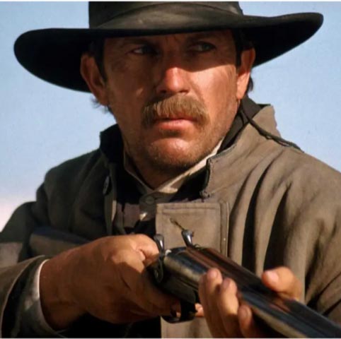
that reached out to me, saying he’d heard that Wyatt Earp’s pistol had his name on it. While I never found it, I made one for the period, which, then,
became the logo for his film.
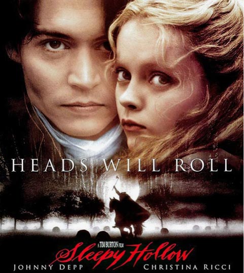
Or similarly, to working with Tim Burton on “Sleepy Hollow.”
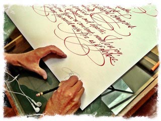
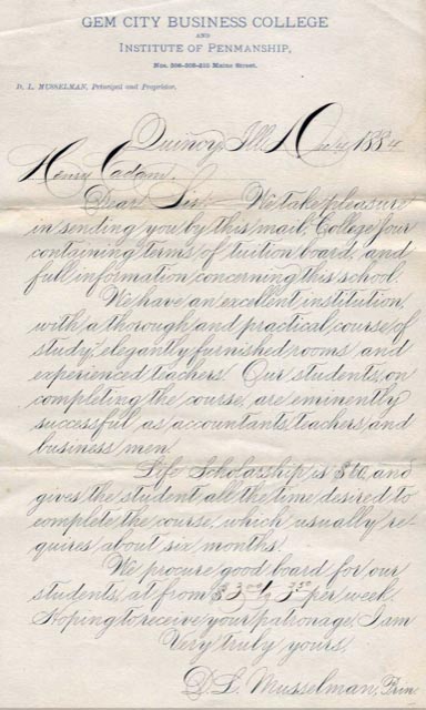
A reach back to 19th century narrative, playing out script types of paleographical reference to the period—a copper burin form of engraved calligraphy that found its expression in broadsides and handwritten exemplars of the period, masterly pen work crafted by gentlemen and gentlewomen of a cultured proposition, like this reference from 1884.
You could offer that
the story of Sleepy Hollow,
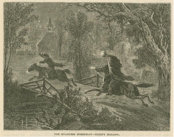
which found presence in a similar time period—1876, would be similarly framed, though in this presentation, I looked towards a rougher conception, as if written in a fearful moment, rather than a flourished
representation of embellished civility.
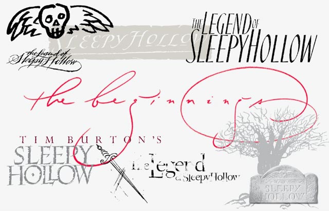
And beyond the gesture to gravestone rubbings, could that be:
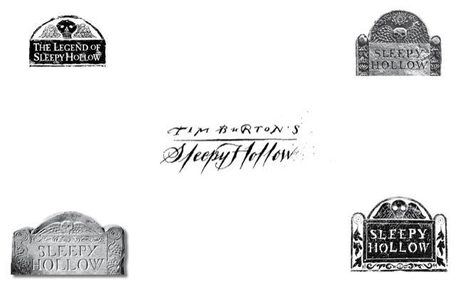
And the final:
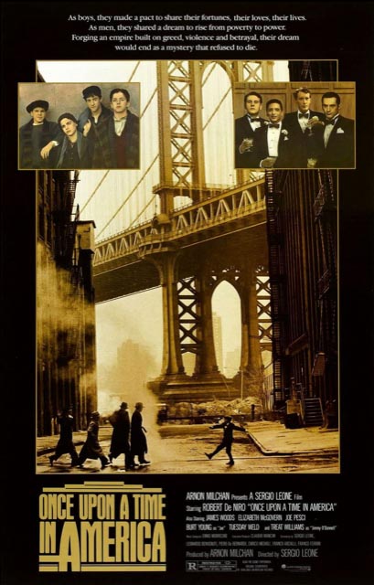
This design treatment, below, designed for a pitch package for Sergio Leone was founded on the typographical legacy of the period—only customized as a hand-built font, stacked and clustered as a “masthead” for the pitch deck for funding.
The thread of early-mid
20th century font work,
to the legacy of a bespoke solution.
Type, as the predominant key to reading, shows itself from 1000s of years of evolution, and design, as a cyclical patterning, wheels like a mechanism of trend, innovation, the quest for the ever more efficient and faster drafting of mindful flights of imaginings, and the return to what was, and what could be, the future.
This typographical telling survives in its timelessness, which in its original rendering was scripted 1,943 years ago.
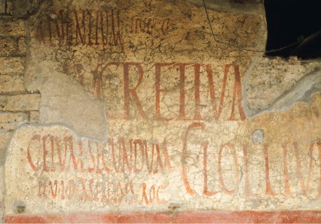
By its simplicity alone, it leaves much to the imagination—and, as a quieted narrative—silent for a moment.
Tim Girvin | Seattle Waterfront
GIRVIN | Strategic Branding & Design
S I T V I S V O B I S C U M
MCMLXXVI
IBI FUNDATA
Facebook LinkedIn Instagram Behance