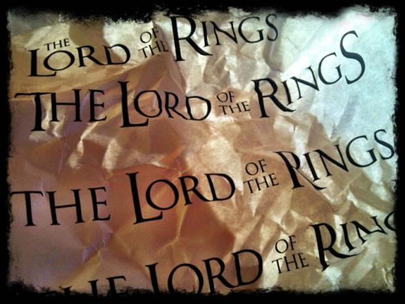
Design studies for the LOTR and Peter Jackson
The process of film identity and brand development is intensely competitive, there are a series of talents, team and agencies whose sole enterprises are focused 100% of the time on theatrical advertising — for an outsider [nay, interloper] more than a 1,000 miles from Hollywood, our career as designers has been specializing in highly customized solutions — nearly always hand drawn fonts and manually drafted lettering solutions. Later, our work, as outside consultants, not on the ground in LA, was focused on aligning identity solutions to bigger approaches to style, like our efforts for David Fincher on Benjamin Button, or Robert Zemeckis on Beowulf — reaching into the visual, cinematic nature of the story, production design strategies and how these might interlace with graphical treatments.
In the early days, the 70s, our work often times started with a raft of original art, drafted on hand made paper, rolled up in a tube and shipped overnight, back then. When I first worked on my “first film” — a literal virgin — I got a call from an agent for Francis Ford Coppola to work on a scripted treatment for “Apocalypse Now,” who’d seen my work in a spread in Upper & Lower Case [U&Lc] a classic fountainhead of design headed up by Herb Lubalin. After the call, I was at a workshop in Port Townsend, studying with a master of sumi-ye painting. I drew up a series of scripts on Japanese handmade paper, Washi, rolled them up; these were sent off to the studio — later, an interpretation of the work appeared. Lubalin, a master type designer, font theorist, and leader of Lubalin, Inc., in NYC, a premium design shop. I met him years later, only for a little meeting and showing of a collection of hand made books of poetry and calligraphy, as well as Alphabet, 100 hand-drawn micro calligraphic fonts. After that, Ed Benguiat — another type maven of the Lubalin clan. It was early enough in my career that I didn’t have any work, a portfolio to show — so to both, I made work up, designed brands, logos, packaging and signage from scratch.
In building logo treatments —
we often start with Girvin type design solutions, using one from a string of Girvin fonts.
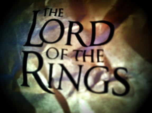
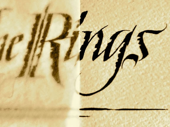
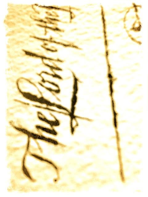
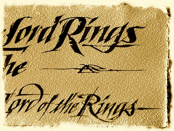
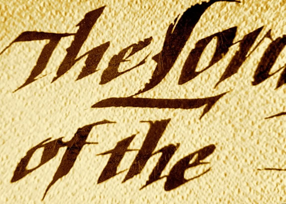
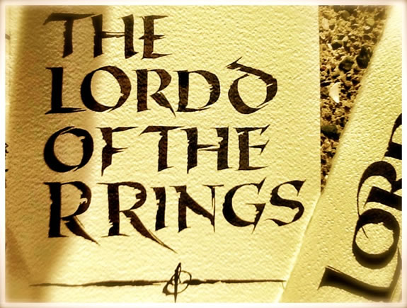
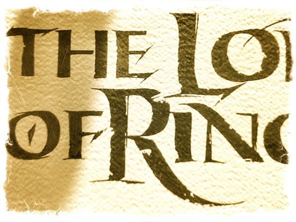
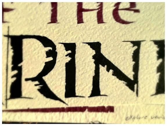
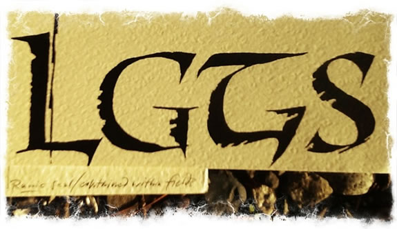
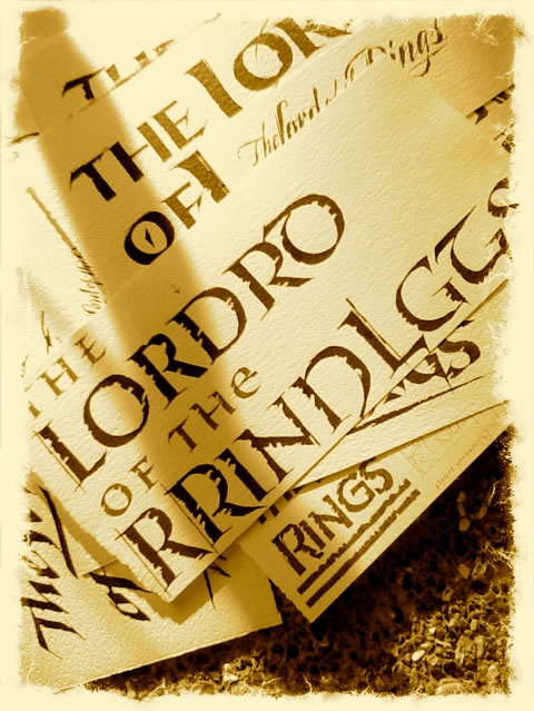
Our assignment, in considering the strategy of The Lord of the Rings brand mark was to see the main font as the overarching identity to a trilogy of under title treatments. Most of our effort focused on the main title. We submitted a folio of steel pen drawings,
drafted on italian handmade paper, shot them and shipped the art.
The final treatment was rendered by another agency, using the font Octavian.
In the business of identity, in the motion picture trade, solutions flow from agency to agency —
often at the behest of studio leadership, or directors, stars and producers.
So while we might offer a custom Roman,
another agency might replace that with Trajan, a font that we never use,
since we have our own customized Girvin romans.
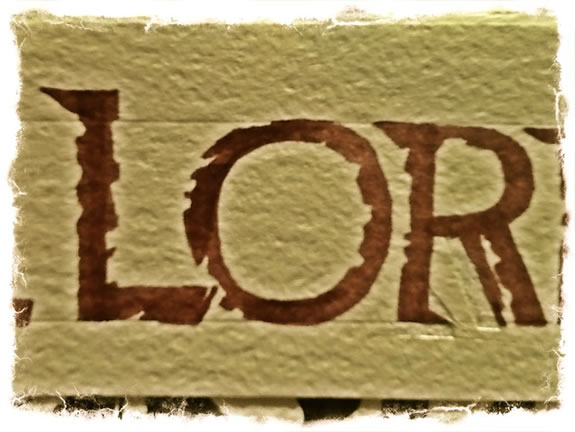
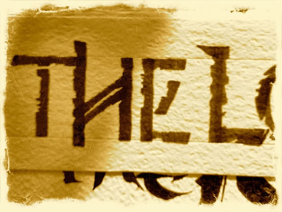
I offer below a string of explorations, on the original papers —
the drawings and foundations for the work —
from cut, epigraphic runic forms to the possible character of the runic Elvish scripts, themselves.
Explore and comment as you will.
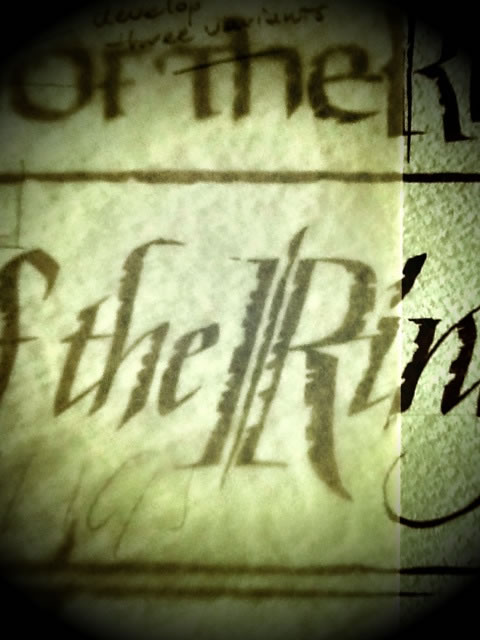
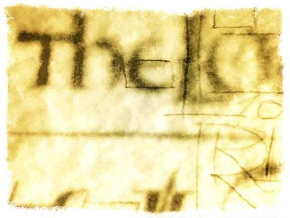
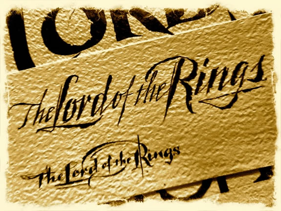
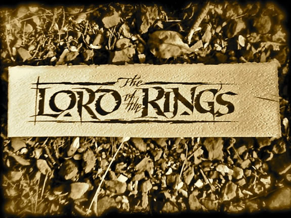
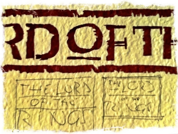
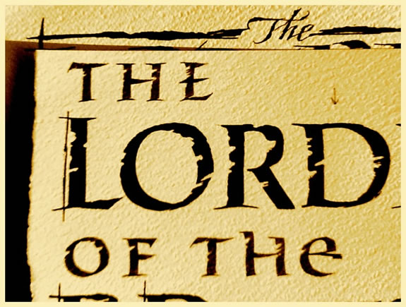
There is a gesture to truth, the authenticity of the steel pen,
toggled on rough handmade paper, in the rendering of these ideas by hand.
There are decades of legacy in drawing ideas by hand, and to this day — that tradition continues.
That drawing, the stroke of the pen shows itself, the heart of its spirit striking out there the height
of inspiration. You reach, you draw — and its spills, raven black, scripted on paper, itself a story of craft.
The hand is a touch,
an especially fluid reach,
from mind to content.
Draw it out.
TIM | GIRVIN | Strategic Branding | Decatur Island Studios
––––
THE STRATEGY OF LUXURY
BRAND STRATEGY, DEVELOPMENT + DESIGN
Girvin Strategic Luxury: http://bit.ly/NwMv46
Girvin Brand Luxe Thinking: http://bit.ly/gTW5HZ