YOU COULD FIND A WAY OUT,
THAT COULD BE A WAY IN.
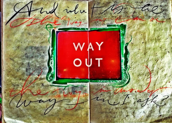
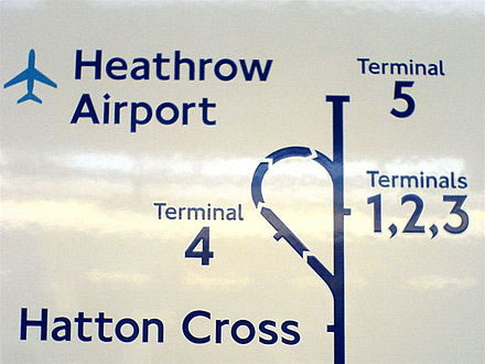
I was first struck by this sign that I found in an antiques shop outside of London; and there’s a story—for those calligraphically-inclined—that this font [for the sign]
was originally designed [1918]
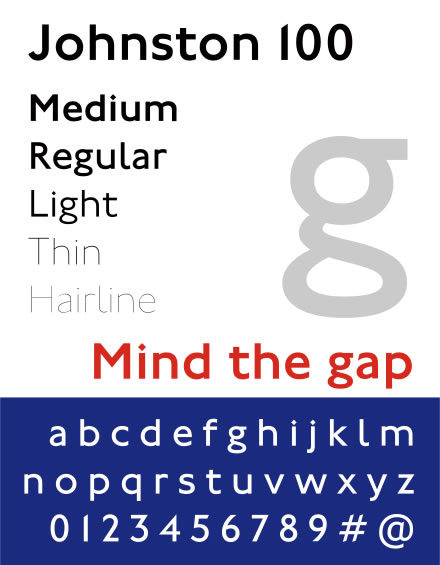
by early calligraphy savant Edward Johnston
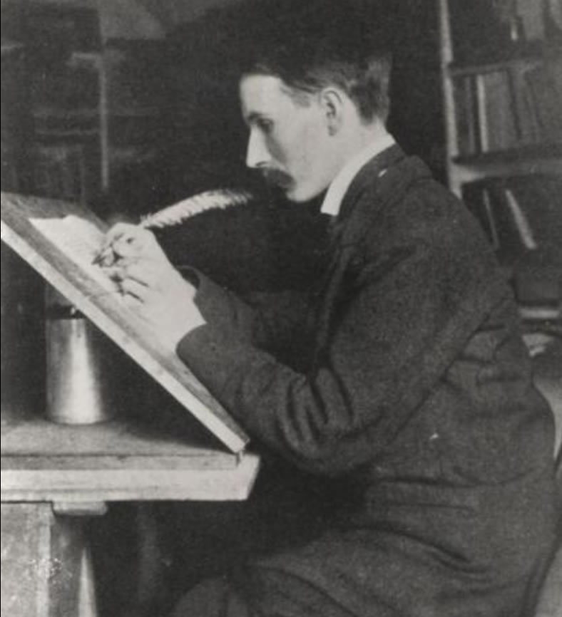
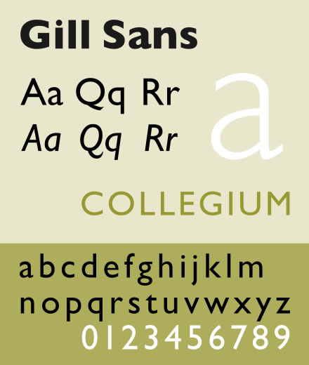
who founded a movement in early 20th century England around a classical study of calligraphy—as a kind of tradesmen’s craft: the hand-wrought and beautifully-manufactured letters of earlier times, the Royal Hierarchy being a constant utilizer of proclamations, announcements and other Peerage-entitled fanfare. That font, for the London Underground, reached out to Johnston’s student and participant on the project for the “corporate branding of the London Underground,” Eric Gill, and the later, evolutionary creation of his Gill Sans.
Johnston’s legacy was specific to strict adherence to classical principles of design that could be found in the expression of Imperial Roman epigraphy as well as the proportional emulation of the Italian Humanist scripts which—in their turn—laid the groundwork for what we know today as “Italic.”
This Johnstonian inspiration—in all scribal crafts, then, spoke to vellum-scribed messages and royal briefs that became a vocation for calligraphy enthusiasts—adding to that, the pacing of the legacy of the Kelmscott register, William Morris‘s Arts and Crafts movement, John Ruskin and his promulgations of the movement, W.R. Lethaby and architectural thinking, coupled with the earlier settings of the pre-Raphælites and other worshipful celebrations of more deeply-minded artistic expressions. It was Lethaby that pointed Edward Johnston to broad-penned calligraphic ministrations.
The above-pictured “WAY OUT”—at the head of the blog—signage is obviously still in play as a property of the Underground Electric Railways Company of London.
Still, in looking at any sign, I’m prone to think about what it says and what it really says—to my imagination.
Is it, for example, “MIND THE GAP” or is “watch the gap…the hole in your line of thinking—the gap in your mind?”
I follow-on in this meditation:
W A Y
O U T
When we think of “way out,” that could be an experience of layered and expansive experience.
As in:
“Way out, man!”
But, the way out, to British signing strategy
is a notation for exit.
It’s, as I’ve noted, from the London Underground.
And below, another example, also
designed by Edward Johnston.
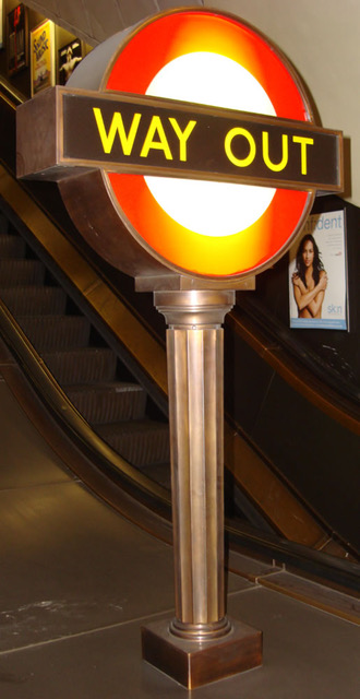
What I liked about it—the image at the head of this missive,
and put a photo in my journal,
is the inverted rendering of the concept
of “exit”—a Latin word
exire “to leave, a leaving.”
It’s also the letterspaced symmetry of the design,
the font itself and the ambiguity
that it represents for a person that is not from the UK,
like “mind the gap” not commonly in our parlance of locality.
W A N D E R
Wander out:
It was only defined as a reference to exiting—
as a sign, for example—from the late 17th century;
about 100 years later as “a door for leaving.” But way out has a layer of meaning—from, “it’s out there,” to “getting way out,” further than others.
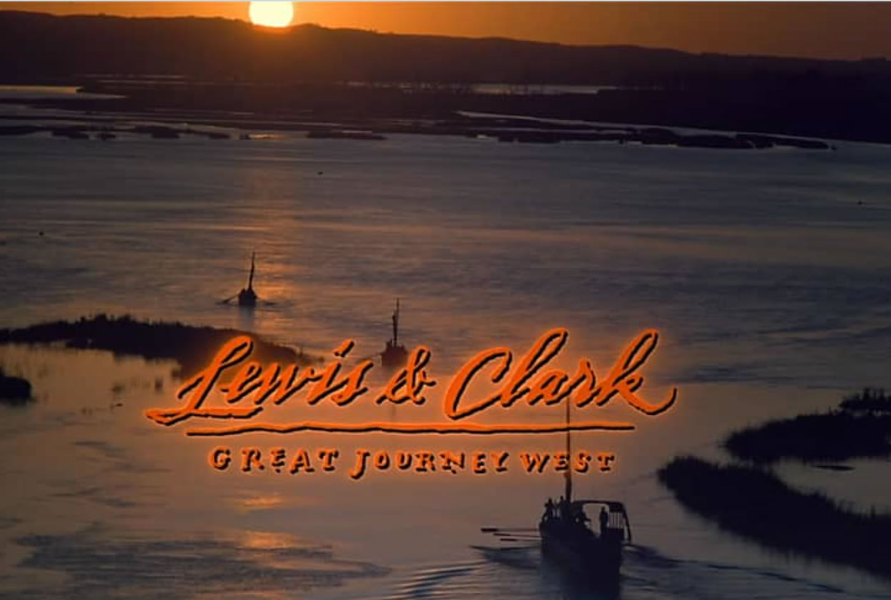
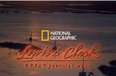
That journeying design pathway, the idea of getting out there was recounted from a National Geographic client that I worked with on for an IMAX titling of Lewis & Clark.
We talked about the idea of travel—in increments of hours, 5, 10, 24, 36, 48 hours—and days:
to get out there,
further and further,
it takes time, to withdraw farther.
It also takes time to get in—when you’re out there farther, you’re actually closer in to here.
What I reference is the travel to relationships that I have—now severely constrained, given pandemia—clients that I’ve worked for, people that I work with.
Earlier in my career,
I operated as a kind
of remote design and signing station —
I was rarely in proximity of my client relationships.
Some clients—back then—I’ve never met.
That isn’t the case any more.
I now—within the challenges of our current traveling scenarios—believe that we should know, personally, every one that commissions GIRVIN, the firm.
I should go out there.
Way out there, if necessary, to know and be more.
That includes
the staying in their city
to sense things,
feel out the culture,
inside and out —
the people that work inside a brand.
Who are they;
what do they care about?
What does the brand
stand for,
what is it about,
what is it,
what it makes,
what it does,
how it lives,
breathes,
examines its place,
envisions its future.
I’ll work in that city, to sense-it-out, more, know more,
be in it more.
And, in that, to be way out.
Get out, get in,
way out,
way in.
You make your way.
You go in, to go out.
W A Y
O U T
It’s the way I go.
Design is like that:
you’re in,
and to get there,
you might need to go way out.
Tim | GIRVIN Waterfront
–––
BRANDSPIRIT, SOUL AND THE FIRE OF IMAGINATION