What sways to blandishment?
A lot of discussions around last week’s blog—
and the notion of brand blandism, and some asked,
“wait, so you’re saying that san serif is too bland, too plain, not…
‘exciting’ enough?”
No, that’s not the point.
As I’d mentioned before, in a broad spread of design history, I’ve seen raw experimental font work, wild, unbridled and abstract—

and, to clinical precision, I’ve seen the plethora of
hyper-luxuriated, Bodoni-derived typographics

[a late 18th font] in my days speaking with Vogue colleagues—and we designed this one for Giorgio Armani;
I’ve seen the trend of calligraphy, scripts and signatures; and even, in one instance, a promotion from a lettering artist saying that he can “do Tim Girvin,” when I was impeding on his territory in Texas.
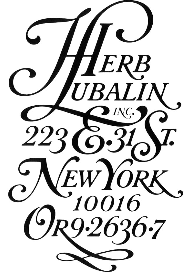
I’ve seen the maximalist age of exuberant, custom typographics during my time presenting to wizard Herb Lubalin and Tom Carnase [who I later connected with in his driveway in Palm Springs—at his mid-century modern ranch house—a wildly weird and convenient coincidence] and later, during a generic design age when simple plain brand works were the rage—a letter-packed san serif. From an elegant, crafted detail to a heavy-handed yell.
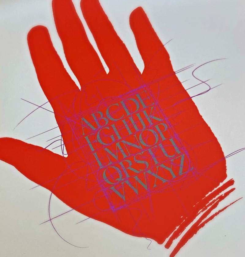
And I believe that the real line in the sand of design in time, lies in studying the greater arcs of letterform design in the span of history in the familiarization with palaeography.
I first walked here with Lloyd Reynolds at Reed College, Portland, Oregon, and later, sitting—the apt pupil—at the desk of James Hayes, and the strict study of manuscripts and the concise match of chronologically current lettering, with ancient principles of letter design.
And the patterning continues, from quickly scribed messages on papyrus, sped up from the slow inscriptions of Imperial lettering on stone to handwritten stories in capitalized letterforms. And, as ever, speed counts since one would note that century on century of scripted evolution that motive is speed—faster thinking and quicker messaging, along all the more judicious use of scribal writing stock, from papyrus, to paper, to calf vellum to parchment.
Every aspect of this design thinking speaks to:
craft,
care,
community and
connection.
Can a powerful compression of message be captured in an out-of-the-box software expression, let alone the implications of
AI-generated design or font solutions?
Perhaps not.
I would consider the work of a strategist and the aligned expressions of the brand designer as the illustration of thought—
the spark of the idea flows out—a radiant, and radial outreach.

Brands are thoughtful, emotional, inherently human manifestations of shared offerings to humans. They are human inspirations and inventions for humans—so they must have that mindfully—and soulful—implication of touch and attention to their creation.
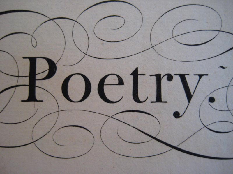
Detailed brands are soulful and poetic—human and handmade.
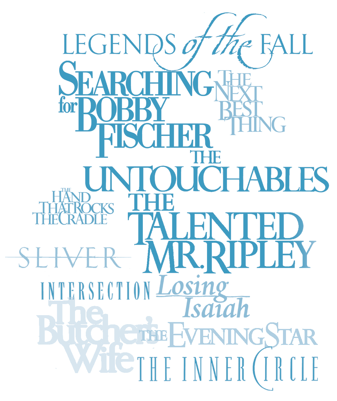
In my work as a designer of motion picture logos, the mission is, somehow, to encapsulate the entire narrative quality of the production into the creation of one mark—which is the stake in the ground at the beginning of the production. It is, has been, on-set, at filming, on the director’s chair, hoodies of the film crews, and the hats of the team—oftentimes a kind of badged camaraderie. All in for the mission—the promise of an unforgettable design narrative.
I look towards distinction, which could be the simple type of “Hunted,” with distressed detailing, the letterspaced character and conjoined characters of “Abandon,” or the mix of fonts, weights and stacks in K-19, the handcrafted prototypes of “The Lord of the Rings.”
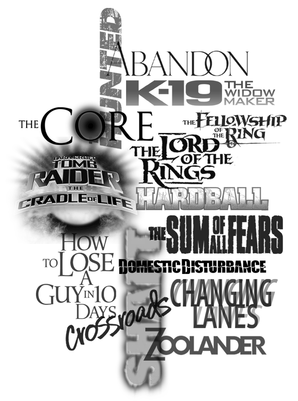
Or the mix of font types, stacking arrangements of classical font work, which are built from GIRVIN-designed bespoke typologies, of a series of studies.
In that premise, nearly every font treatment in GIRVIN’s history of
logos are built on customized type design, our bespoke fonts.
And to the implications of time, developing solutions that, in their craft, speak of chronological illustration from the varying geographical qualities of—per exemplar—a South American “Mission,” to the Parisian, early 19th century handwriting of Thomas Jefferson, or the rough Spencerian cursive scratched to “Glory;” and onwards–latter 1800s—“Tombstone.” Just like the signature of “Wyatt Earp.”
A different place, but similar times.
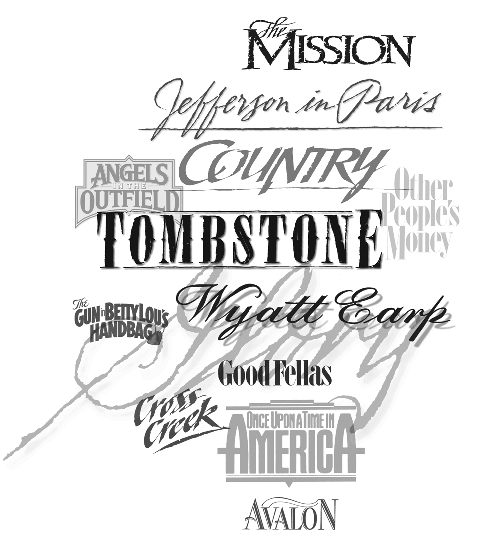
And, in film, there is always the star and—how, stylistically—celebrity portrayal plays into the weaving of the core identity.
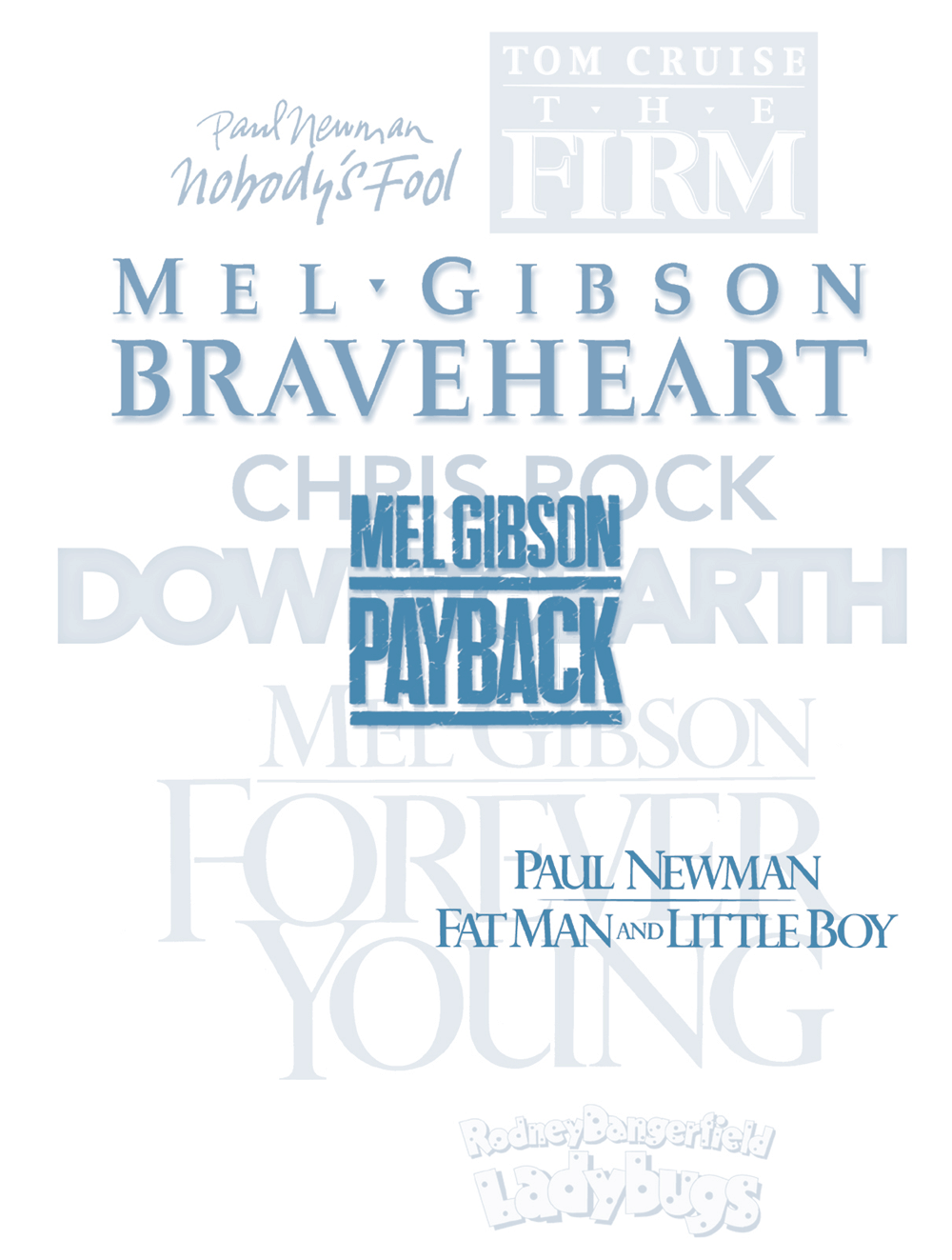
I mix them up—an entire clustering of mixed fonts, containments, border treatments and interplays, scripts and custom fonts.
There is always a detail that could be an added illustrative twist, nuanced, like the voicing of a narrator.
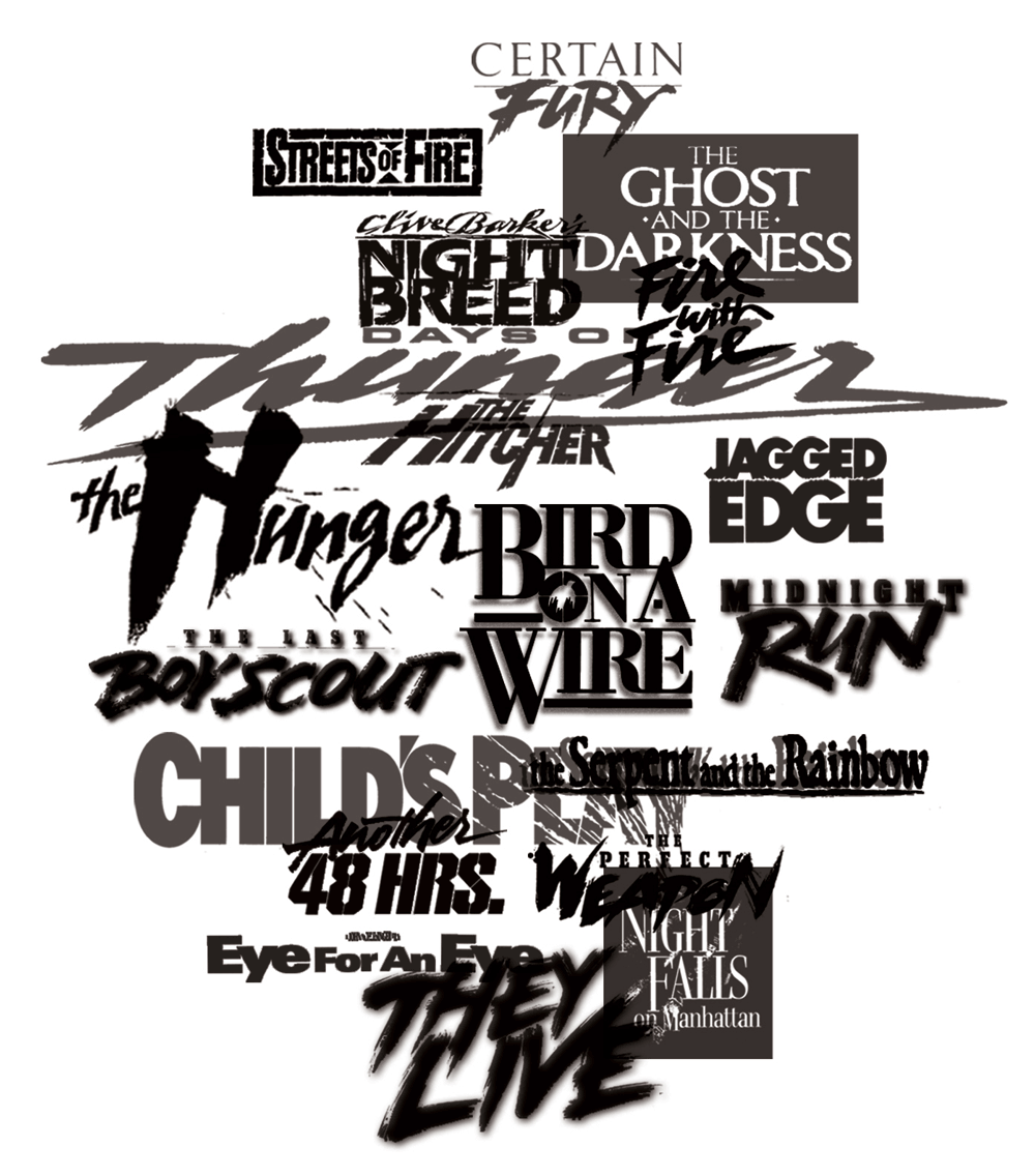
For GIRVIN, emphasis of character and structure, care and detailing last—and are remembered—by the viewer.
So what of bland?
As ever, I look back into the origins of voice and idea—and what of it?
Our colleague at Etymonline.com offers his usual insightful appraisal:
“mild, smooth, free from irritating qualities, not stimulating,” 1660s, from Italian blando “delicate,” or Old French bland “flattering, complimentary,” both from Latin blandus “smooth-talking, flattering, alluring,” perhaps from PIE *mlad-, nasalized variant of *meld-, extended form of root *mel– (1) “soft.” Related: Blandly; blandness.
Or:
- banal
- boring
- dull
- insipid
- tame
- tedious
- watery
- white-bread
- wishy-washy
And, being a spice-oriented person, I’d offer,
“who likes a bland meal”?
Tim | In a Sitka forest,
the Washington Coast
–––––––––––––––––––––––––––––––––––
Dining Design
We build projects
digital: girvin.com
built environments: oseanstudios.com
––––––––––––––––––––––––––––––––––––––––––––––
Follow Us:
Facebook LinkedIn Instagram Behance