Exploring form language, art and brand.
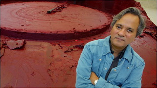
Miro Kuzmanovic | Reuters
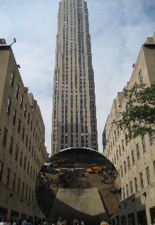
My first large-scale awareness of Anish Kapoor, live exposure, was in October 2006, at Rockefeller Center, NYC. But I’d studied his work, off and on, for about 15 years: http://blog.girvin.com/girvin-kapoor
Actually, early on, I had not really thought of him as an artist, but instead as an industrial designer and object maker. And so, in a way, as a designer, I’d put him in the realm of other designers / thinkers / product makers — like Philippe Starck, Karim Rashid — where object, art and installation seem to mix. But Anish Kapoor has never, to my observations, created “product”, per se.
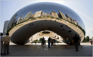
Aside from his Tate | Unilever installation, he’s created other permanent placements, like his well-loved “Bean” — as the Chicagoans call it — in Millennium Park.
But there’s more to the legacy of his creativity than that. And there’s a new grouping of shows of his work in Boston and NYC that gathers up that sense of heritage. Barbara Gladstone has had a longer running relationship with Kapoor and her earlier shows have offered representations like these, since 1998, 2002 and onwards:
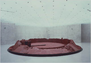
My Red Homeland
Whiteout
Untitled
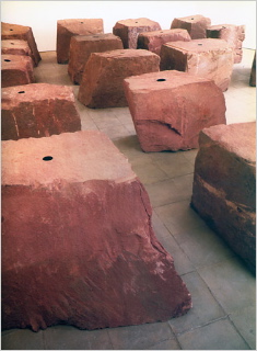
Voidfield
Randy Kennedy, the NYTimes writer, references the long running character of that legacy, as
“extensions of Mr. Kapoor’s almost career-long interest in sculptural incorporeality. Borrowing ideas from Minimalist and post-Minimalist predecessors like Donald Judd, Bruce Nauman and Eva Hesse but using deep matte colors, reflectiveness and other illusions, he makes boundaries seem to disappear with an effect that is often overtly sensual and spiritual. Mr. Kapoor, who first rose to prominence in the mid-1980’s and won the Turner Prize in Britain in 1991, calls them nonobjects.”
Actually, that’s a beautiful summary. Like any industrial design, or a grouping of “products” there can be a language, a formal / form vocabulary that speaks to message (brand or otherwise). Hence my opening titling allegory. But while there might be a sense of form that’s part of the grace of his work – some psychic underpinning to his soulful character — he keeps roving on his path of creative making.
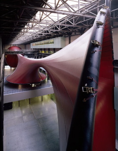
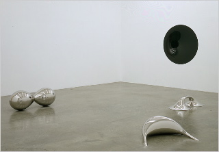
Here is some of the imagery from the show, currently running in the Boston Institute of Contemporary Art:
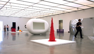
Erik Jacobs | The New York Times
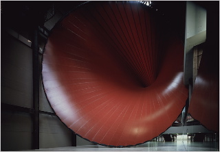
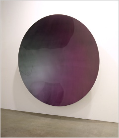
And these images, also from Erik Jacobs and Librado Romero:
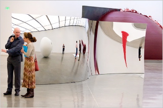
S-Curve
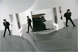
Vertigo
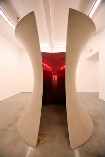
Here for Alba
Of course, I’d like to get there. And will, I’m hoping. I savor the gentle sensuality of his approach, less to shock tactics, and more to soft persuasions. While there are expressions in his legacy that capture a rougher texture, much of his work is spectacularly fluid – almost to the degree of impossibility, let alone the issues of keeping, literally, the art buffed to mirrored perfection. More explorations are here:
The NYTimes:
http://www.nytimes.com/2008/05/30/arts/design/30kapo.html
Gathered exploratory with added links: http://topics.nytimes.com/top/reference/timestopics/people/k/anish_kapoor/index.html
Lisson Gallery:
http://www.lissongallery.com/#/artists/anish-kapoor/
Kapoor, a brand? A human brand? I’m not sure about that. While his work is monumental, the power of it like Serra or Turrell, the majesty of the concepts real, Kapoor himself seems very quiet, even restrained…
Recessive, perhaps.
What’s your take to the idea of design language, form vocabulary, art and Anish Kapoor?
tsg | seattle
—-