Knowledge work, navigated — the endless quest for answers.
For decades, the work of Girvin really has been about the reorganization of information. That is, the re-forming of form, in the content of comprehension.
All of these words are meaningful to me; and they’ve all been explored – to the deeper tiers of thinking and re-collection. And, in a way, they are all relevant to the idea of being drawn into the reformation of information.
Thinking of content — the continent of context — as being a new holding of what is seen and sensed, holistically. There’s one person that has lived in that space — the place of the display of information, more than any other — for nearly 30 years.

Edward Tufte.
Tufte is a specialized informationist. And I ran into him in the early 80s. Not that I really understood the concept of information. I thought about the idea of the informing nature of my work, but not about design being in reality, the display of information; and there’s nothing there to suggest that the visualization of information can be anything but beautiful. Edward Tufte has written seven books, including Visual Explanations, Envisioning Information, The Visual Display of Quantitative Information, and Data Analysis for Politics and Policy. He writes, designs, and self-publishes his books on information design, which have received more than 40 awards for content and design. He is Professor Emeritus at Yale University, where he taught courses in statistical evidence, information design, and interface design. His current work includes digital video, sculpture, printmaking, and his newest book, Beautiful Evidence.
His theories are about the concept of beauty, displayed informatively, yet concisely and imaginatively organizing content.
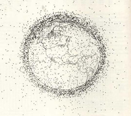
Orbital pollution: debris circling the earth. Illustration by Nicholas L. Johnson, Teledyne Brown Engineering, Colorado Springs, Colorado. (Dots are not to scale of Earth.) Cited by Edward R. Tufte (1991)
The nature of informing presumes objectivity — and perhaps there it is: a balance between the concept of science and art, discipline and imagination. Exploring Tufte’s examinations is a fascinating journey. More, here.
The organization of information sculpts knowledge. And to that, all of us explore learning and gathering content in whatever manner we can. And that search leads us to how we access the libraries of mind fullness. For me, there are the libraries. And there’s Google; for the further display of quantitive data. And Tableau, our client, creating malleable forms of display of information.
And now, Wolfram|Alpha.

Stephen Wolfram
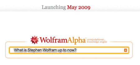
Wolfram|Alpha, the “computational knowledge engine” launched this week. And it claims to have access to a vast repository of information from trusted sources around the world: 10tn pieces of data filtered through 50,000 models and algorithms.
Those numbers represent an enormous catalogue of information, but intriguingly enough, the final test of the facts is, (alliteratively, in fact) human. The site has already said it will encourage users to vote on what they think is best in an ad hoc, crowdsourced set of eyes that informs the site’s programmers. In the end, that is perhaps not more distinguishing or better than the information returned from a search on Google or Wikipedia. While the foundational attributes are derived from a special source, in the end, personal scrutiny supports the final calling. At the heart of the mind of Alpha lies Mathematica, a piece of software that’s fantastically popular with engineers and scientists.
It was designed by Alpha’s author, the British physicist Stephen Wolfram, and resorts data from its users that Alpha is then able to spit back out again to web searchers. As well as their computational relationship, both systems can also pull answers from a range of approved references, databases and documents.
But what kind? What kind of data works. I tried some comparisons and found that Wolfram offers enormous insights for what you might call enormous challenges, while (espoused as a Google killer) a contrary search on Google creates a wholly different and usable set of answers. Many answers to the same problem. Thereby, the human intervention — what knowledge works? And, getting back to the beginning of this exploration, what knowledge informs.
The form of the question bespeaks the language of the answer.
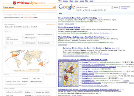
Technology Review explored that, too. David Talbot writes:
“SEARCH TERM: Sydney New York
WOLFRAM ALPHA: I got tables showing the distance between the two cities in miles, kilometers, meters, even nautical miles; a map of the world with the optimal flight path; and the fact that the trip spans 0.4 of the earth’s circumference. I learned how long it would take to make the trip: 18.1 hours flying; 13 hours for a sound wave, 74 milliseconds for a light beam in fiber, and 53 milliseconds for a light beam traveling in a vacuum. I also got comparative populations, elevation in meters, and current local times.
GOOGLE: I got a mix of things: a form for finding flights between Sydney and New York; a Google Maps-plotted list of businesses in New York City that contain the word “Sydney”; and links to the municipal government of Sidney, a small town in upstate New York.”
I suppose the reality — the display of information — might be defined in the character of the beauty of the display — and I might offer that Wolfram’s interface is beautiful. It’s an interesting solution — warming palette, strikingly red logotype — simple and classically delicately own-able, with the curious little geometric “object” for the Wolfram form of query and organization, all thoughtfully (and it is surprising for a search tool to be beautiful). Congratulations to them — a good opening launch: live on Friday night and managed to avoid crashing over the weekend and on Monday, the first full business day of operation, the 18th of this month.
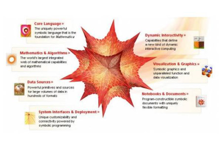
The engine was launched on schedule despite failing a large-scale traffic simulation test earlier on Friday. The site quickly began receiving 100 hits per second, a figure that climbed steadily over the weekend. As of early Monday morning, the company said that Wolfram Alpha had processed a total of 13.7 million queries from six continents and had received 27,000 responses to requests for feedback.
It might be about the beauty of the question. And the beauty of the answer.
In anything I might offer, I’d hope for just that. Asking beautiful questions and supplying beautiful answers.
Literary References:
- William S. Cleveland (1985). The Elements of Graphing Data. Summit, NJ: Hobart Press.
- William S. Cleveland (1993). Visualizing Data. Summit, NJ: Hobart Press.
- Paul Lewi (2006). “Speaking of Graphics”.
- Thomas L. Hankins (1999). “Blood, dirt, and nomograms: A particular history of graphs”. In: Isis, 90:50–80.
- Robert L. Harris (1999). Information Graphics: A Comprehensive Illustrated Reference. Oxford University Press.
- Eric K. Meyer (1997). Designing Infographics. Hayden Books.
- Edward R. Tufte (1983) The Visual Display of Quantitative Information. Edition, Cheshire, CT: Graphics Press, Edward R. Tufte (1990) Envisioning Information. Cheshire, CT: Graphics Press, (1997) Visual Explanations: Images and Quantities, Evidence and Narrative. Cheshire, (2006) Beautiful Evidence. Cheshire. CT: Graphics Press
- John Wilder Tukey (1977). Exploratory Data Analysis. Addison-Wesley.