Early hand drawn explorations of the letter
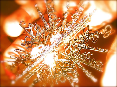
IMAGE: GIRVIN | hand made cut star alphabets in 12 languages
––––––
There’s a rhythm to the alphabet, drawing it, the forms can flow from one character to another. The story of their evolvement is a legacy of thousands of years, and the movement of the hand’s rhythm and the touch of the strokes on stone, metal, vellums and paper.
It starts with the spirit of the drawing of the O. Any alphabet will find the basis of scripting and form in the beginnings of the O. The next defining character will be the I. It is the combination of these two letterforms that hold in their strokes the nature of how the alphabet is formed. The letters hold the strength of the curve, the detailing of the straight stroke and the structure of its “finish” will define more. Straight letterforms either hold the radiused closure — at head and foot of the stroke, the quality of the serif — softened, hardened, ruled, bracketed, incised or bulbous — these combinant details reflect that idea, for how the alphabet is made.
When I began, in the 70s, I really didn’t have any work — fresh from college. So I began to fabricate a set of tools to build that opening effort: handmade books, hanging treatments, cards and papers, placards and hand-bound books of poetry. It worked — but even back then, people had a hard time actually understanding what I “did.” It was specialized. And the idea of making things by hand wasn’t common among the graphic design community. I didn’t actually know a great deal about graphic design — I wasn’t formally trained.
In college, more of my studies were about the idea of history and art: the book, the building, the writing, civilization, literature. I was curious about the concept of how these intertwined. To this day, that notion is still something of continuing fascination.
In fact, the opening work was very simple, but luxuriously focused — which ranged from custom printed booklets and brochures, letterpress work, small packaging assignments, book design and book jackets, signing and installed lettering, and sign painting and wall treatments and framed calligraphy. I drew logos by hand, had them shot, film-copied and built into business communication plans, stationery, headline and lettering treatments, magazine work, shopping bags. That was the beginning.
This book, these images — they are one of those books that still exists. A lot of the others were sold. A hand-drawn cover, and the specimen pages within, rendered on hand made paper and hand bound.


I’ll skip some years — from the late seventies, to the early 80s, the idea of the alphabet, the very mystery of her, caught me in a continuing spell. Far beyond the norm of real relevancy to project expectations, I’d create fonts simply for added applications. Working, early on, as a designer for Nordstrom advertising, I’d conceived the idea of building fonts into the design of multiple programs, that idea sent across the country to the attention of creative director John Jay, then the CD for Bloomingdale’s. The notion of wholly integrated campaigns was an innovation at that point – beginning with Nordstrom, then Bloomingdale’s, then Neiman’s, Bullocks, Dayton, Jordan Marsh, John Wanamaker’s and a string of others. This idea was about building fonts that could be used as headlines, advertising page initials, print applications and video for television.
That idea continued onwards and onwards — as art, to this day, the magic of the alphabet is a mysterious series of markings and symbols that continues to enchant and bewilder. I couldn’t hope to master it in a lifetime.
A G A L L E R Y
AND SOME STORIES
––––––
this is a font that was created for the identity for Travel & Leisure, an American Express publication, working with acclaimed art director Bob Ciano


this is a typeface study for a salon, which included signing and collateral, to that end — an entire font was created

for the design of a special retro font for the PanAm airline “Clipper”

a scripted font created for a floor signing treatment at Bloomingdale’s, under the direction of John Jay


a rough drawn calligraphic alphabet for Nordstrom

Disneyfont, designed for Disney Stores, for packaging,
signing and indoor merchandising

a trial font built for Wall Data, a software emulation group, based in Seattle, working worldwide (then)

a script font for Nordstrom, based on an identity and packaging treatment for a national store-wide campaign

a steel pen script font, designed with rubrics and color knock out, for initials

an alphabet for Douglas Trumbull, for the film Brainstorm

a series of font treatments for Tiffany & Co. — drawn first with a brushed tool, then redrawn, digitally built (the early days)


a font created for Pennzoil, an annual report application

a font drawn with a steel pen, cut and ribbed — for a Bloomingdale’s campaign on Jamaica

a font designed for the Oregon School of Arts & Crafts, drawn on japanese washi with a radiator brush, then baked in porcelain enamel and applied to installed building signing (for each of the schools) and business materials.
The signing was ultimately all stolen.


a customized font, drawn for the Nordstrom family, for print, for signing and identity applications

a alphabet originally designed for Sharon Stone, for her company, Chaos; and applied to her film: Sliver

a font drawn for the Horvitz family, a series of trusts and foundations, in the name of the estate

a font designed for Bloomingdale’s, for the celebration,
Fete De France, a fortnight event originated by Marvin Traub, former CEO of the store group


a typeface designed for Massimo Vignelli and Michael Bierut, for a building property in NYC

There are more, many more.
Most of these fonts are pre-digital, though some — like Tiffany & Co., there were early experiments in carrying it across the line from analog stroke to pixelated visualization.
The character of the alphabet, the strokes and geometry of the language of the mind — now touched in the stroking of the finger tip, then to the other visuals: the weft and heft of form which builds out that curving and linear language of design.
Stroke on stroke, there’s still nothing to the power of a handwritten note in the warmth of the palm, the fingertips, the turning wrist.
Beauty emerges in touch — drawn with the digital pen, or drafted with an ebony stick of ink.
tim | girvin, inc. | nyc, ny
—-
THE CONCEPT OF CROWDWEAVING
Girvin Cloudmind
the reels:http://www.youtube.com/user/GIRVIN888
girvin blogs:
http://blog.girvin.com/
https://tim.girvin.com/index.php
girvin profiles and communities:
TED: http://www.ted.com/index.php/profiles/view/id/825
Behance: http://www.behance.net/GIRVIN-Branding
Flickr: http://www.flickr.com/photos/tgirvin/
Alltop network: http://my.alltop.com/TGirvin
Google: http://www.google.com/profiles/timgirvin
LinkedIn: http://www.linkedin.com/in/timgirvin
Facebook: http://www.facebook.com/tim.girvin
Facebook Page: http://www.facebook.com/girvindesign