Notes on signing, wayfinding, alphabets and recognition.
When you are lost, where do you go, what do you do?
Some would say, “I’d look at my phone.”
Or “I’d look at the Sun. Where is it, anyway?”
You can, metaphorically, look for a sign—some augury that portends the next path. That might help. Or you can look at a map. They are the same thing. A sign is a map. A map is, in fact, a grouping of signs, arranged to help you get somewhere.
During working sessions at UA HQ, Oakbrook, IL—late 90s, we’d proposed an elegant redesigned system for all collateral for United Airlines, world-wide, as well as a new font system and palette,
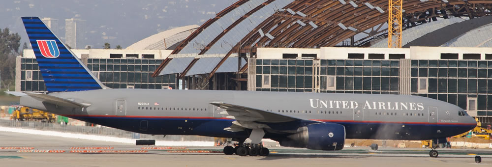
speaking towards worldwide Ad Director, John Ruhaak and CEO Stephen Wolf’s positioning of a “ new visioning of a business-person’s airline.” with a brandcode®—a palette of grey, blue and a deeper Prussian blue, Bodoni typography and Univers Condensed support typographic systems. This became a jet [the fleet fully retired in 2011.] What this opening foray represents is a kind of study in legibility—while the jets were inordinately elegant, you couldn’t see them in inclement weather. And speaking of lostness, that’s one thing you don’t want to get lost. A jet coming at you.
A friend of mine, a signing designer and place-making expert were talking about this issue, what about getting lost, and designing “finding solutions:” you are here—are directories really necessary? Can one direct people to the experience of places well-made in the hope of simply letting them find their way?
Perhaps so—but there are some circumstances that require clear attention. Like jets. And another form of navigation, first off—roads and highways, and the other labyrinth of driving signing experience, the garage.
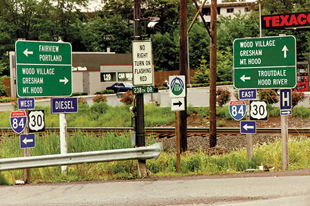
CAN YOU SEE BETTER, FARTHER?
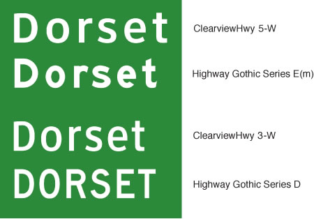
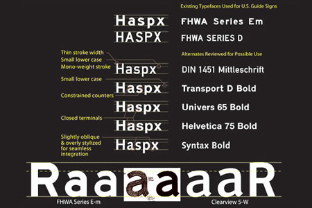
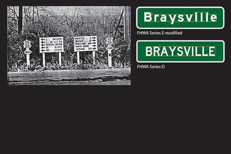
Don Meeker is a environmental graphic designer and James Montalbano, a type designer that have been exploring the use of fonts in design for visibility. And the founding basis of that original alphabet, the classic Highway Gothic. This font, while attractively oriented as a san serif treatment, has some curious eccentricities, like sliced finishes on some of the ascending character stems—an intriguing detail for designers. We designed an entire newspaper system with these fonts.
Creating, however, a font that replaces the current system took more than a decade for the Meeker team. More, to that new font–Clearview, here:
Highway Gothic & Clearview comparisons
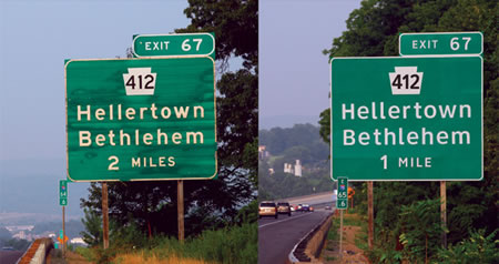
Legibility analysis and comparative explorations
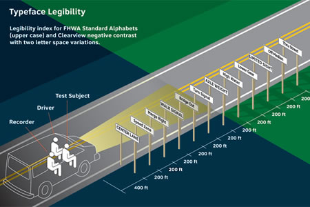
Photos by Don Meeker
The article that summarizes these explorations is here:
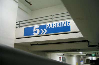
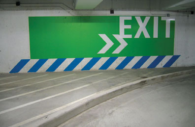
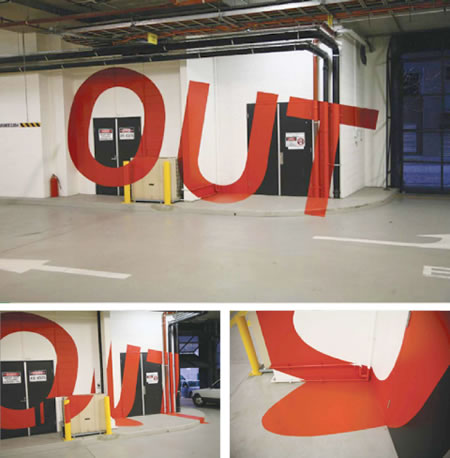
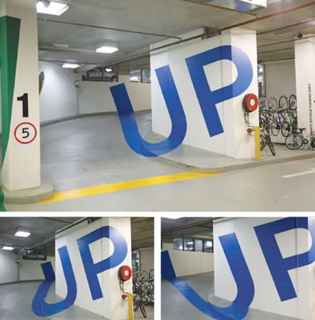
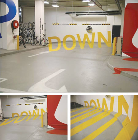
In our own work, we’ve explored highway visibility, as well as labyrinthine signage: signing garages—in this instance, Lincoln Square. And it’s always been about being direct, simple, fast: helping people figure out where they are, and where they are going.

But, all of this began, in my mind, with one set of images—one grouping of ideas—finding the way. Where are you, where are you going, how are you going to get there? And what might stretch the proposition for how that might be told?
What’s your take? How are you going to get there?
What would be the best way, to find a way, to get there.
—-
Tim Girvin + GIRVIN | Reno on the Truckee, UTAH
GIRVIN on Signage, Environmental Graphic Design and Wayfinding