WHEN I CONTEMPLATE BRANDS, THEIR RECOGNITION, IT’S MOSTLY ABOUT EMOTION AND MEMORY:
“I KNOW THAT BRAND, IT’S RED.”
OR IT’S BLUE, VERMILION, OR YELLOW.
MOST IMPORTANTLY, IT’S UNFORGETTABLE.
COLOR, OF COURSE, IS A KEY MNEMONIC.
Working with a team recently, we were talking about a scheme of refreshment, a tuning forwards of a brand—to hold onto core assets, boost them slightly, tweak their impressions—yet, at the same time, to push them into a refreshed sensibility—knowing that their consumers would know the color, would recognize and recall the color. Obviously, there are brands that—by virtue of their product offering—their colorations are integrated.
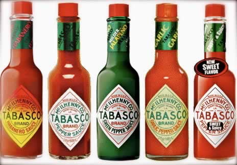
Take, for example, this one—a recognized packaging,
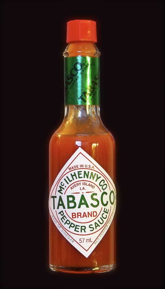
with its iconic mark and labeling;
systemically expressed. It’s a patterning. A pattern language of color, rhythmic graphical repetition at shelf and typographical detailing.
Globally, we worked on the definition
and registration of this palette,

as a trademarked association with this hardware tool—
that it would be, ultimately, the only electronic
testing hardware that is allowed to use this registered PMS.
In our work, this brand has a worldwide user profile [The Artisan / Engineer, ] based on international personality testing and profiling, to arrive at alignments of patterning personas of users, the relevance of color persistence in consumer cognition, saturation and pervasion and chromatic type to support the profiling of people, their user characteristics, as in the Artisan—“I like strong, recognizable colors, easy to read information, bold contrasts—I like to have the tools that I need to do the job that I need to do; and I like to be the guy in control—people count on me to take care of things.” That’s the Artisan—who Keirsey defines as:
Artisans are concrete and adaptable.
Seeking stimulation and virtuosity, they are concerned with making an impact.
Their greatest strength is tactics.
They excel at troubleshooting, agility, and the manipulation of tools, instruments, and equipment.
Hence the palette strategy,
matched to user personality.

To the other side of the business—Fluke Scientific Measurement,
that brand group has a user persona that speaks to an attribute of the Artisan,
a sub-sorting persona, which is another spiral
in the lens of types—the Engineer.
So that would be:
“easygoing yet private. They are logical and enjoy analyzing complex problems.
They thrive on the theoretical and like to figure out how things work.
They do not like rigid rules and often do not abide by them.
They are independent intellectuals.”
This palette aligns—solid, direct, honest, non-artificial, foundational:

There are more meditations to color that play to other sensibilities and characteristics that are less about personality profiling and user designations. But rather a spiritual journey—the walk of color as a gathering insight, it’s a wind on the hills of imagination, it’s a storytelling of experience. When you think about it, what about you, what’s your more emotionally powerful color—the color that you can relate to, connect with, represent yourself.
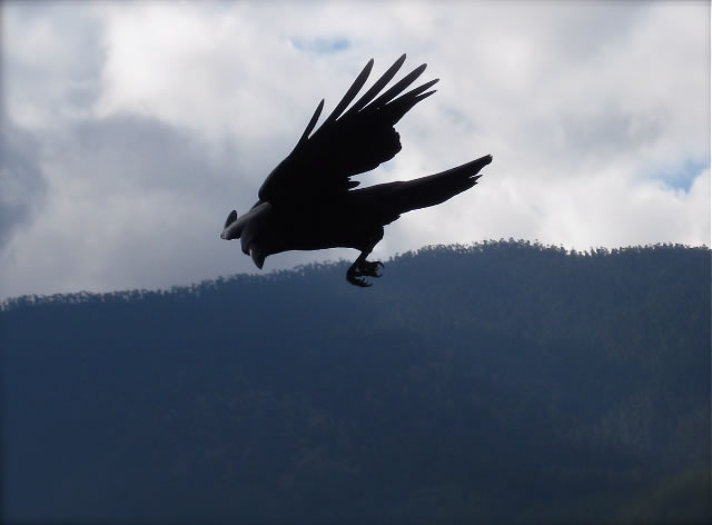
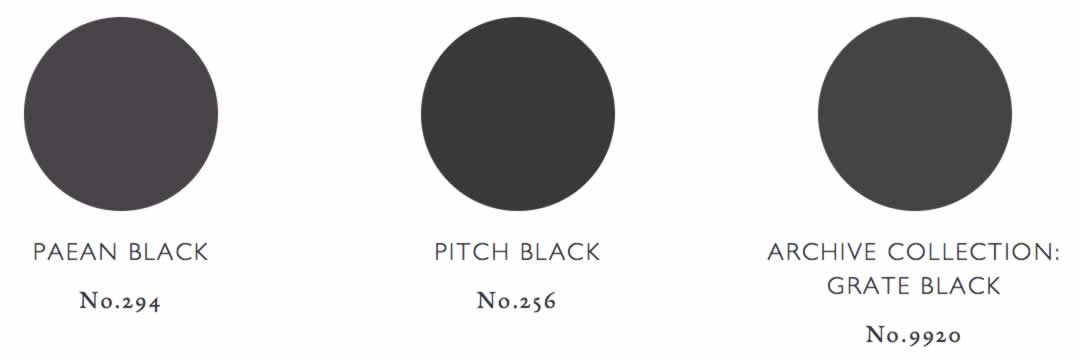
Personally, for me, and I’d written on it earlier, it’s black. I love black—because black is never merely the absence of light, but rather the character of darkness variously tinged with the suffusion of light. If you really look into the black, there is a detail of just what kind of black there is. Of course, the Raven isn’t really black—looking into them, they’re more like a oil-in-water rainbow-colored kind of a deepest dark brown.
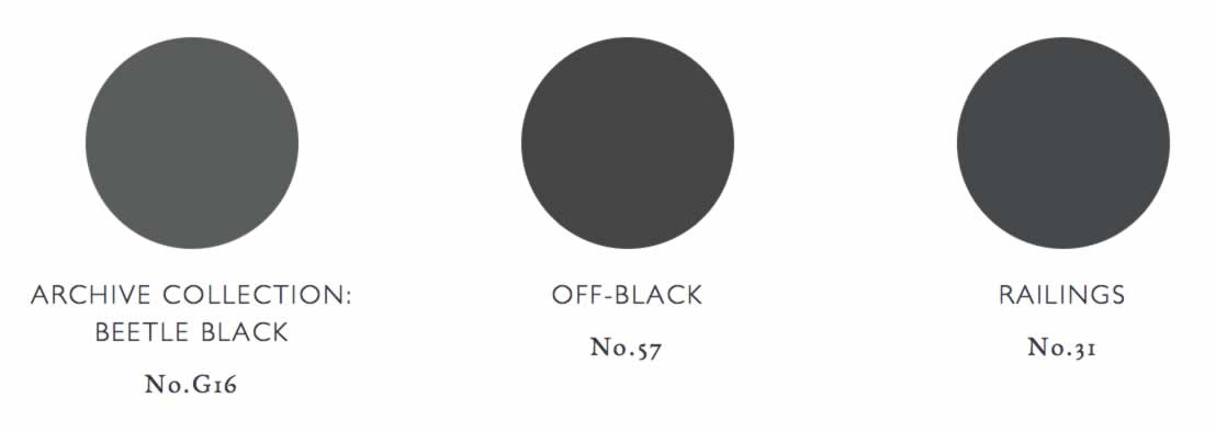
Then there is tar, which isn’t really black, per se, but a kind of black. A quick scan of, for example, Farrow&Ball plays to the blackest of blacks. As they say it:
“A true black—
Pitch Black is as pure a black as you can get and is strong and uncomplicated in all lights. Named after the dark sticky residue of coal tar often used in roofing, this true black has an unsurpassable depth and almost velvet quality.”
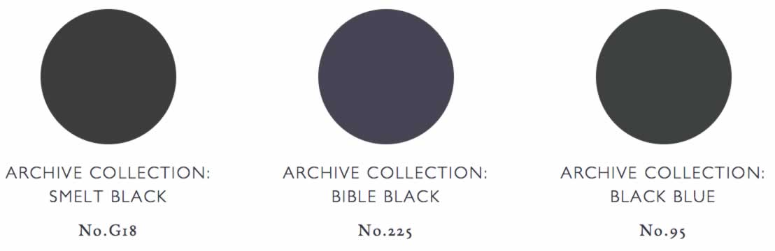
And there are other F&B blacks.
And there’s the blackest black—ever:
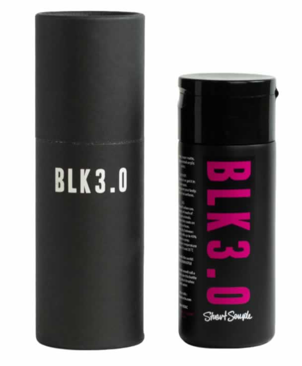
Handmade by the artiest artists at CultureHustle.
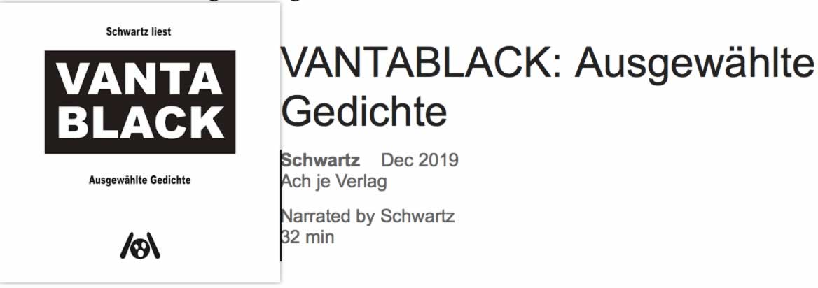
There’s a poem read to a blacker black,
which would be Vanta Black, spun by Schwartz, auf Deutsch lesen, bitte.
But that leads to the real VantaBlack, a new engineered HyperBlack, is a light-grasping black hole of blackness.
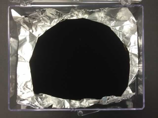
As described by Wikipedia, it would be:
“Vantablack is a material developed by Surrey NanoSystems in the United Kingdom and is one of the darkest substances known, absorbing up to 99.965% of visible light. The name is a portmanteau of the acronym VANTA and the color black.”
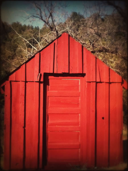
And what of red?
There are two notes from us, to the symbolism of red.
And both reference Sweden.
The red thread—“den Röda Tråden” and
a very specific red paint,
iron mined in the mountains of that country.
By elves, they say.
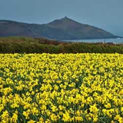
Yellow.
our observation.
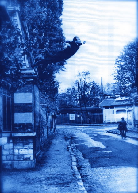
AND
B L U E.
Still, with all the meditations on the psychic power of the colors and our intractable relationships with the memory and meaning of chroma, it goes deeper, as here are some thoughts
that walk that pathway towards the mysticism of color.
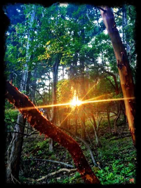
As a painter, draftsman and calligrapher, I walk into the woods, Wanderer of the Green. What’s seen through the forest?
What of green?
THE GREEN MAN OF LIGHT
I was seeing this, dreaming this, drawing this.
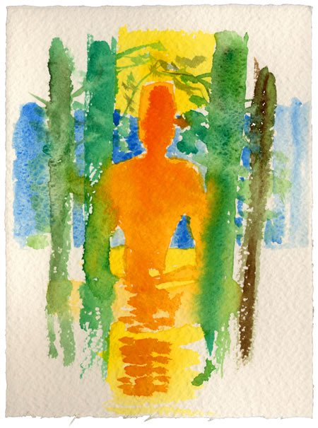
IN THE WOODS,
CONTEMPLATING THE GREEN LIGHT
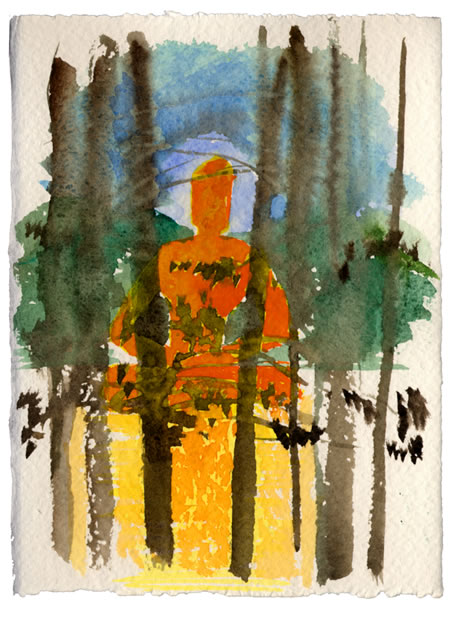
BUT IN THE GREEN LIGHT —
THERE WAS A WARM LIGHT,
a SUNNIER LIGHT — COMING THROUGH.
I draw on, and through that light, what I see.
A LIGHT MAN, THE WAFTING MIRAGE OF LIGHT, MAN.
L I G H T W A N D E R E R
–––––––––––––––––––––––––––––––––––––––––––––––––
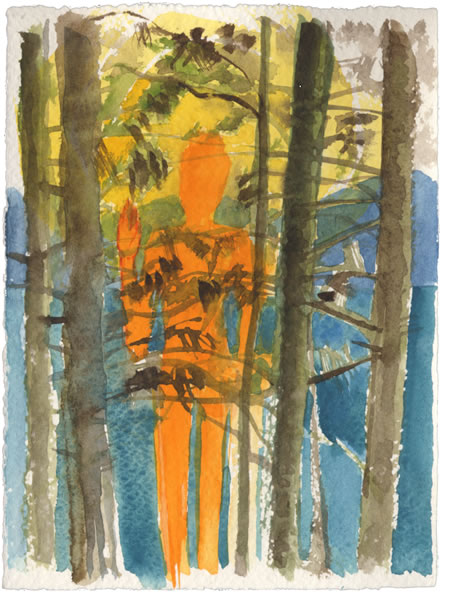
DEEP IN THE FOREST,
WHEN THERE IS WATER NEAR,
the light of the forest mixes with the light of the water and the reflecting Sun,
a refracting waver happens—like slipping, and drifting rhythm—and luminous people come through—light walkers, flickering, wavering light bearers.
FIGURES THAT WARY LIKE WAVES,
FLICKERING AND WAVERING IN THE LIGHT,
AS THE LIGHT BURSTS INTO MY SEEING.
T H E
P A T T E R N I N G
of the
O V E R S T O R Y
AS I LOOK UP,
THE OLD WOODS,
POLISHED AND LONG RUBBED BY TIME,
SALTED MIST AND THE RAIN BLOWN
IN SHEETS, FAR INTO THE light room,
THE STUDIO’S LONG HOUSE.
THERE, THE LIGHT MOVES ON THE CEILING
LIKE THE SQUABBLING OF GULLS AND DOVES, THE LIT WINGS, LIGHT-TOUCHED FOLDS OF LUMINOUS DRAPERY FOLDING IN,
OUT AND OVER EACH OTHER.
TO THE ETYMOLOGY OF THE GREEN MAN —
THE WALKER,
THE FORESTER,
THE ARCHETYPE—
THERE IS ALWAYS THE DREAM—
MORE
G R E E N S