The Nuance of the Hand-Wrought
Being a handworker—a person that, over the last half century, has utilized my hands as a consistent pathway to the articulation of ideas, I tend to look for, and create in, the spirit of those things.
You—being a creative person—know what it’s like to develop an idea on paper, or glass or stone, perhaps? the palm-edged heel of the hand on paper, sliding across the stock, the substrate of your rendering—and the feeling of it.
How you hold your drafting tools, a brush, a pencil, a stick in the sand—these are particularly sensate experiences—quite unlike any other. And, as a design firm leader—I’m always looking for people that can draw their ideas out—whether as a string of hand-crafted words, spelling out the thinking of the ideal, or drawing-out the distinctive character of a logotype, the form of a website, the shaping of content.
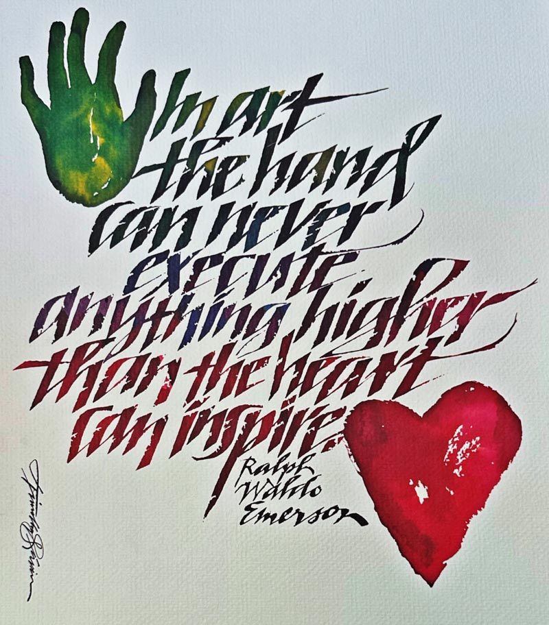
Here, a patterning of words—the death shroud remembrance of my mother, Lila Lee Shaw Girvin:
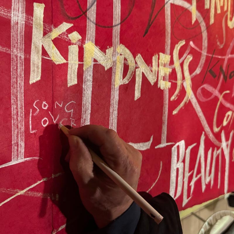
There is something here, to the fragile detailing of emotion, grief, love and remembrance—that, in the outpouring of visible contemplation— becomes a meditation in motion, which transmigrates to an entirely human rendition.
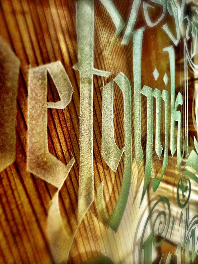
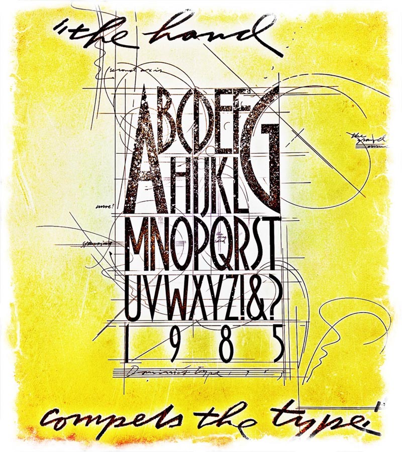
Thinking of her, that takes me back to my beginnings—signwriting—drawing on glass in Olympia, to pay for college tuition at the Evergreen State College.
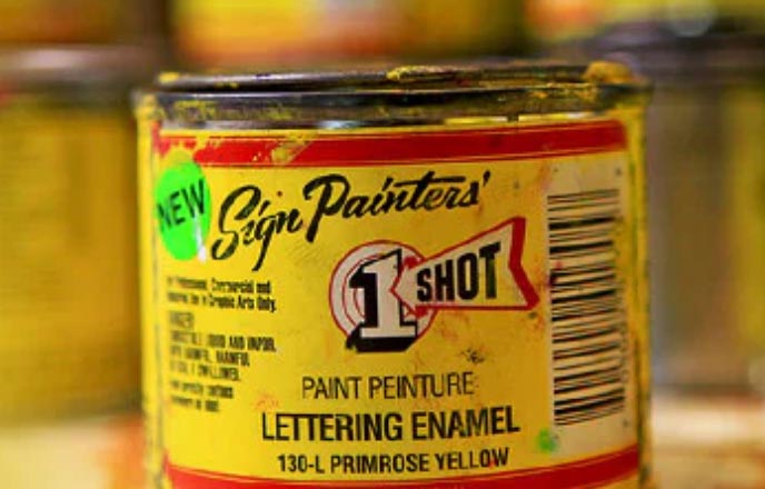
I used broad-edged sign-painter brushes, wood and silver-ferruled brushes and OneShot™ Lettering enamel—windows, pointed pin-striper brushes for motorcycles, cars, trucks, and boats. I also, with a tiny swiveled microblade, cut friskets, and then sandblasted the designs in glass, wood, and metal, by hand in blasting containers that I built.
Can you draw?
The old way, the handwork—now kind of a dying art—is rarely seen, mostly today replaced as digital output and decal-related applications. Surely these “outputs” do the work of defining the way forward, for a journeyer—but what is the character of that moment?
One might say, “it’s the difference between a cast china bowl from a kitchen supplier, or a handmade bowl from a living potter.” Of course, there’s room for both. But my abiding fascination lies far into the realm of the emotionalism of interpretation—and the sensations of experience. When you think about it, which is most memorable, in the deeper part of your psychic legacy,
the deep state of re-collection?
Traveling, I’m always looking at signage.
I look at the way of their making—how are they manufactured?
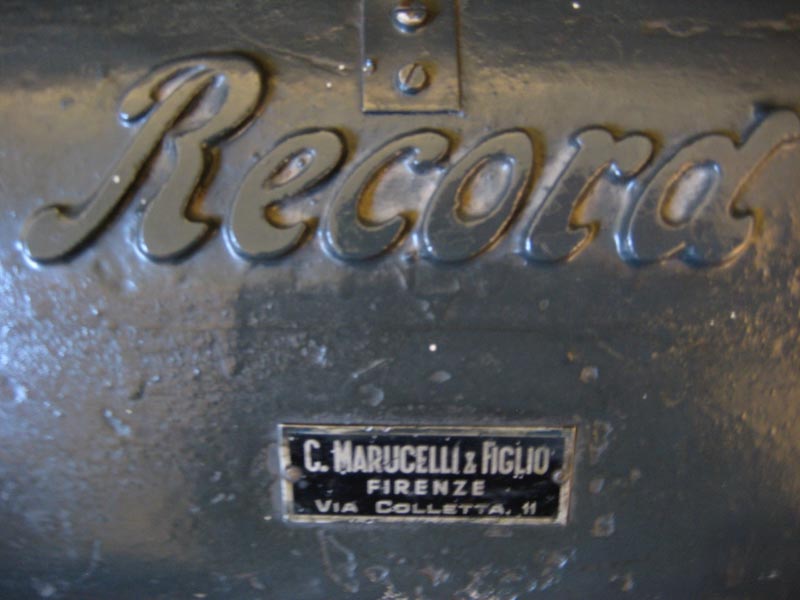
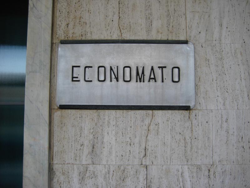
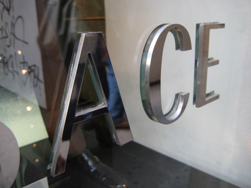
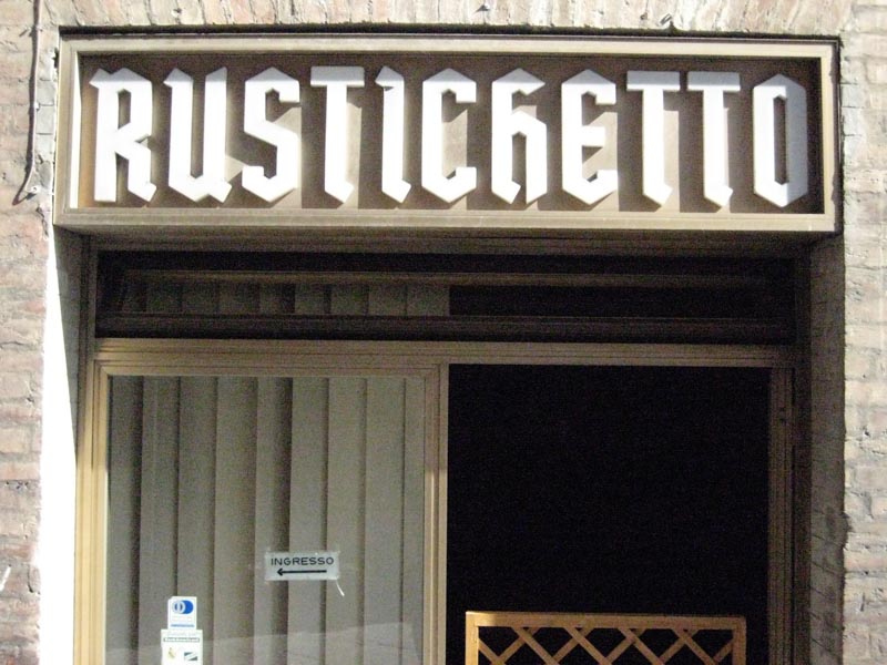
Here’s a string, all Firenze, IT—and I’ll leave it at that, though I have 1000s of photographs of signs, wayfinding, shopfronts from all over the world—North Africa, India, the Himalaya, China, Korea, Japan and Indonesia, as well as the US, the UK, Europe.
I’m looking for hints of intention, construction, materiality, illumination, letter character, appropriateness, craft, siting and attachment.
The signs below speak to touch, which is manifested in the texture of their materials,
their stylistic message and storytelling, the signal of their placement, lighting, and critically—how they are made.
The Medium is the Message
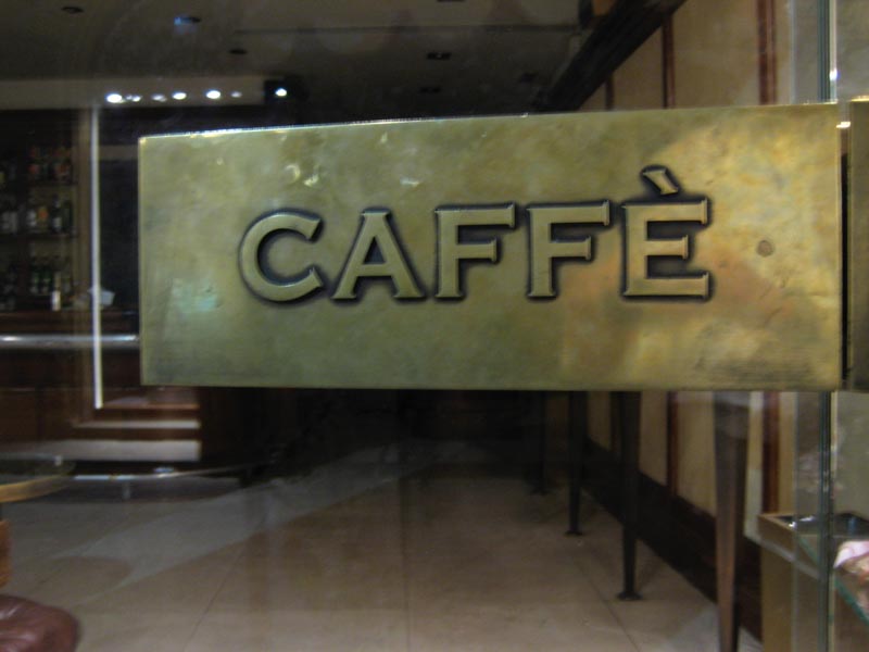
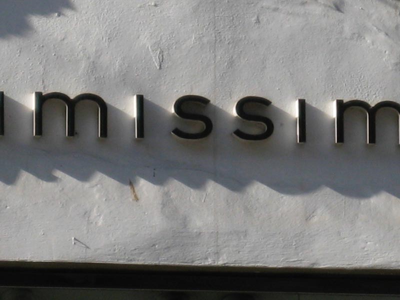
Cut, pin-flush-mounted tarnished brass on stone
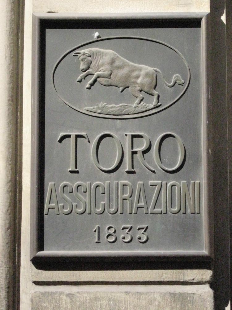
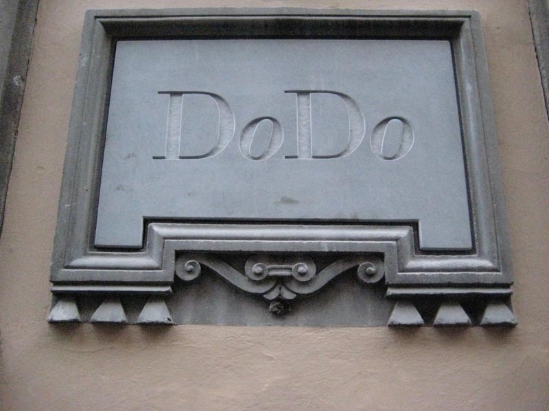
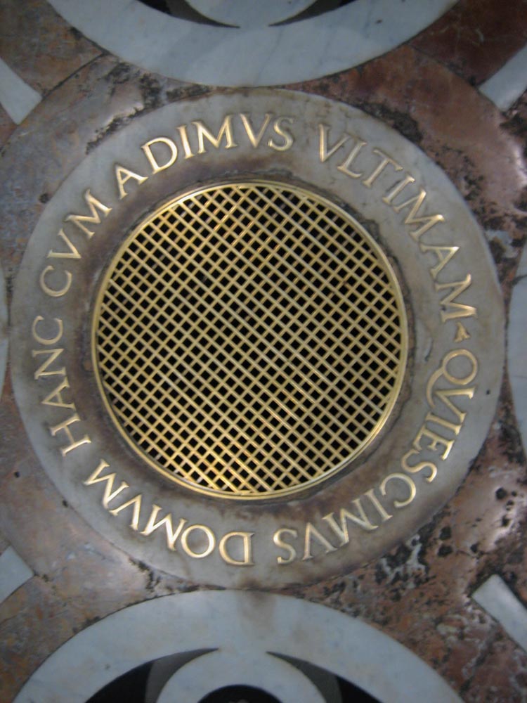
Cast-plate, impressed concrete.
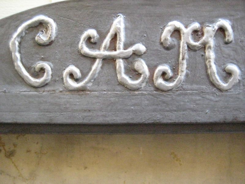
Cast iron
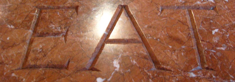
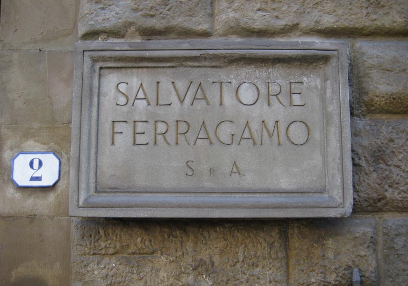
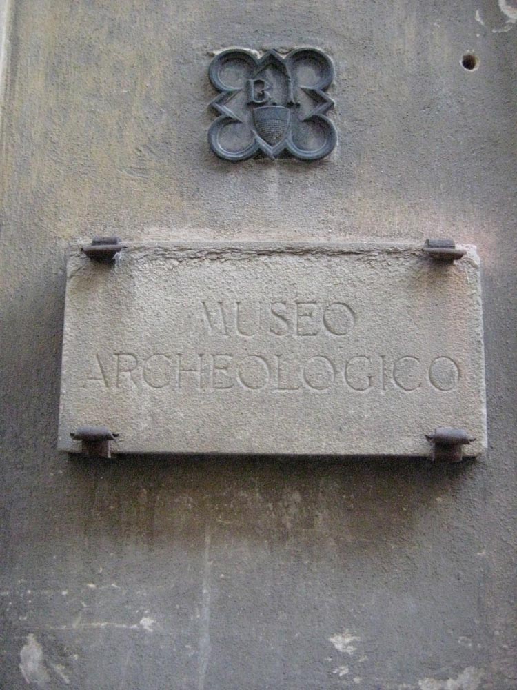
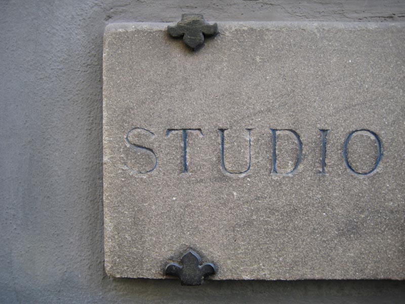
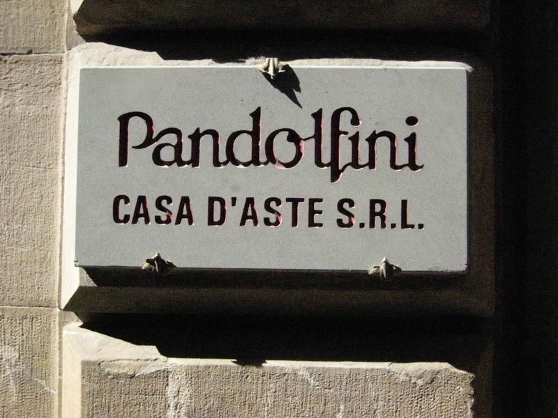
Hand-incised lettering in stone.
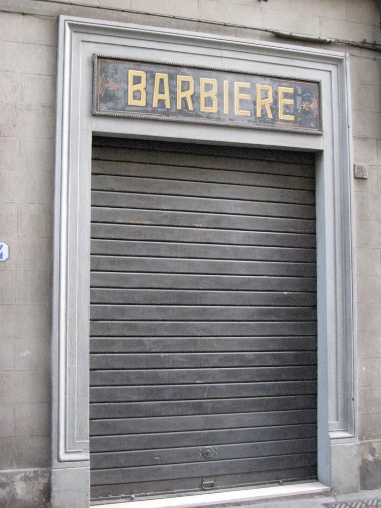
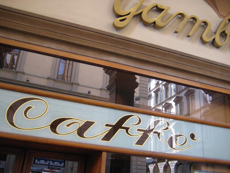
Tarnished substrate metal with outline gilding and flat gold lettered interiors.
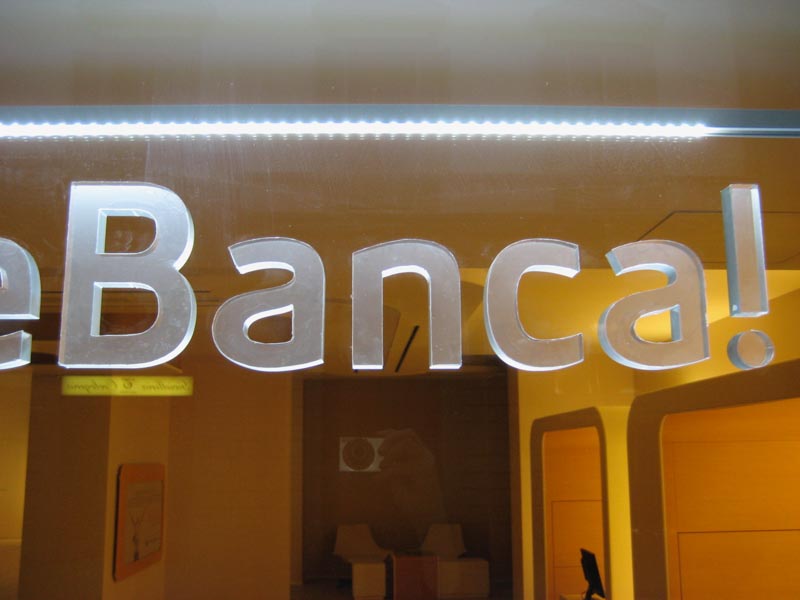
Incised Acrylic appliqué with uplit illumination.
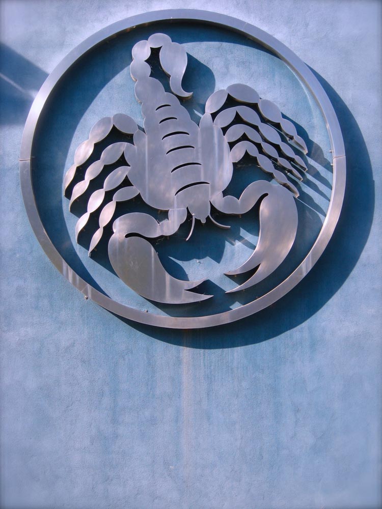
Soldered to metal substrate.
Chiseled stone, hand-cut.
Gilded outline with inline silver decorative details.
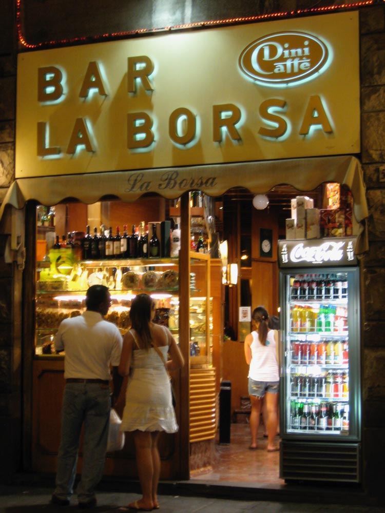
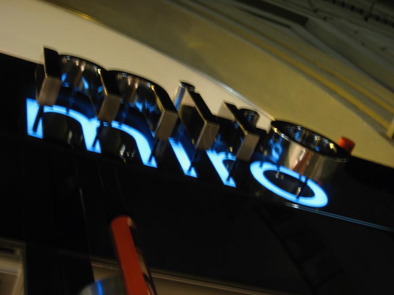
Pin-mounted channel lettering with inline illumination.
Aluminum substrate panels with acrylic attached characters.
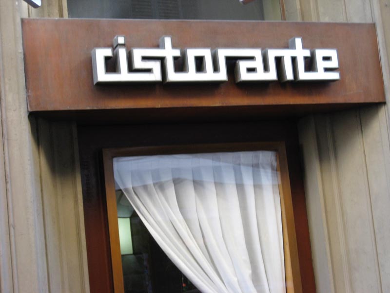
Cut brass lettering, attached and overpainted on metal substrate.
Brass incised and flush, pin-mounted signage.
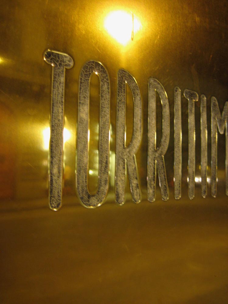
Incised steel, double-laid, inside and outside glass.
Incised and channeled lettering.
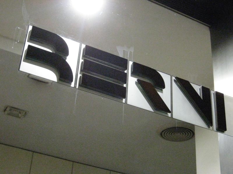
Polished steel, pin-mounted with illuminated, sub-glass letter reflection.
Stone sandblasted lettering in plaque.
Variegated, slip-shadowed gold with inline flat gold.
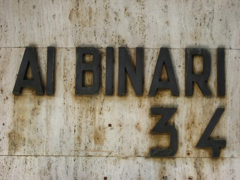
Deep sand blasted lettering on a stone plate.
Deeply channeled burnished steel device on metal field.
Channel lettering, pin-mounted on aged Corten steel
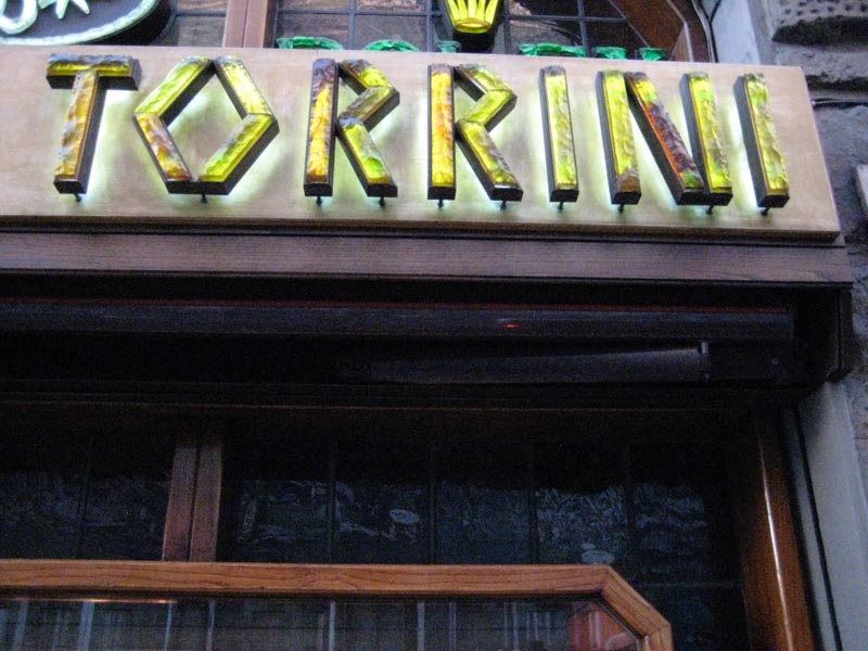
Glass-molded, interiorly illuminated, channel lettering.
Raised metal plate, flat-mounted on glass.
Variegated gilding with outline, as raised, incised letters.
Outline gilded lettering with interior filled lettering
[and dimensional wood signing, pin-mounted.]
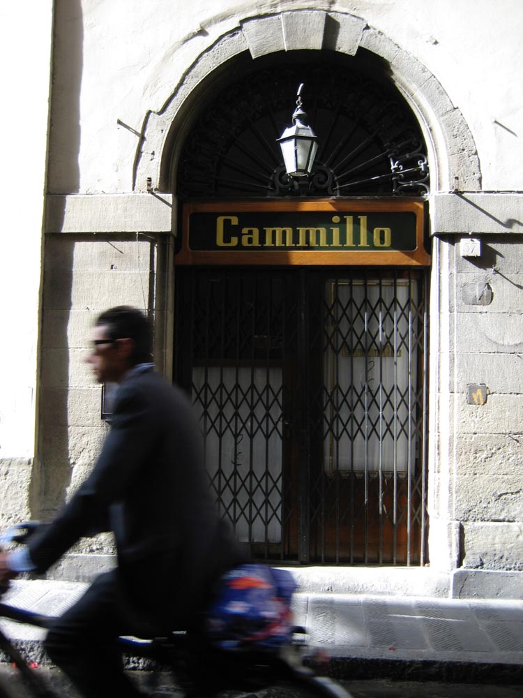
Flat brass, burnished, applied to a brass substrate.
Flat brass, tarnished, applied to a stone substrate.
Steel channeled lettering, pin-mounted.
Incised, slightly raised lettering, flush-mounted in concrete.
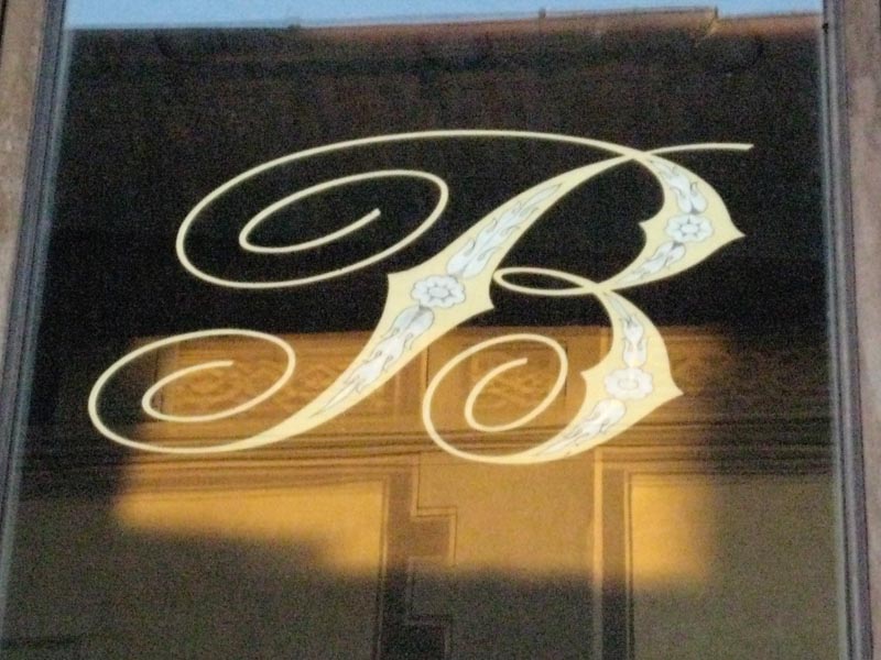
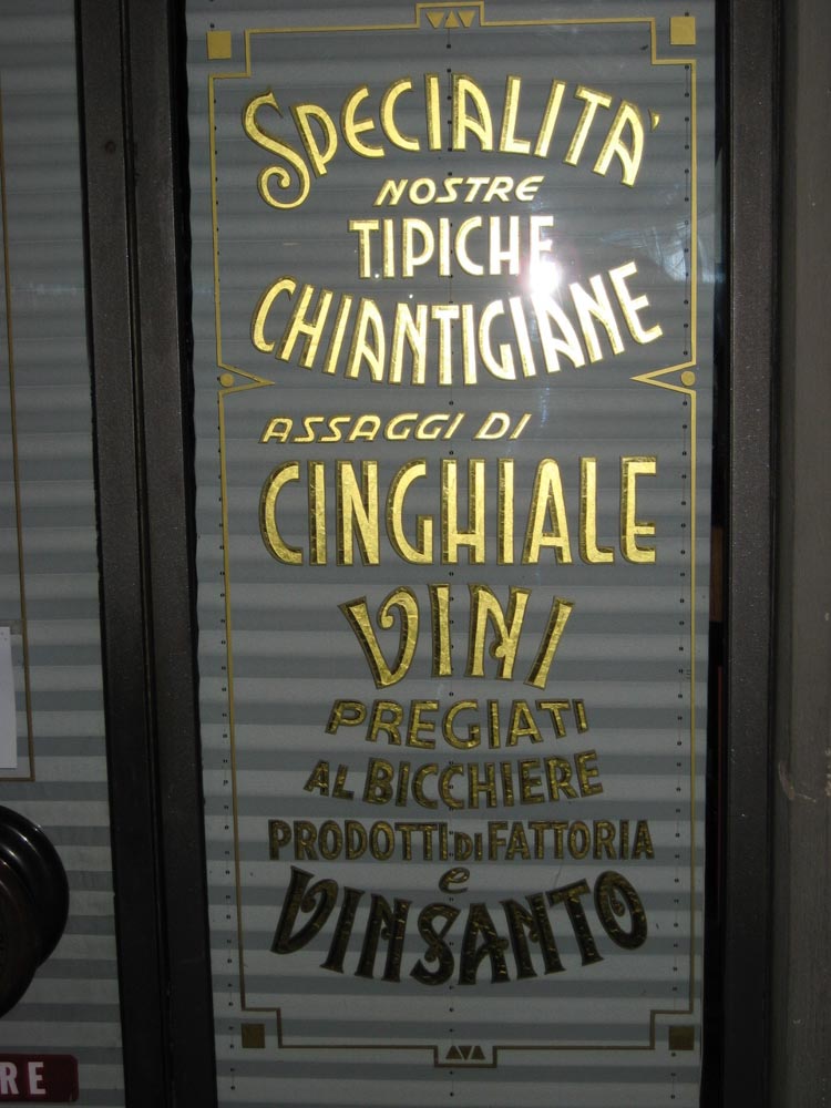
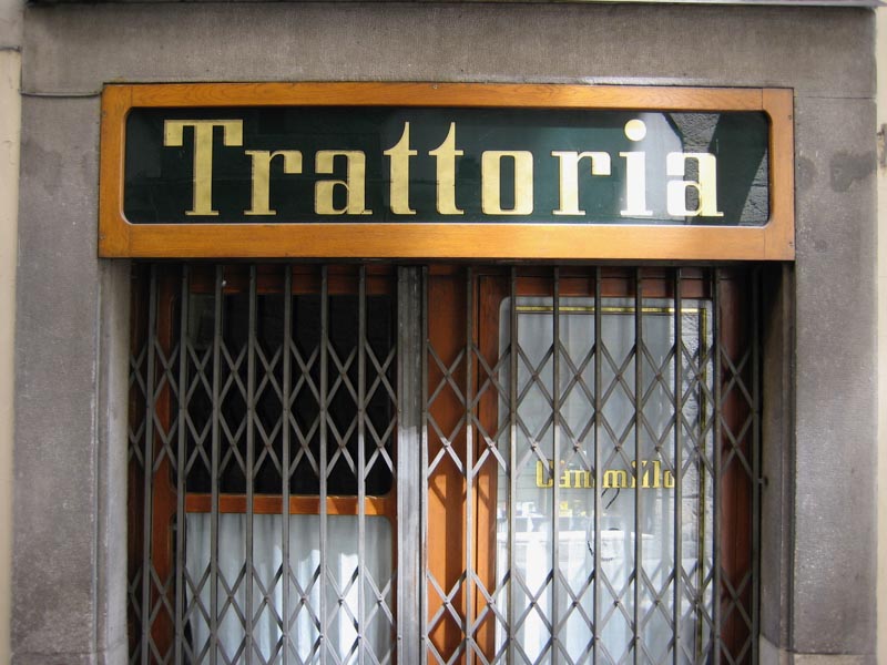
Painted lettering on interior glass panel.
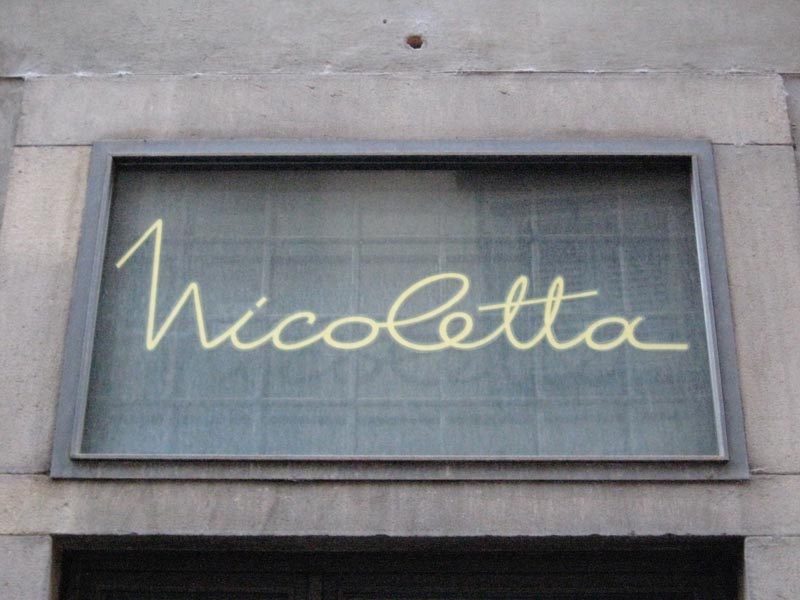
Molded glass on channeled pin-mount.
Gilded glass with metal surround.
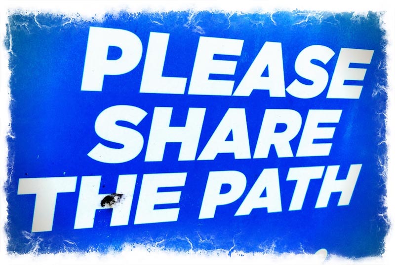
When I think about finding a way, setting pathways for guest processions, I’m remembering something that I can touch, something that I can recall—something unforgettably sensorial.
Working in retail, as well as dining-related design and experience strategy, creating touch-points of customer contacts, there is oftentimes a sway towards electronic media.
But, as Linda Stone notes, we are overwhelmed with screen-related impressions, spouting messages and visualizations. Experienced merchandisers know that flickering electronic portrayals and sales-related messaging are less memorable—they’re less like brand-relevant whispers and more to shouting. And when the journeyer makes a way, finding their path—it should be sensational.
Think of a sign.
What do you recall?
Tim | GIRVIN’s Queen Anne Hill Studios
––––––––––––––––––––––––––––––––––––––––––––––
Follow Us:
Facebook LinkedIn Instagram Behance