THE QUEST FOR DEEP METAPHORS IN SYMBOLIC PATTERNING, BRAND VISUAL LINGUISTICS
In Paris, the above plaque was an installed signage in a small studio’s shopfront off the Seine, Rive Gauche. It was a place that I shared with Pierre Dinand, as a working collaborative lab, brand and bottle design. 9.11 and the American rudeness to the French knocked us out of the brand design pitch fray—more particularly me, since the French brands and agencies couldn’t, likely, be connected with an American firm—given President Bush’s arrogant impudence. I met with the American Ambassador, Consul in Paris and he said, “there’s nothing I can do about it.” Still, we continued the pitch and met with packaging and fragrance executives in Paris, NYC and Tokyo.
Onwards, we go.
As I’ve practiced since the 70s, I see design as a kind of mysterious process—marks and marking change in the landscape, and thence the storytelling of planes of space, converting them into newly defined “places”and the art of this transformation is—in the western parlance—akin to alchemy.
The mark of a single line converts a nothing into a newly defined some-thing. Thinking about design as a signal, a sigil in redefining space is akin to magic, in the original mage-based construction of the word, since design is a composite from ancient renderings of the Latin de—“out” and signare—“to mark or signify,” sign, itself, from signum—“an identifying mark, token, indication, symbol, proof or standard, an omen; sign in the heavens, a constellation.”
Interestingly, the latter evolution of “sign” was manifested in the early 13th century as signe—which is a “gesture of the hand.” Gesturing, of course, is a sign, but it’s also the movement of a designer in making the art of the mark.
In the midst of thinking about design patterning, taking brands into places, using patterning in a place to create visual and emotional response in an environment; one could think of them as a pattern language, which we’ve spoken of at FiRe, [here’s an abstract of the talk and overview,] Mark Anderson’s Future in Review innovation summits.
Everything is a pattern of some tier of recognition—there are larger synchronous patterns in cultural trends, then there are, too, patternings in large and micro data—insights from looking at the reassembly and search of ultra complex problems, and how they might be seen in differing ways for profound insights, such as we designed for Anderson’s PatternComputer and his PatternDiscoveryEngine™.

That revisualization of data in newly evolving quests for insights shows true—and through—in our pattern-related brandwork for Tableau and their foundational technical start-up team,
led by Christian Chabot.

But what if—getting back to mysteriousness of design—which is surely part of our heritage, our exploratory research, and in the DNA of all of our brand development, that we go into a study of mystical brand linguistics: a brand design patterning that speaks of the brand. And more so, vocalizes—as a recognized psychic instinct—the patterning says something, as a language itself into the mysterium fascinosum—it’s the mystery that draws the viewer in—deeper and deeper. People remember the storytelling, the brand story is memorable, self-empowering, and personally energizing?
I first met Sarah de Joybert in NYC, at a brand summit for a water product she was developing for L’Oréal. We stayed in touch. Later we met up in Toronto, as well as Seattle, talking through the GIRVIN BrandQuesting® process to work out a new brand concretion for yoga and meditation—
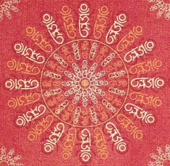
a brand to be called HUM, based on
a monogrammatic Sanskrit render:
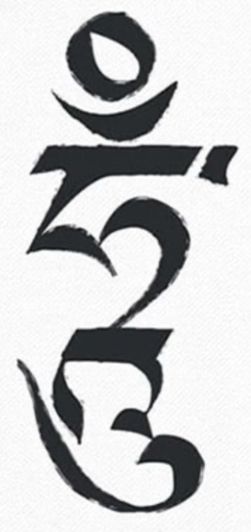
The structure of the syllabic seed sound reflects its own storytelling, as in: “depicting the sun in full splendour, the new moon in all its crescent glory and the powerful “tigle” above, signifying the consciousness of mankind… merging like an invisible cord into the cosmic Universe. Then below these symbolic representations and in the elegant secret language of the Dakinis are the lines that evoke every kind of Protective Deity associated with the Buddhas of the ten directions.”
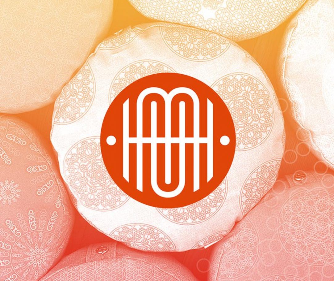
One Devanagari rendering forms another Roman alphabetic signet—along with a first century GIRVIN bespoke font reference, the core community-facing brand.
Digging into the legacies of interpretation and a patterning-related dimensionality, our patterning renderings insinuate themselves into geometric expressions that speak to layer,
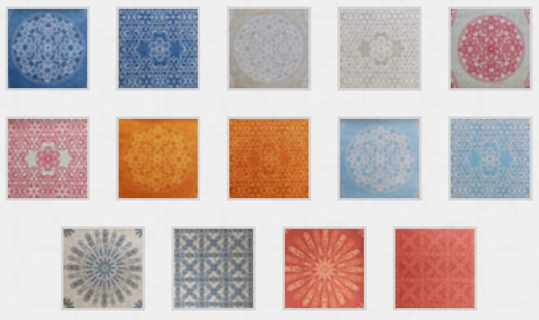
inside layers, inside other formal product interpretations—the meditation cushions, bolsters and floor supports.
These lead to the macro [and micro] intimations of the patterning and characters, along with symbolically-empowered colors translated from sacred sites, palettes of place:
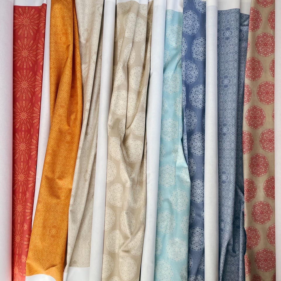
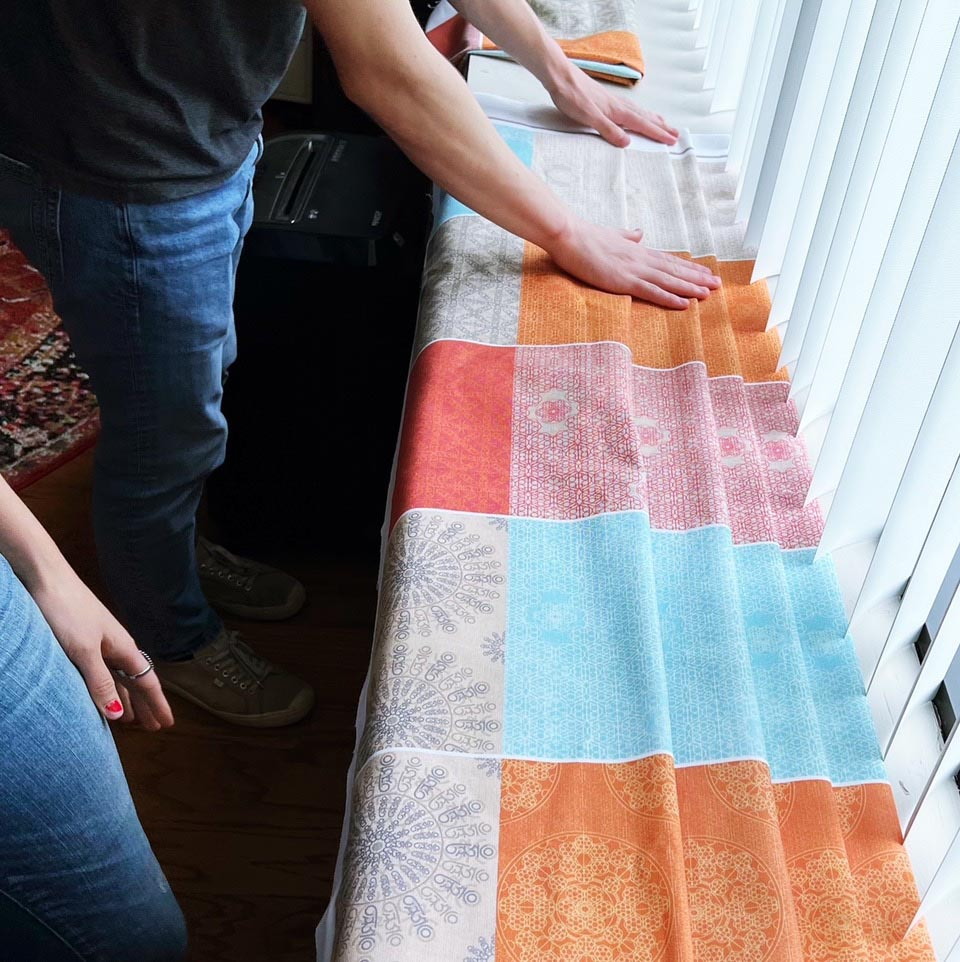
Organically imprinted, the raw fabrics hang in quietude before their manufacture as supportive yoga and meditation practice cushions.
These are then arranged and organized for production arrays.
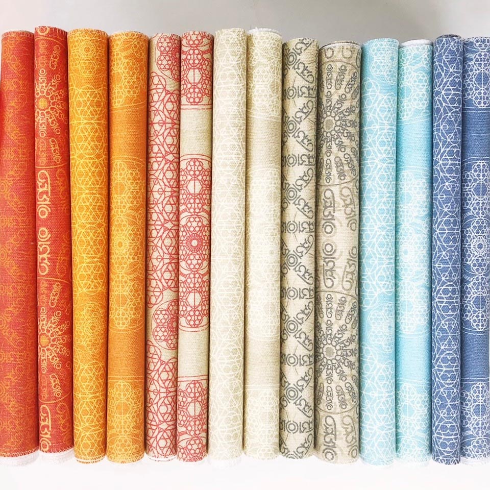
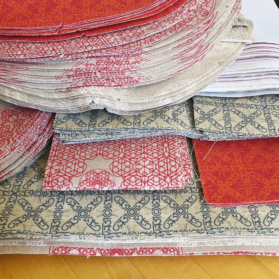
Base product templates are trimmed for sewing in a Toronto studio.
And the forms are fabricated into patterned renderings, embedded in the brand, story inside story, patterning inside geometric symbolisms—each, inside the other, on top of another, layered and tiered—in a progression of meaning in context.
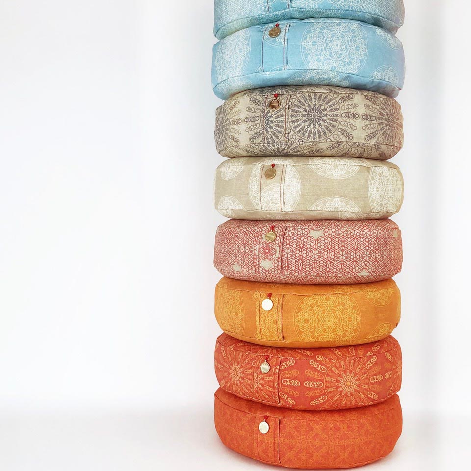
These are grouped into conceptual clusters as manifested in these groupings, as sorted by Sarah de Joybert:
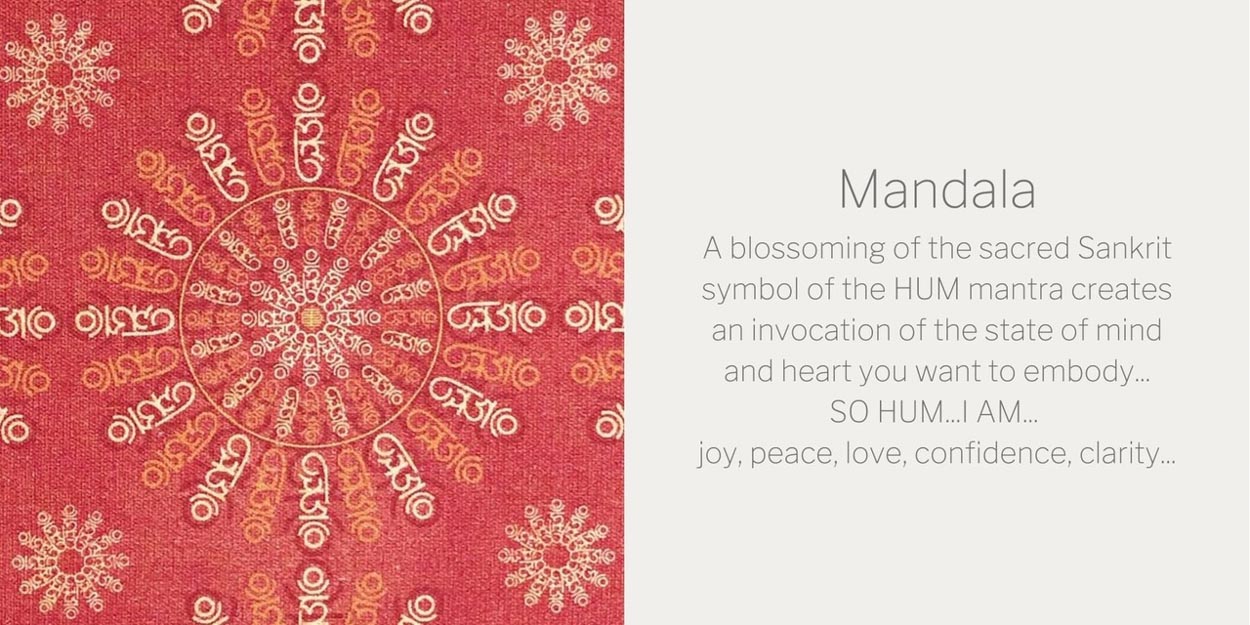
The mandala as a star wheel of meditative convergence.
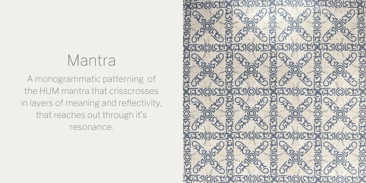
The Mantra as an intonation of vibrational depth.
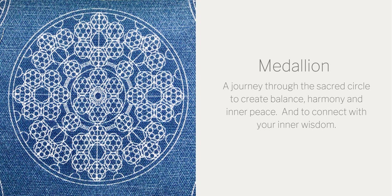
The medallion, as a seal or device, the badge of patterning.
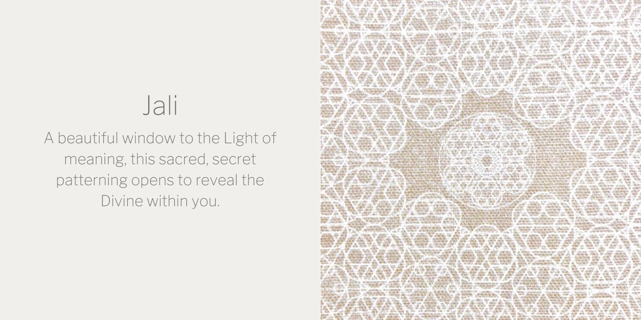
The jali, a punctured window from India that refracts the emerging light into scintillant patterning—the luminous story, ever evolving.
Everyone knows that enthusiasm, etymologically, speaks to—from the Greek: en theos, as in “an indwelling of divinity,” the spiritual energy of the deep and marvelous. The enthusiastic have staying power and longevity in well-lived lives.
But too, in brand-related work, passion counts: the most powerful brands have a soulful intention, there’s a tenor of a deeper meaning, there’s a personal driver, a human at the center of its making, a people-based proposition of a reach-out—it’s all about the person at the center of the brand. There’s the personal dream and there are the recipients,
the experiencers of that storytelling.
Soul, another ancient word, comes from the legacy of the sea, as in the journeyer of life—from the Proto-Germanic *saiwaz (see sea). Klein explains this as “from the lake,” as a dwelling-place of souls in ancient northern Europe.
And, in everything, life’s journey is one of many patterns, large scale plot movements, storytelling [and the currents of history’s trends and swells]—the arc of a narrative, the array of the interplay of characters, protagonists and antagonists, uplifts and downdrafts, flame-ons and flameouts.
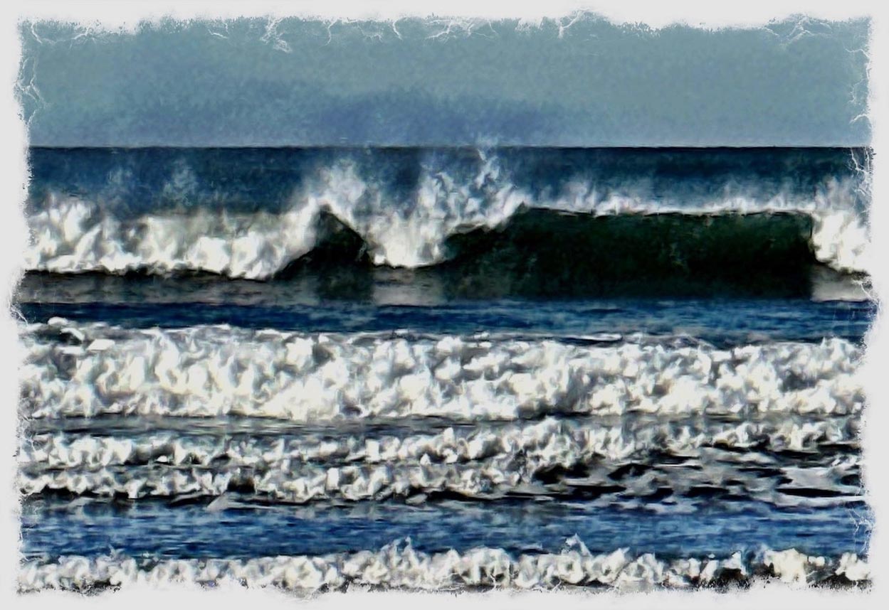
Such with life, the wilder
shores of the sea beckon.
Tim Girvin | OSEAN+GIRVIN
S I T V I S V O B I S C U M
MCMLXXVI
IBI FUNDATA</span>
Follow Us:
Facebook LinkedIn Instagram Behance