A Journey in Design Explorations.
When I first went to Japan to present my work as a designer, I was advised that I should be bringing gifts, and that I should offer the greeting–introducing myself, as well as the offer. This went like this,
Hajimemashite, Tim Gabin to omoimas,
handing my business card, another ritual, obsequious presentation,
with a eyes-down bow—more deeply for Elders,
kochira wa watashi no meishii,
accepting their business card with
appropriate gravity and care—onamae wa…confirming their name.
Doomo, yoroshiku onegaishimas.
Sumimasen, kochira wa tsumaranaimono—doozo.
This translates as—”hello for the first time, I am called Tim Girvin, here is my business card,” I then politely confirm their name on their meishi. And “Thank you, I will do my best in the future.” And finally, “excuse me, here is a boring little nothing”—an obsequious way of offering an omiyage—
or a travel-related gift.
The point of the gift, in a string of business meetings and presentations is that you’re likely to be giving a lot of gifts. So I’d offer wrapped objects—originally, GIRVIN-branded items like Aplets & Cotlets—or other PNW sweets—like Frango, and wrapped packages of Dilettante Chocolates. and I’d come with a brief case with gifts for the senior executives and smaller gifts for support staff. In five days of travel, that could be dozens of specifically bespoke, custom-branded GIRVIN pens, watches, scarves, hats.
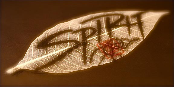
Finally, I moved to something special—on a traditional wrapping leaf for Japanese cuisine, with calligraphy of “spirit” signed and gifted as a very personal tsumaranai-mono—a boring little nothing.
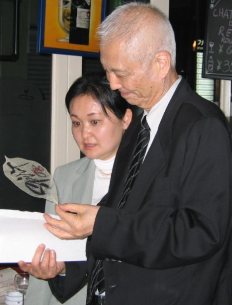
You can see the scale in this gift exchange at a beauty event in Tokyo, with
Shu Uemura. He said to me, “kore wa totemo tokubetsude kioku ni nokoru.”
Which comes out to roughly, “this is very special.”
TSUTSUMU
The Japanese Art of Wrapping.
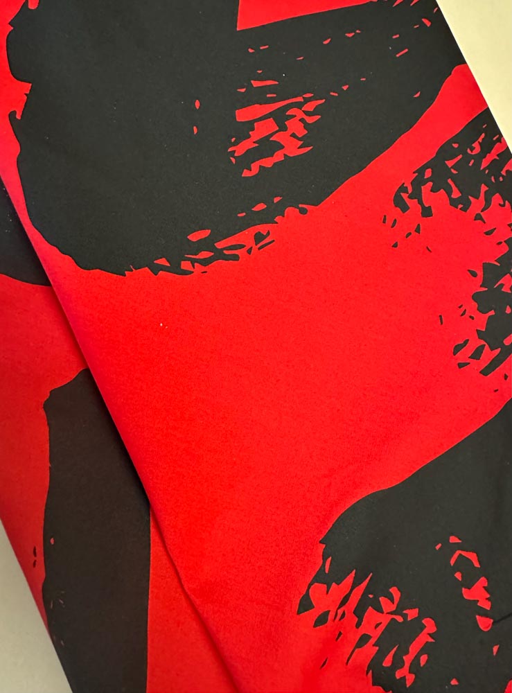
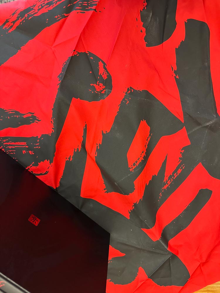
In Japan, gifts are specially wrapped as a celebrative journey for the recipient. In fact, many objects are traditionally wrapped in wholly natural materials as a layering of beauty and narrative expression of what lies within. The character of the wrapping material speaks to the delicacy of the object within.
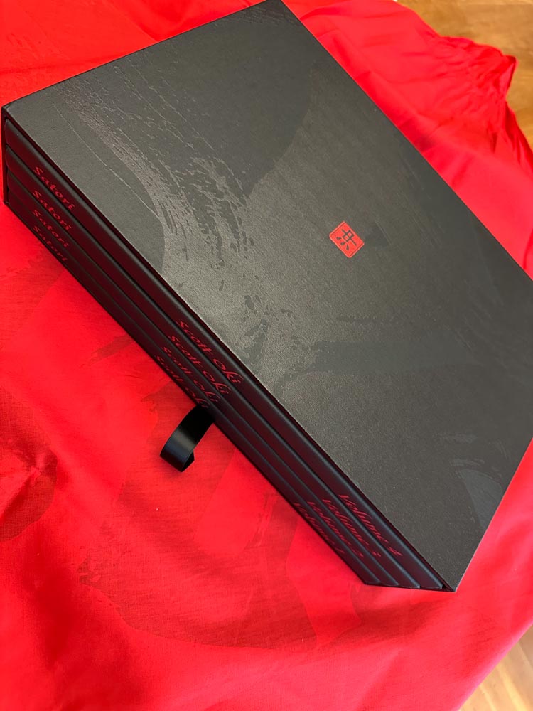
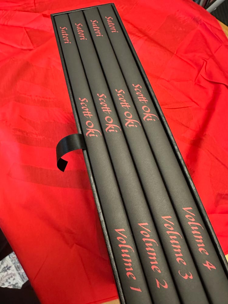
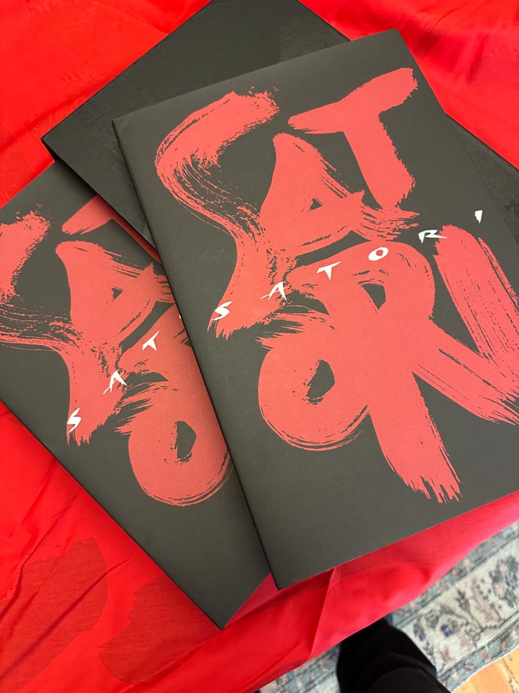
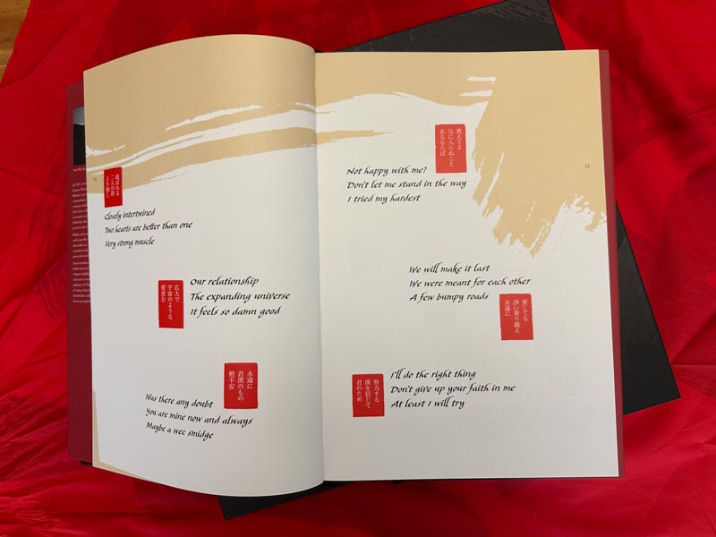
For a book design project, two and one/half years in length for Scott Oki,
his Satori quartet, a complex program involving hundreds of haiku. This was rendered in a bespoke, keystrokable font that we designed, based on a 17th century calligraphic system, and we called the typeface Scotto.
This was accompanied with large scale brush-stroked, original calligraphy that I helped Scott with, in a string of training sessions.
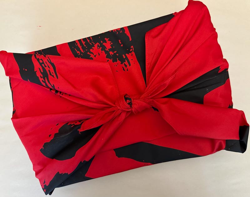
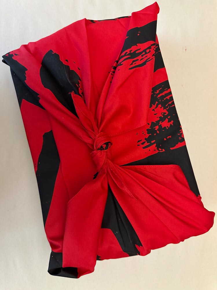
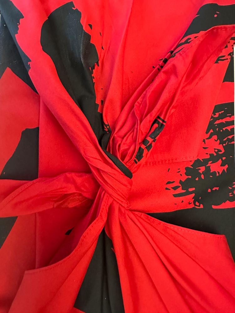
In a conversation, as we literally—wrapped up—the design project, we’d suggested the notion of a traditional type of carrying-wrapper, furoshiki used in traditional gift-giving as well as an artful containment for the pilgrim, the journeyer carrying objects, protected and wrapped.
You can see how this is wrapped, as well as the sequencing of the recipient’s sensate journey from receipt, the unwrapping, opening and the revelation, layer on layer, of the quartet collection.
As below.
As packaging designers, we think of the experiencer’s journey as a progression of sensations—this notion of sight, sound, touch, scent—even taste—in some instances.
This same characteristic of journeying, better still, wandering, is a core strategy for GIRVIN—what is the meander, the sauntering movement from first site, to exploration and revelation? As architects—hearing taste, seeing sound, tasting touch—you can think of applicability to considering the holism of sensational brand strategy.
Tim Girvin | GIRVIN Queen Anne Studios
Built environments by Osean