How to build brand storytelling for terrifying design narratives
Clive Barker
It was roughly 40 years ago that I read Clive Barker’s “Books of Blood,” which struck me as a remarkably distinctive turn on the horrifying—as expertly fear-inducing storytelling. Stephen King, apparently, thought the same: “I’ve seen the new face of horror and it is Clive Barker.”
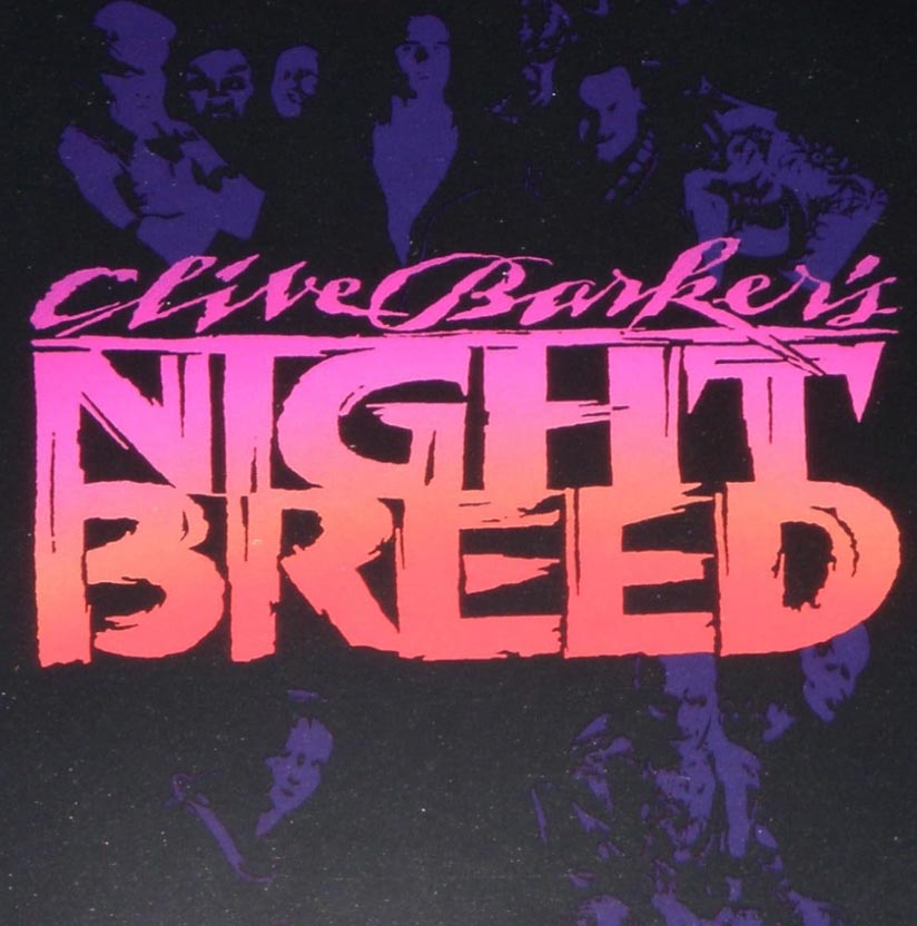
I’d not believed, that only years later, I’d be sitting with him in the Alexis Hotel [which we also branded]
talking to him about his film “Nightbreed.” I’d read his script, and studied his drawings of the creatures depicted in the film.
I drew concepts on our snack napkins in the bar, which I envisioned—and suggested—
the logo rendering as a stacked and distressed lock-up—
also emblazoned with his name, crackling at the top.
The goal was to draft a solution that worked as a horizontal
single line object, as well as a stacked expression.
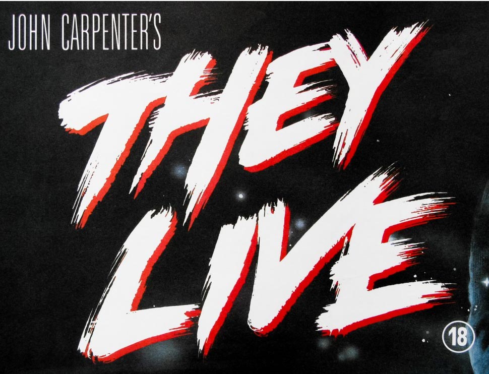
John Carpenter
It was in a similar time frame that I was asked to design a brand around a John Carpenter’s anti-political (as he puts it) portrayal of the Reagan dispossession of the American underclass of homeless and disenfranchised people; it’s an anti-commercialist rebellion through—as one might imagine—
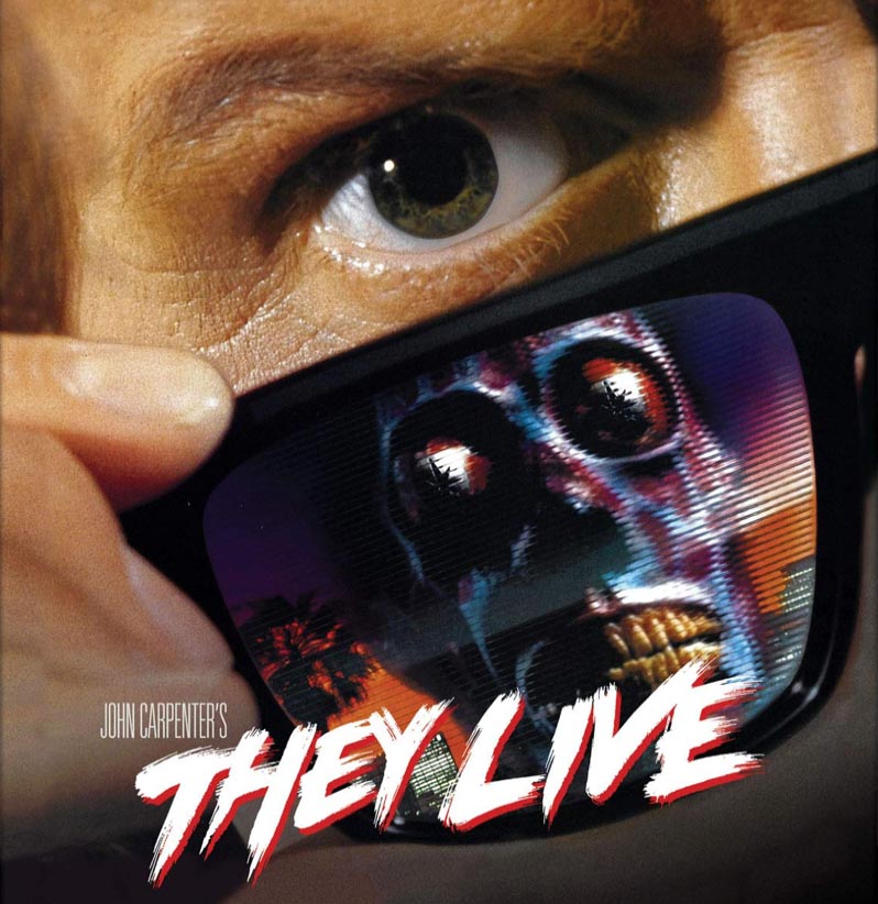
specially “tinted” glasses to “see” more of the reality of the depredation. Sunglasses, actually.
The focus—in seeing through it all—was revolt. The design was intentionally graffiti-esque; experimentally first drawn with old radiator brushes and mechanic’s brush scrubbers—and then finally, I settled on the best tool.
A toothbrush
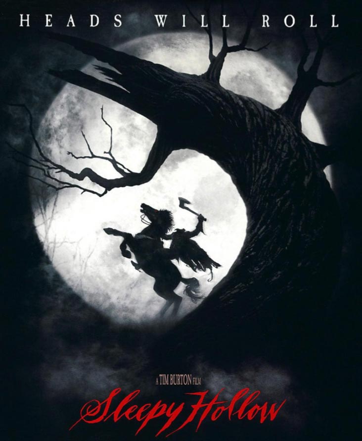
Tim Burton
Through a string of those things called “faxes” I got into an exchange, through the studio theatrical leadership teams, with Tim Burton—and, between the two of us, notes went back and forth, towards a paleographical reference—the time of scripts. The question being, what form of writing would Ichabod Crane, of Terry Town, draft a missive—1790?
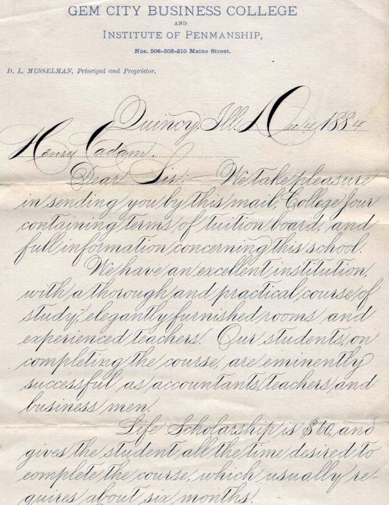
That would be something flowery, sentimentally memorable, flourished and reflective of the American colonists attempts to represent their British scriveners of “English copperplate, round hand” or other pointed pen, quill-like variants. Here’s one from roughly 60 years after Washington Irving’s “Sleepy Hollow” was penned—considered by many to be his scariest story. In the hands of Tim Burton, this would be a far more visually striking interpretation, production design, and narrative. Working with him, it was more about how to capture the spirit of the scarier aspect of his portrayal, still with some gesture to the time. So, while I tried to be chronologically appropriate, I was also trying to be desperate in the illustration. I used the split pen metal tools of the period, given the waning of quill use by that time period—the late 18th century.
Here’s the “handy” Victorian antique writing tool—
split finger—as you can see.
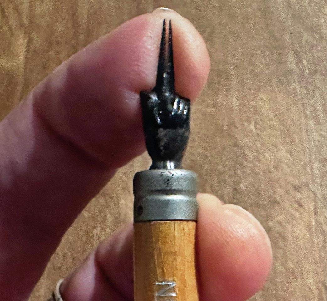
Using the tool of the period, lent itself to this solution
under the direction of Mr. Burton.
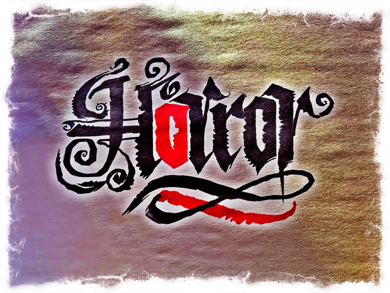
Wes Craven
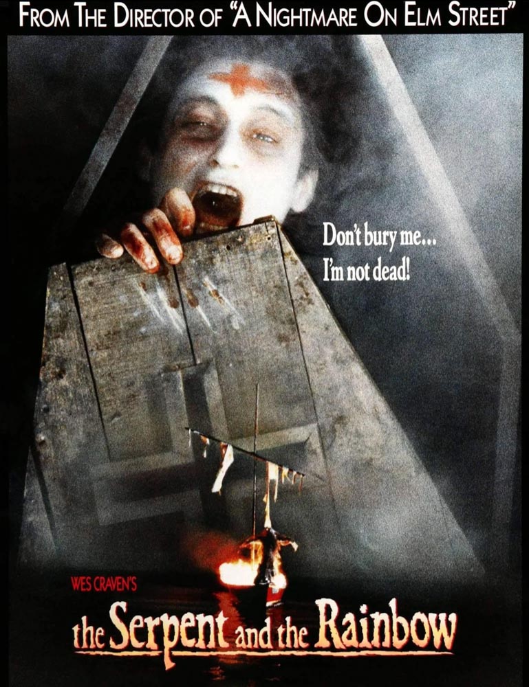
In working with a advertising executive, we were looking for the visualization of some hand-built, elder-styled font, that could capture a semblance of fear, a cemetery styling, that too had some mass and presence in contrast to complex imagery, as noted below. This found its way into sidebar merchandising efforts in support of Wade Davis’s storytelling. Later, I met Wade in NYC, at another talk he was giving on a later published narrative—along with his wife, Gail Percy. Earlier, during my college years I’d met, and promoted a talk for, Richard Evans Schultes, a kind of legendary Indiana Jones of ethnobotany from Harvard. Richard was Wade Davis’s collegiate mentor and supported his research into the Zombie characteristics of certain toxins, part of a Haitian Vodou ritual—as gravitated from West African Vodun. Voodoo revival of the dead, which in Davis’s exploration was the combination of a mollusk-derived tetrodotoxin and the hallucinogen Datura, which created Zombie-like characteristics, exemplified in Wade’s study of a “living Zombie” Clairvius Narcisse. Story overview, here.
Tony Scott
I had a long history working with Tony Scott—and in the beginning—my first project with him, was partnering as a logo agency for Tony Seiniger, the founder of one of the first mega agencies of theatrical marketing. I started working with him—and his myriad teams—at the very beginning. And it was his direction, along with Tony Scott’s input, to look for strikingly dynamic solutions—which we studied in bespoke fonts and emboldened renderings, but they all fell flat on the director’s vision. I was brought in as a remote ronin, a masterless samurai designer from Seattle, as Tony suggested and worked onsite in Los Angeles, exploring ideas in proximity with Tony—as I did later in his offices with other films.
For me, thinking about language and
the illustration of words, it goes like this:
1. See the word.
2. Study the story.
3. Know the landscape of the characters—
and for whom would this story be attractive.
4. Say the word, voice the expression.
5. Draw it.
I see it, hear it, smell it, feel it, and draw it.
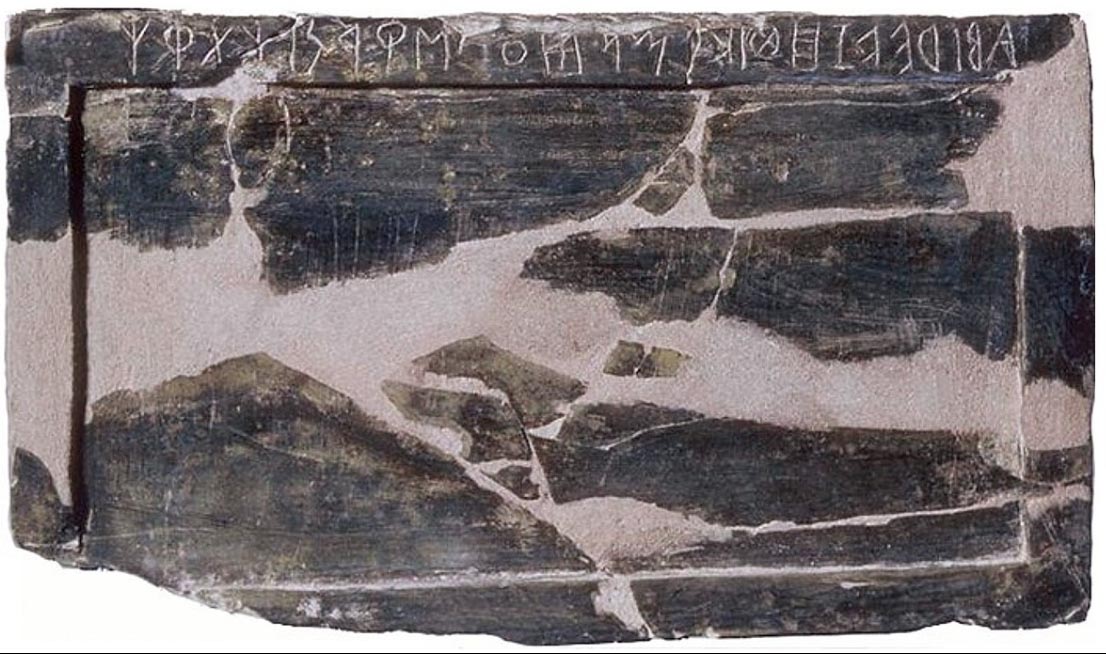
When I was at The Evergreen State and Reed Colleges, I engaged in a study of 3000 years of calligraphy, from pre-Roman scripts, Greek and Etruscan carvings in ivory [as above, a 7th c. BCE abecedarian tablet] stone and pottery, to papyrus documents, Imperial signage and brush lettering on buildings, to cursive accelerations of alphabetic drafts in the first century forward to post Imperial script expansions, onto early medieval renderings. The spread of the alphabet throughout the Middle Ages, the script of Humanist, the pre Renaissance, Renaissance, and post sixteenth century, to the 1700s, 1800s and early 20th century renderings of continuous “speed writing” of Industrial and post industrial legacy. Doing that, drawing everything by hand, taught me a fluency to support almost any expression—the drawn word flows.
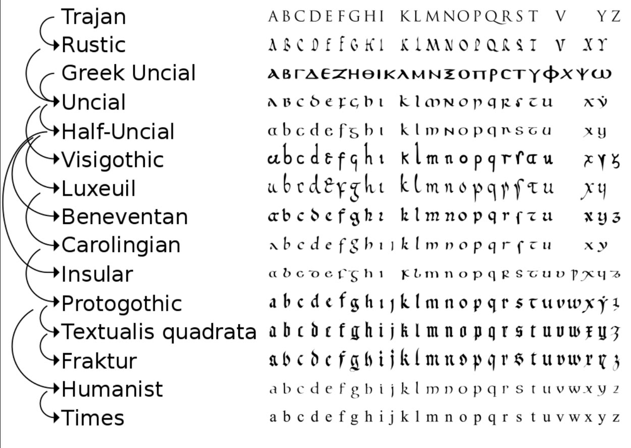
This chart shows some sequencing, which manifests some noticeable gaps
in the complexity and geographical expressions of the alphabet—as time and placement in
various locales affects particular scripts.
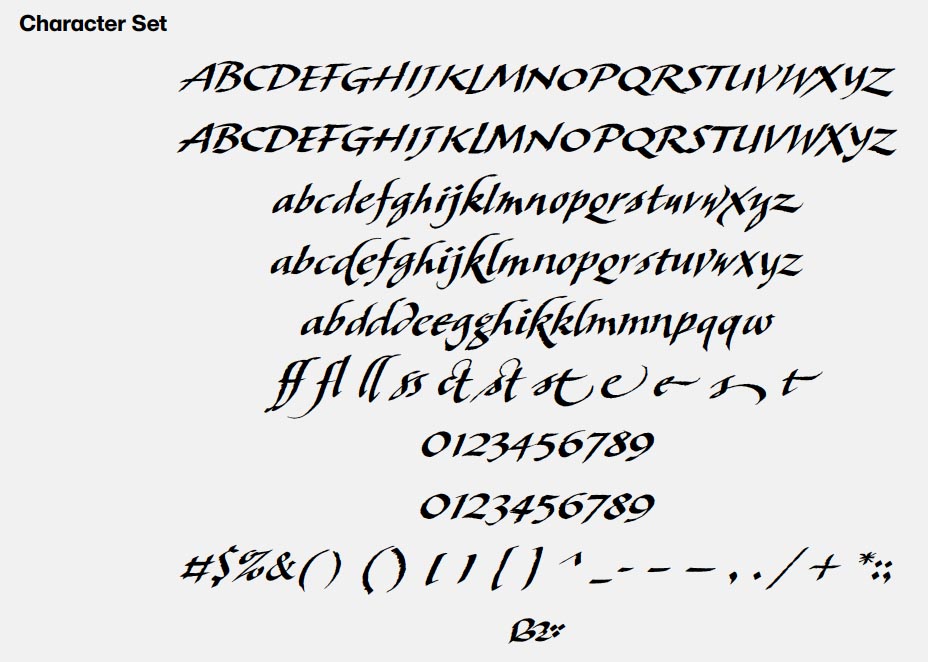
Contemplating the legacy in our illustration of language, the study of history, the paleography of scripts, allows for a deeper understanding. For example, in our font development for book design—Scotto, designed for and owned by author Scott Oki is based on the illustration of poetry—it’s built on historical expressions that align towards latter Roman cursive—a 3rd-7th century form of quickened handwriting for communications on Papyrus, I’ve modified that with a broad-edged tool, which could be likened to the later Blackletter cursive as one might study for explorations of early 16th century calligraphy, densely weighted, yet fluent and quick-reading.
Flows like:
Flow. Fluency. Form.
Thinking of the word illustration—
which is, in its own etymological history,
a “shining,” from illustrare, “to make light”
it brings forth the raw quality of the idea.
Firebrand foretold.
What’s the story,
who’s telling it,
how’s it told—sound and vision,
and who cares to listen?
––––––––––––––––––––
wishing well
Tim
GIRVIN | Strategic Brands
digital | built environments by Osean | theatrical branding
waves | art | talismanika™
Projects in strategy | story | naming | messaging | print |
identity | built environments | packaging |
social media | websites | interactive.
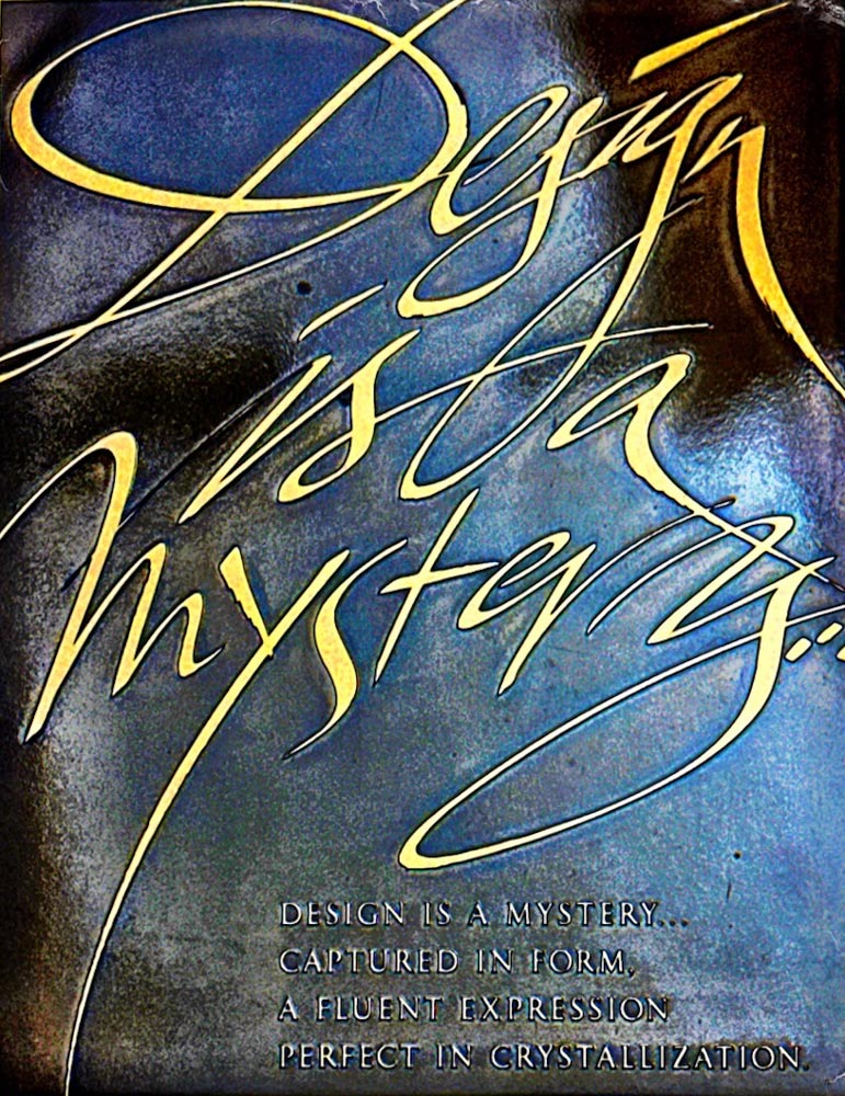
The emotional mysteriousness of design
a studio plaque, Rive Gauche, Paris