Are you a touchy-feely person?
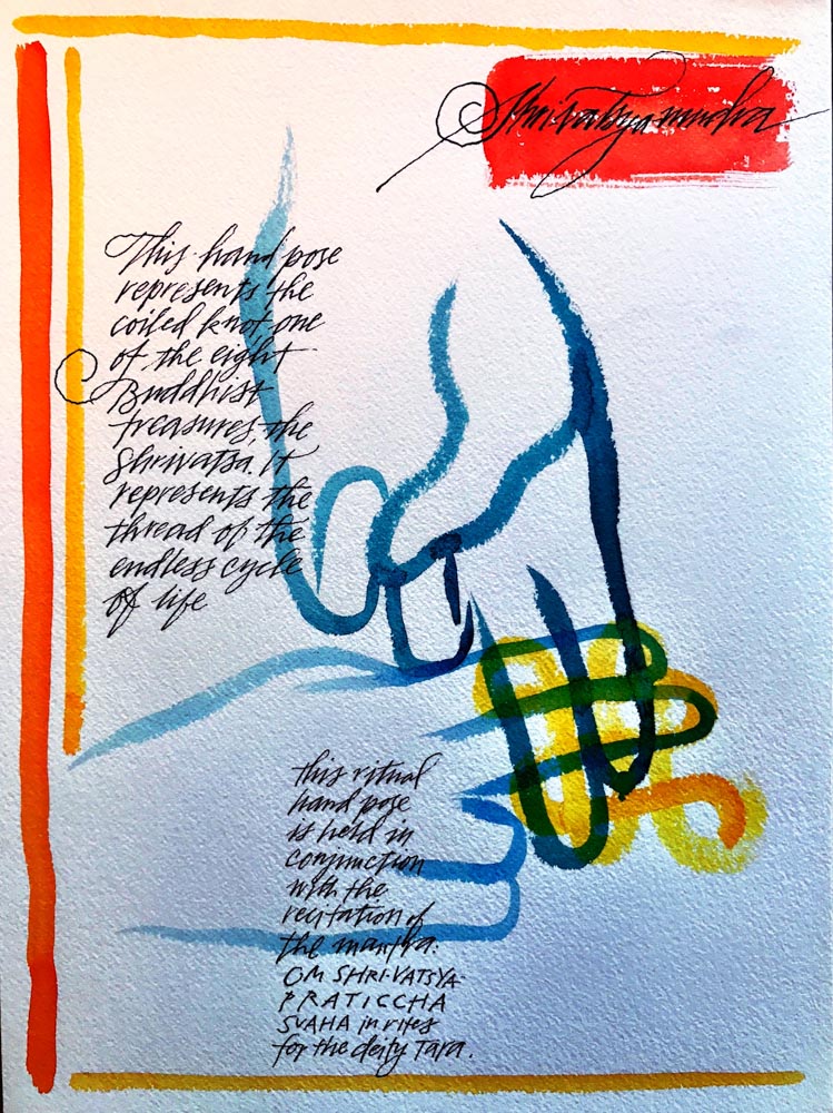
From a GIRVIN book of mūdra, symbolic hand-poses—
the universal language of gesture.
I’m very much about touch. And feeling. The realm of the GIRVIN brand work is about hand-craft, making brands by hand, grasping digital interpretations and building from that foundation—since brands are touched, and felt, it’s about how that sensationalism is deployed.
When it comes down to the holism of experientiality, the synaesthesia of impression and contact. Working with the Imagineers, and Eisner, Richard Hutton and Bette Zaret on the Disney Institute—now Disney University—we learned from guests that brand experience is not only about the larger spectacle, but it’s also the nature of the tiniest details.
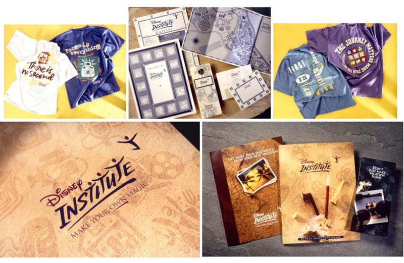
There, we created a pattern language, a string of symbols that speaks to the various aspects of learning and educational programs that were offered onsite in Orlando—but it was the experiential implementation that supported guest recognition of the elements of the brand experience. That crossed from interiors, floor patterning, signage, rugs and wall treatments, guest learning tools and take-aways. And how it was voiced to me by a guest, and recalled, “what I remember about my time there was, one, what I learned, and two, all the ways that the symbols and patterning kept bringing me back to what I was studying and exploring—the place was great, but it was how everything fit together, brought me back to that experience, that I brought home with me.”
This was a profound learning for our design group, not only working with the extraordinary team at Disney, but the permission to detail that narrative in a manner that allowed for tiering symbolic design languages into touchpoints of guest procession and experiential mnemonics.
We took that thinking elsewhere.
Collaborating with architectural visionary, and partner, Dawn A. Clark, AIA LEED AP.
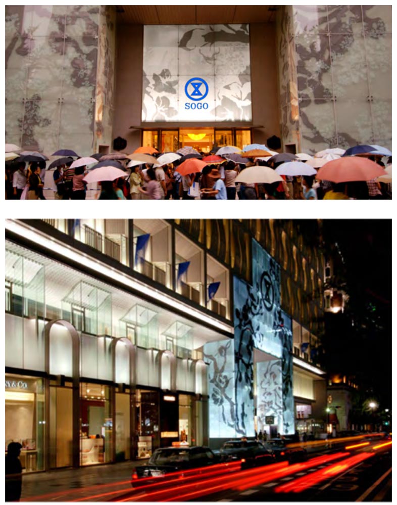
I learned more about the idea of linking symbolic brand patterning into large scale retail expressions.
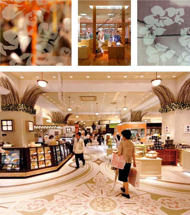
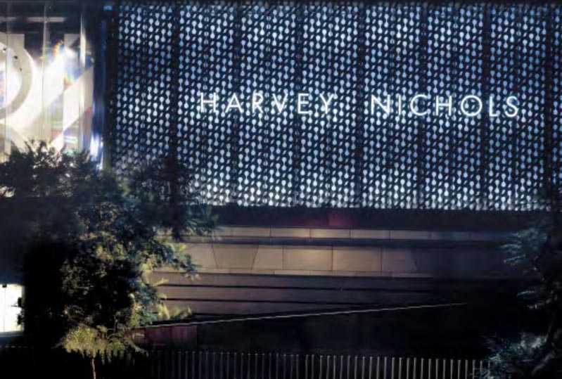
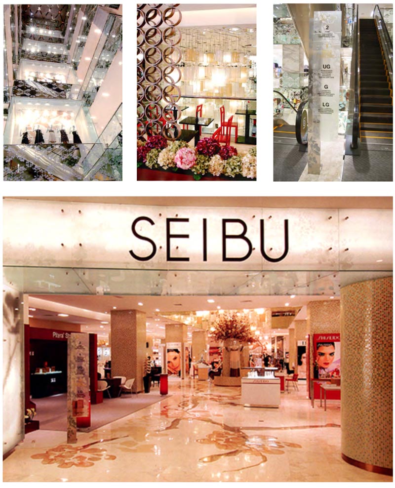
So, to her, a key element at Sogo department store, Osaka, Japan,
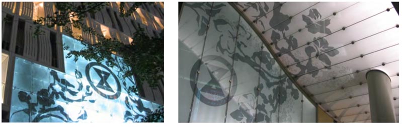
was the gingko and cherry blossoms on the street—which, from one of her polarized photographs we built into a brand patterning that was integrated not only into a “hung kimono” entry way [Sogo’s hourglass logo is actually a thimble from their 19th c.legacy as a kimono shop,] but feathered into an award-winning architecture and graphical interplay throughout the entire retail compound, every storey, the floors and environmental graphic systems.
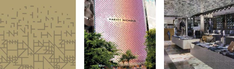
In another collaboration with Dawn Clark, AIA Leed AP, Andy Thaemert and Doug Shaw AIA, we employed another patterning language in Jakarta, Indonesia. In this instance, in our explorations of royal batik patterning and formal
cultural design language,
the parang.
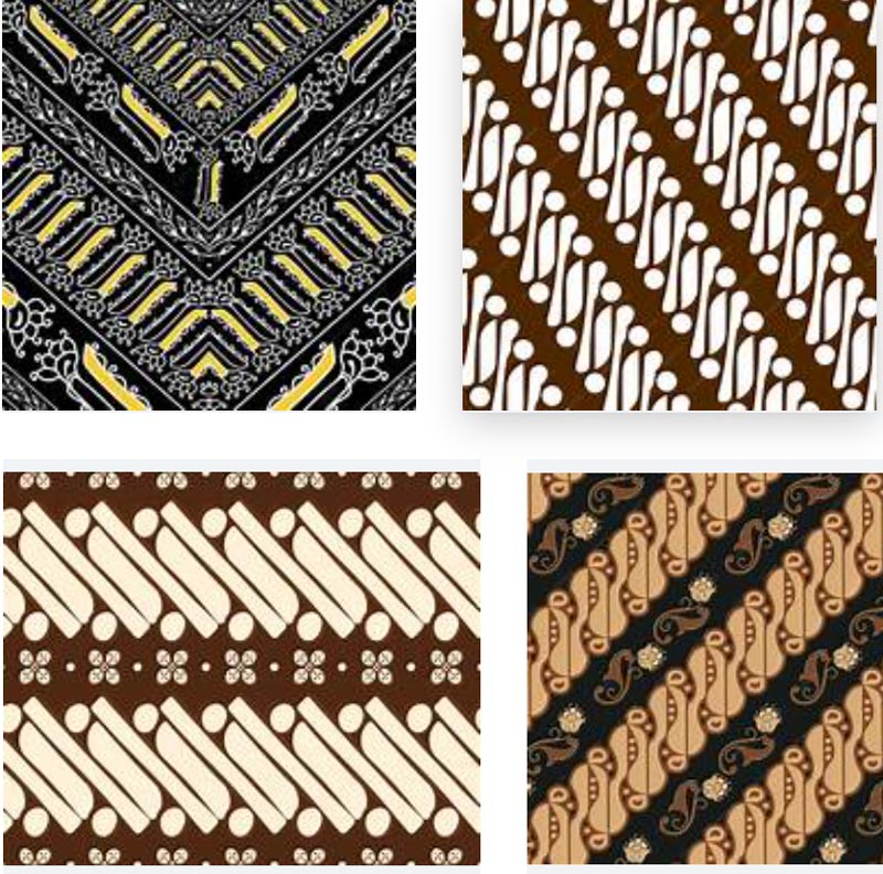
What does it mean? The core symbolic meanings of the parang in Java:
Waves and Continuity:
The most common interpretation of the parang motif’s S-shaped, diagonal lines is that they represent the unending waves of the ocean, particularly those on the southern coast of Java. This symbolizes a spirit that never gives up, like waves that continuously crash against the shore. It represents the importance of being persistent, consistent, and never giving up in the face of life’s challenges. It also depicts a continuous, unbroken bond, such as family ties or the pursuit of self-improvement
Power and Authority:
Historically, the parang batik was a “larangan” or forbidden design, reserved exclusively for the royal family and nobility of the Mataram courts in Central Java (Yogyakarta and Surakarta). Wearing the parang motif was a symbol of a person’s high social status, power, and authority. The size of the motif could even indicate the wearer’s rank.
The Battle Against Desire:
“Parang” is also associated with the Javanese word for “war.” In this context, the motif symbolizes a daily internal war against one’s own passions and negative temptations. By wearing the parang, Javanese kings and knights were reminded to be agile, have noble ideals, and be loyal in their continuous struggle to control their desires and maintain wisdom.
Management and Control:
The neat, repetitive, and perfectly laid-out arrangement of the parang motif signifies the ideal of a well-ordered and well-controlled condition. This is a symbol of power and strength to manage difficult situations and to be a good “administrator” of community life. This is why the motif was worn by rulers, who were expected to possess the wisdom and strength to govern their people effectively.
Protection and Victory:
Some folklore associates the parang motif with supernatural power, believed to provide protection, bring victory in war, and even heal the sick. This further cements its status as a symbol of strength and power.
The Parang, what does it look like in our applications?
This was implemented in a patterning language
that was deployed in floors, merchandising, wall treatments, badging
Monogrammatic patterning for metalworks | rippling parangs | ceiling perforations
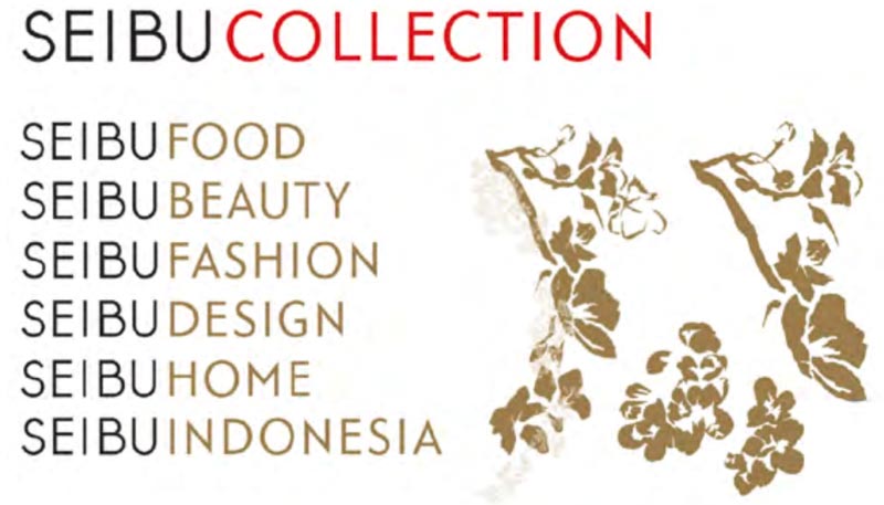
Seibu Indonesia
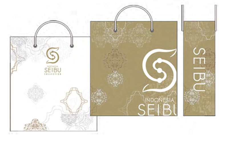
Working with the matriarch of the Nursalim family in Jakarta–the request of Ibu Nursalim—she asked that we bring some of the corporate, familial design language of Osaka to her Japanese brand experience design in Java—both originally owned by Seven & I Holdings, now Fortress Investment Group.
We worked with the architectural group, Andy and Doug, on the strategic notion of a collection-driven, departmental vocabulary, expanded to a bespoke graphical font system of signage that we designed, along with patterning and floor treatments.
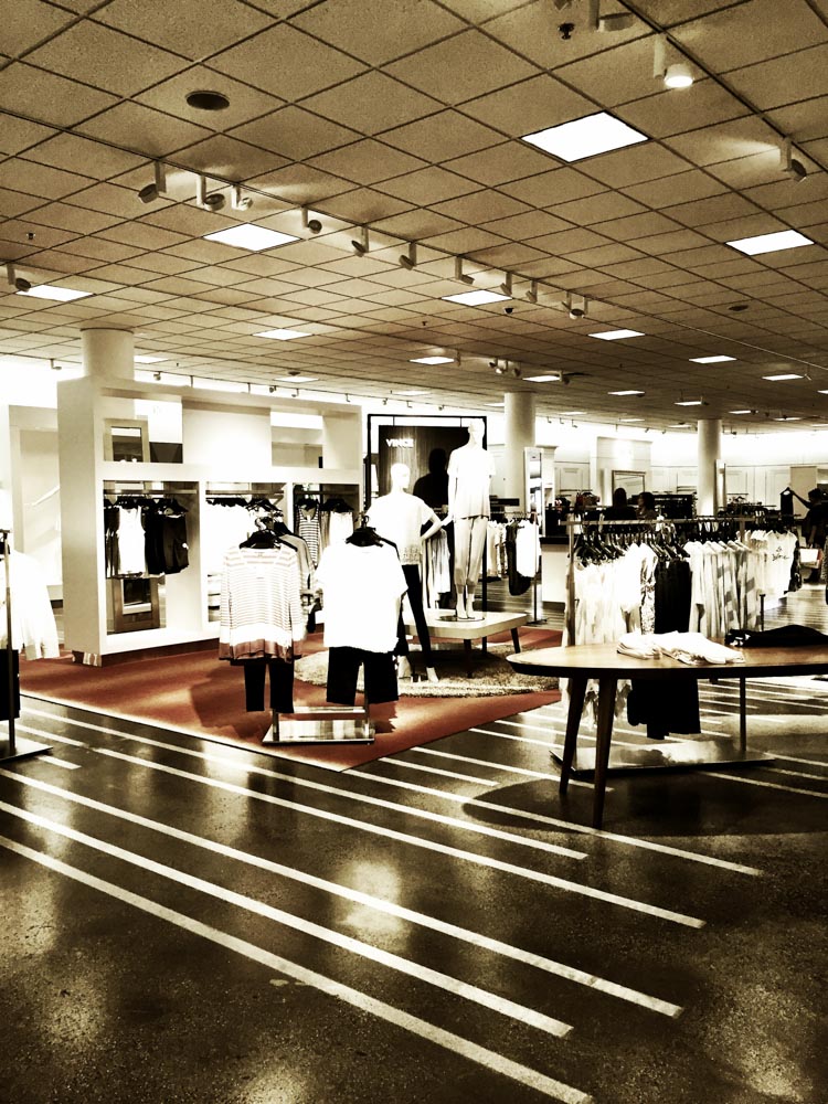
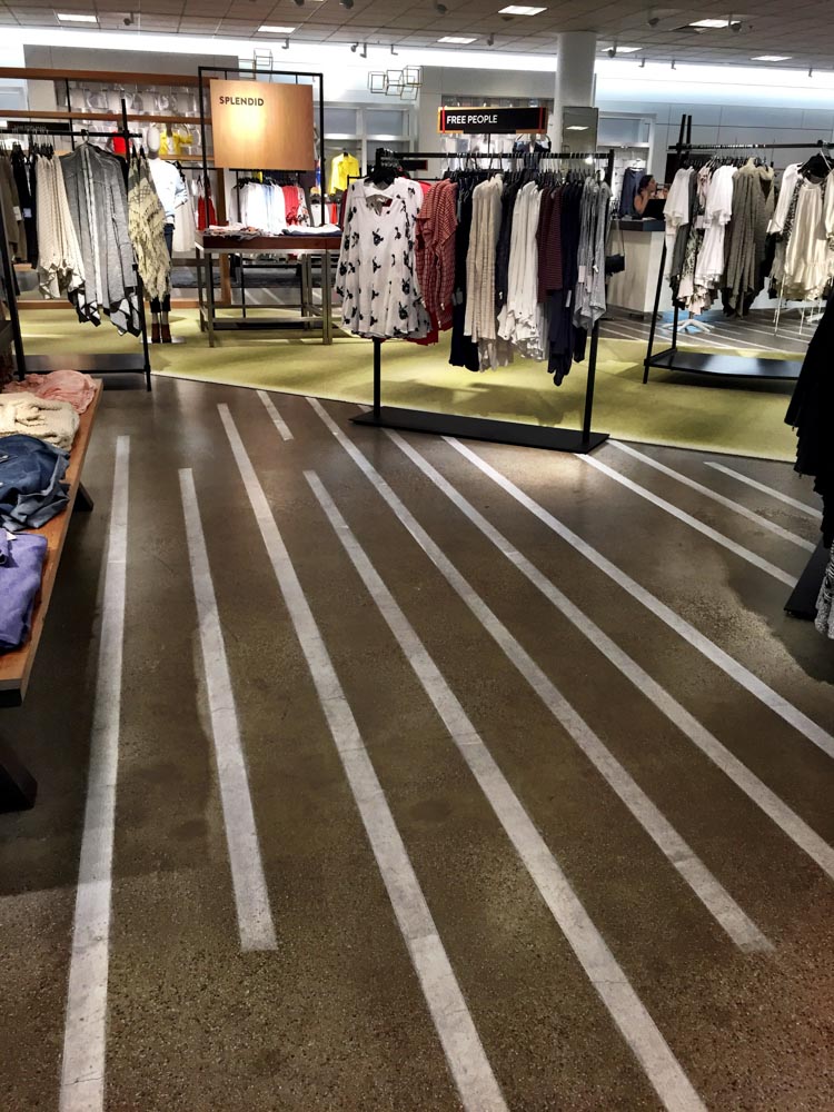
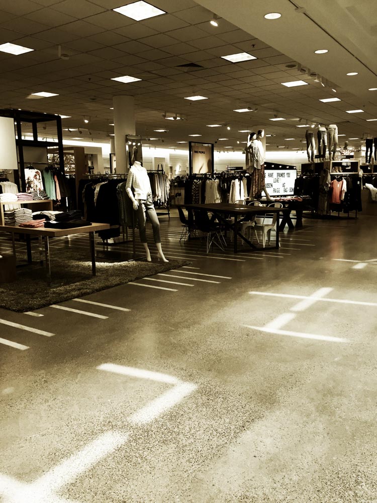
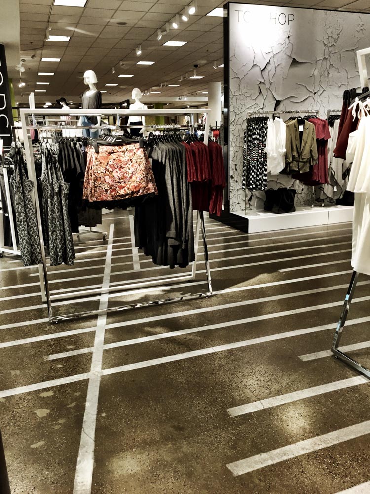
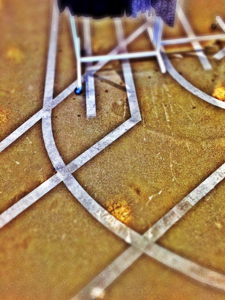
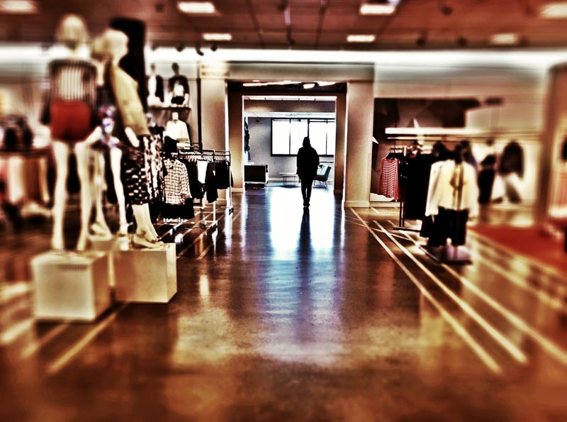
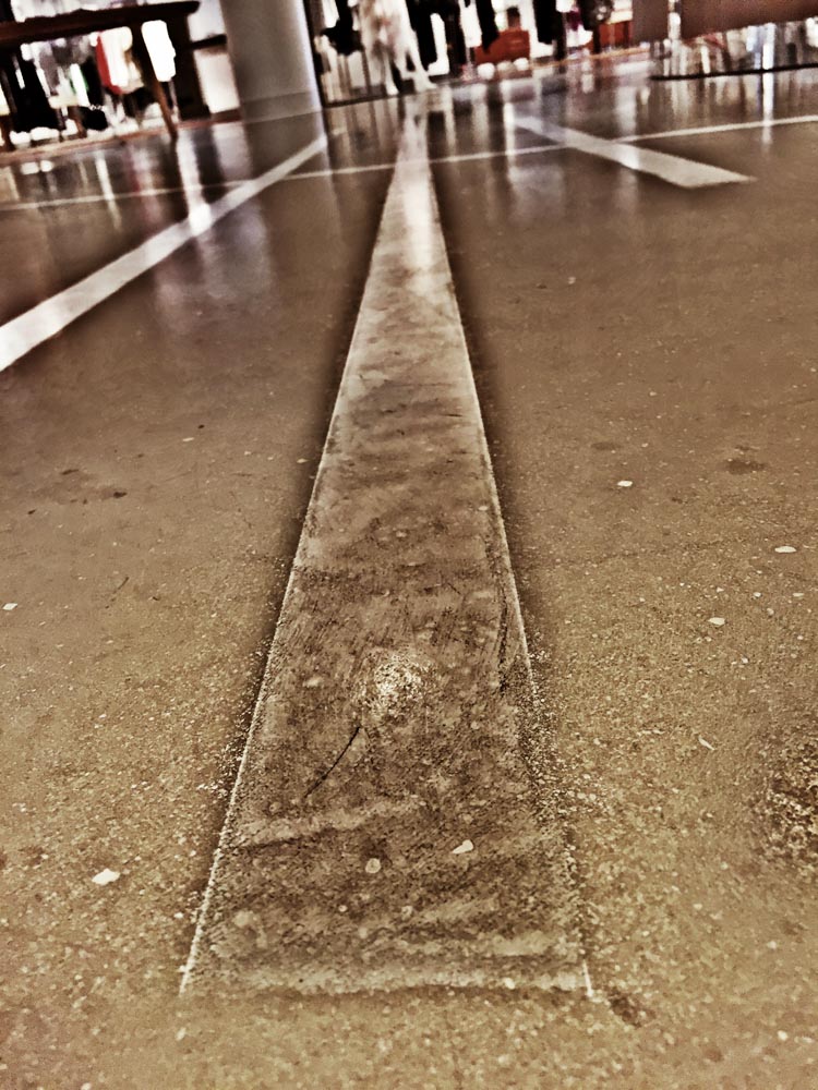
Stateside, we worked on the design of a coded scrim brand patterning for Nordstrom’s flagship store in Seattle, as well as scrim-brand patterning in Chicago, and more transitionally in a merchandising floor-plan reboot of the Nordstrom Irvine Spectrum, where there was an expectation to re-engineer the store, renovate and tactically revise the interiors while keeping the store fully operational. And, in a manner, this brand patterning became, in each store, a kind of subtle, yet observable and memorable Brandcode®.
In conventional laid scrims, there is an expected geometry, usually pillar aligned.
We broke the rules to lay a new vitality, a more energetic and adventuresome vibe.
Here are some snippets to share our the pathfinding scrim-lines of our “you are here, now you can go there…”
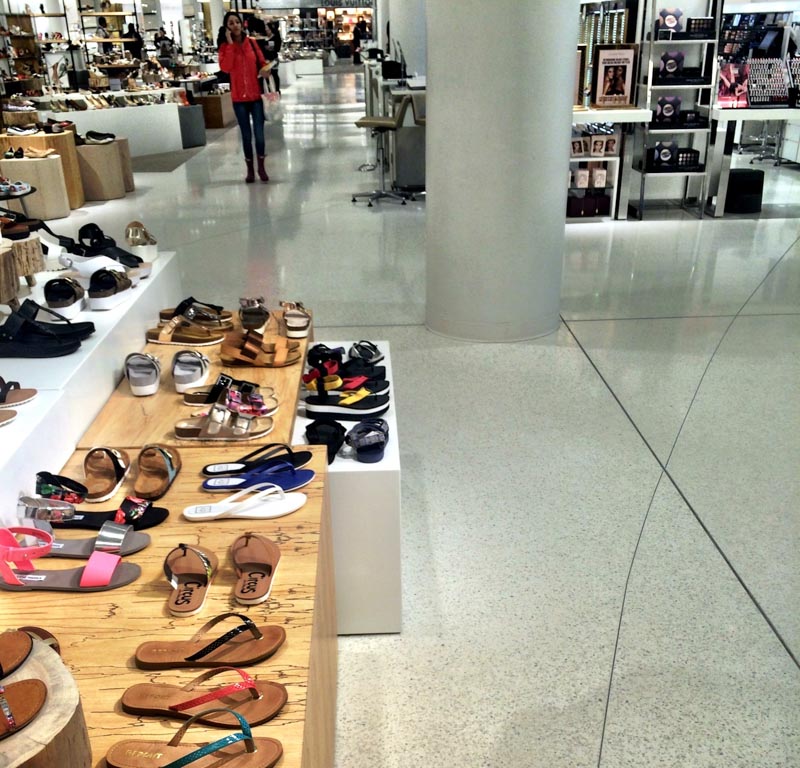
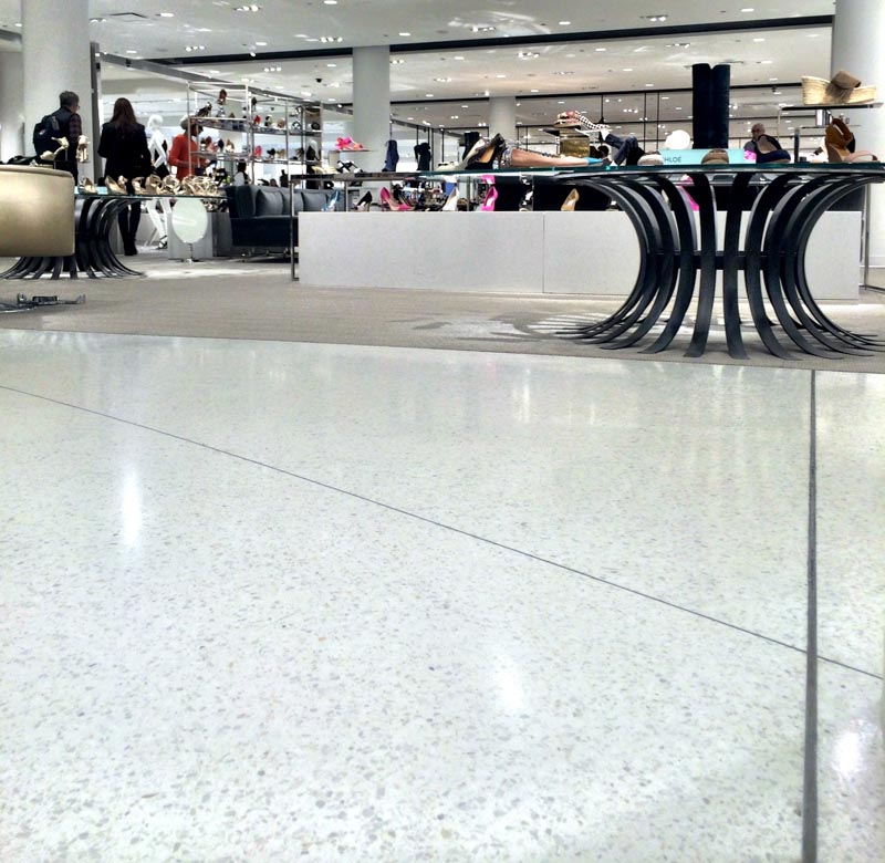
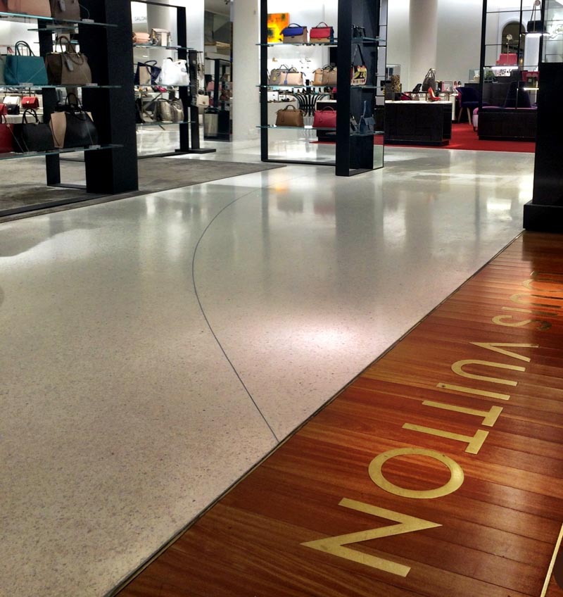
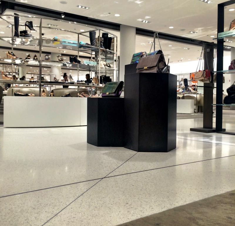
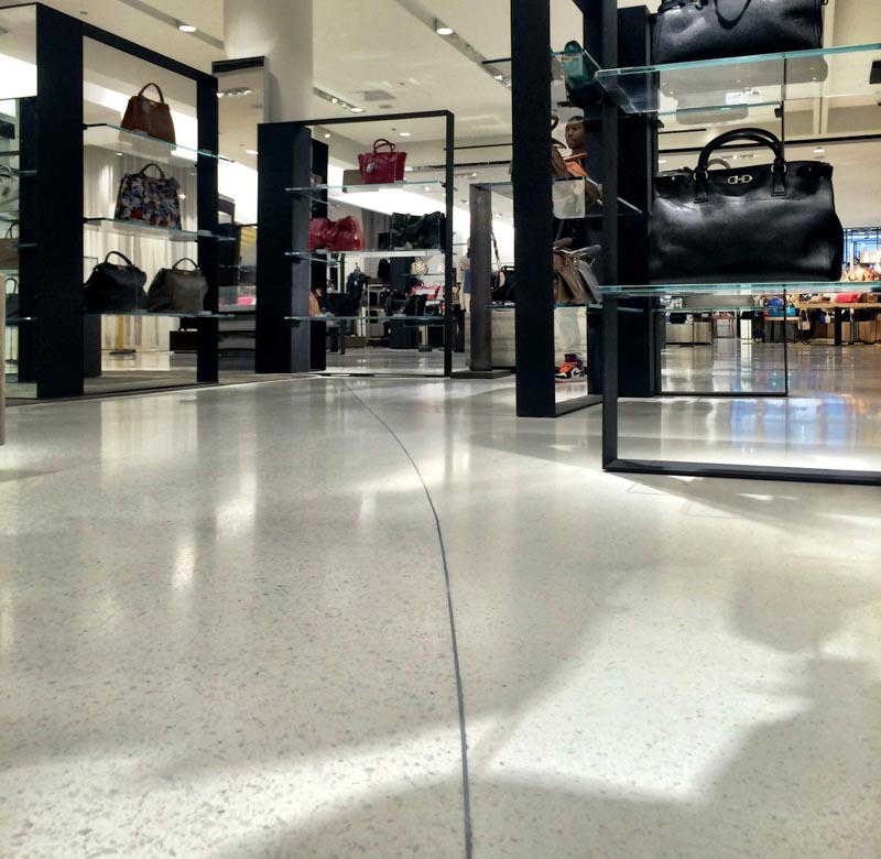
This become a new code, speaking to the inventiveness of a design strategy authored by Dawn Clark.
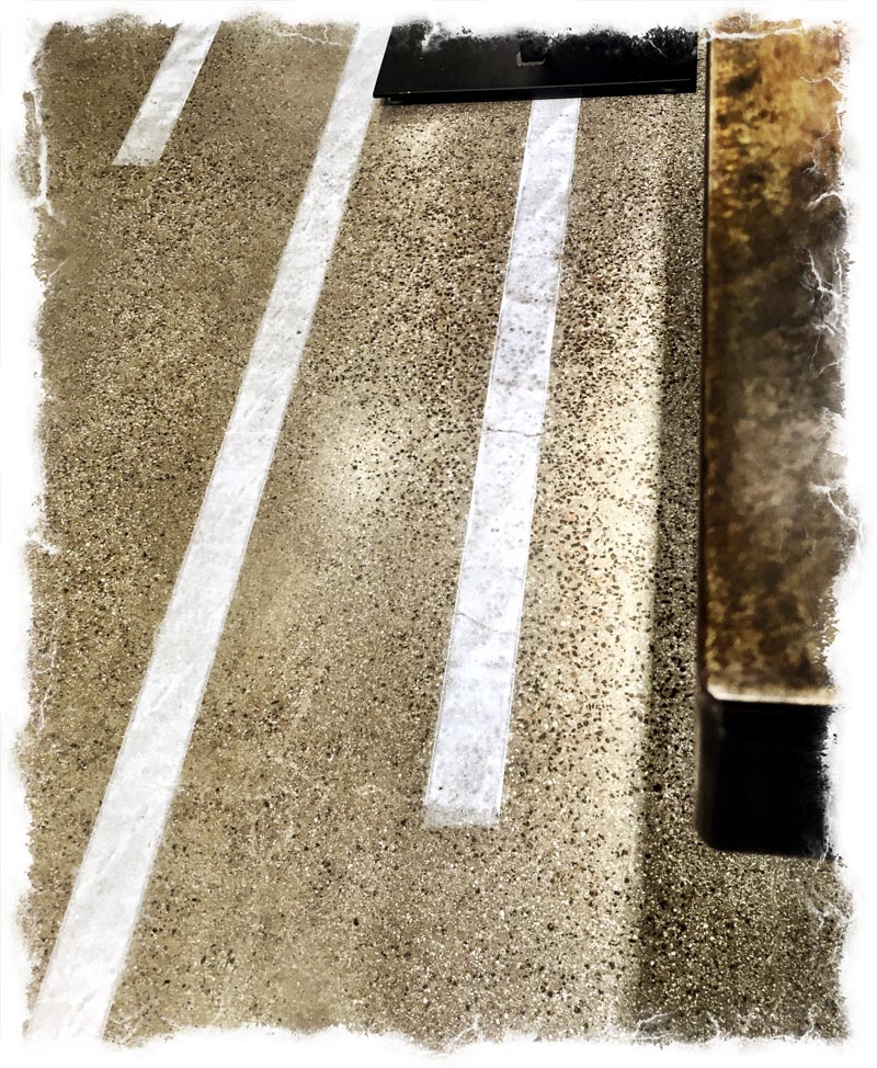
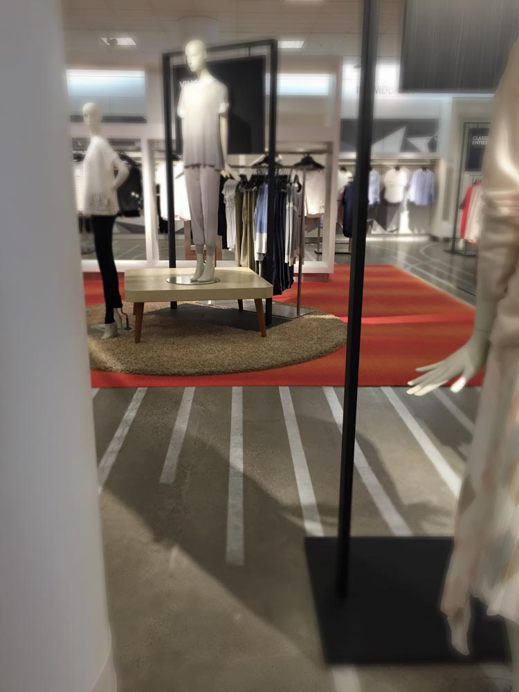
We deployed a dynamic evolution on that front in Irvine, CA, the Nordstrom Spectrum, “designing a metaphorical, touchable and walkable environmental graphics system that re-orients traditional merchandising arrangements, formerly with bays and insets with carpeting to a new rawer rendering. Founded on the chalk lines of tailored garments, we explored experimental floor application methodologies in re-scrimming the entire floor to newly-planned and resilient sales environments, flexibly allowing new sales environments and categorical shifts.
Textured, hand-painted and precisely designed in the floor plate to showcase a wholly flexible merchandising set up, arrangeable to trend, market need or customer responsiveness.
While designed for renovation, it allowed that the store was wholly operational during the entire process.
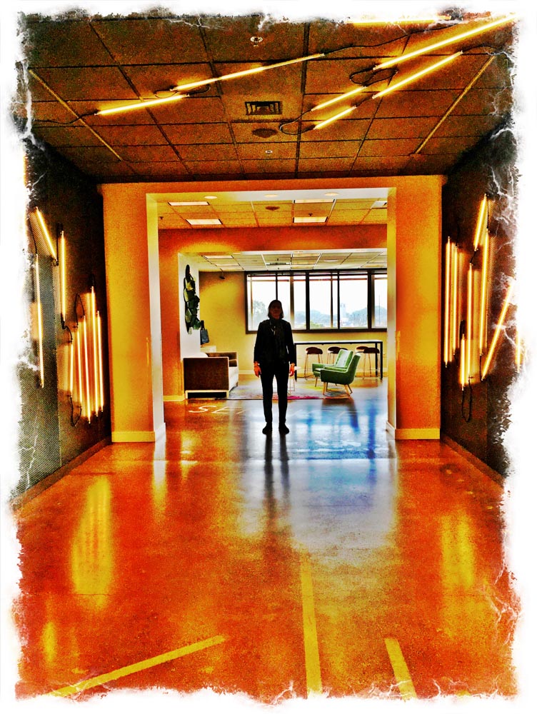
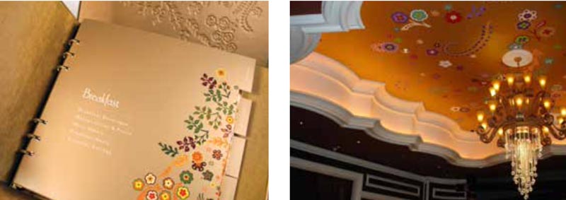
It’s the reach from built placemaking to hands-on space, which is the reach in our efforts for Elaine Wynn, patterning in placemaking and touchable impressionism. There’s the book in your room, and there’s the hallway outside your door.
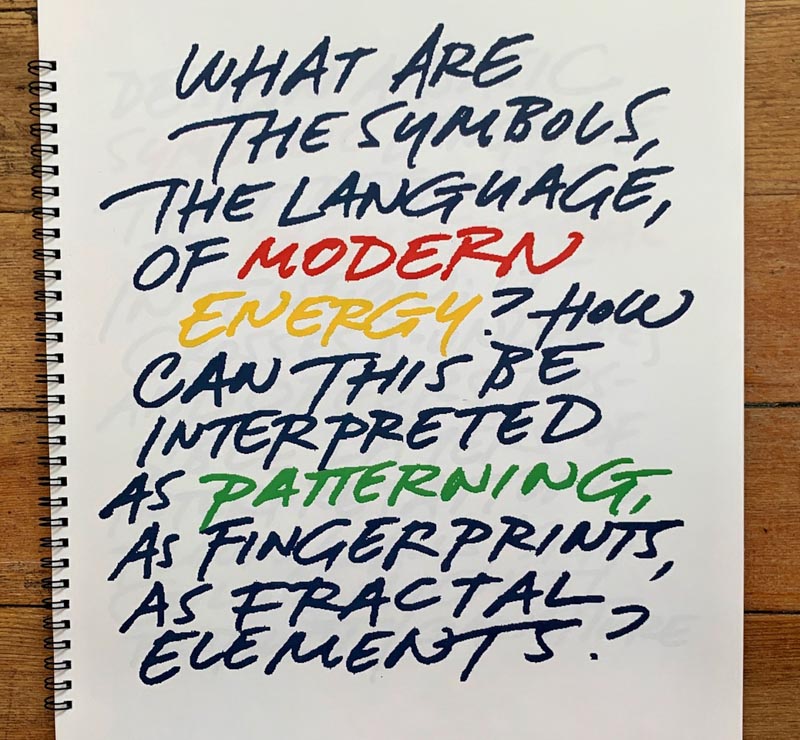
There is a pattern in our life, the journey of our discoveries and explorations; it shows as a psychic patterning, what you—the journeyer—experience in your own revelations. And it shows, two, in the natural graphical revealing of sigils, signals, markings and patterns that reveal to you—again the journeyer—in the passage through this physical plane.
What patterns do you see?
Tim Girvin | Old Queen Anne Studios
GIRVIN | Strategic Magic