BRAND DESIGN, INSPIRATION, CONSTRUCT AND MEANING
The quest for the right place of brand identity—starting with strategic foundations of name, story, stance, personality and chromosomal attributes, integrative and experiential tactics—extends to look, and, inherently, feeling. To our thinking, the identity [from late Latin identitas, from Latin idem ‘same’] implies an explication of alignments, everything synchronizes—which comes to typographical style, symbology, impressions of imagery, color, layers of information, sounds, touch and tastes. It’s a sensual presence. We think of it as spherical in character—
it reaches into everything.
There is an intriguing challenge in the nature of illustrating the apex of an identity, that which might be called “the first read,” which could come to the logo-typography. Logos—expressions of the name of a brand can be a key statement into the “reading” of the story of the first order: “this is the name, this is what is says, its name might suggest something of its intention and meaning, the tiering of its storytelling to a community, from those who know it and recognize it, to those that approach the design as a first read.
These are detailed manifestations and in the journey of making, we think that there is a taut unwinding to find the right parlance of design speaking—for the design is a storytelling unto itself, it unravels whole sheaths of narrative. And working on brands that are around the direct illustration of storytelling—theatrical marketing—the importance of design detailing becomes one of crafted movement. Story becomes a spoken narrative, it sparks the imagination, the mind plays the sinew of arm, wrist, fist and fingertips; the eye guides the threading of idea and execution—a meditation constructs meaning in context, memory holds that which the memorable articulates.
I’ve been giving these talks in LA—for the theatrical marketing communities, inside the major motion picture studios and their teams, as well as advertising agencies that support only the promotion of motion pictures.
And in this talk, which is part demonstration, part onsite manifestation of design ideas, I speak of stories, the historical research, the gathering of strategy and visualization, bespoke, hand-drawn type design and solutions finalized.
The raconteurs speak, the seeing hand renders the telling.
Tell me a story, I draw it out in mind and meaning—and I draw it.
This is a live event. Action to requests.
But in designing identities for brands, in a manner, motion picture identities have a particular
focus on storytelling the narrative, inside the treatment of the typography. And, as I offer in my classes, as well as the agency and studio talks, it’s about highly customized solutions.
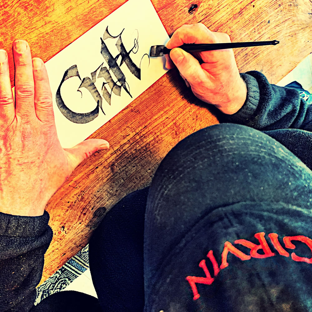
And craft. Made by hand. Drawn to measure. As in a story—you draw it out.
Knowing type design, the character by character expression of story—
it could be a beautiful thing.
As many in the industry know, typographic design attached to motion pictures—or any other major brand—can be subject to licensing litigation for “raw” use of extant fonts, since type foundries are realizing that entertainment brands, from major studio offerings, can represent billions of dollars in revenue. So if a major motion picture brand is founded on raw typographic data from an established font—one, it’s not distinguishable as a discrete marketing entity; and two, it’s possible that it could be a major marketing tool that is operating from the design strategies of a single font house that is not receiving any benefit from such a use. Litigation is possible.
To that end, we design by hand—and every logo typographic solution is a completely hand-crafted, bespoke and customized expression—and in some solutions we design font families in support of integrating the brand design language, holistically, through hybrid media.
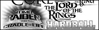
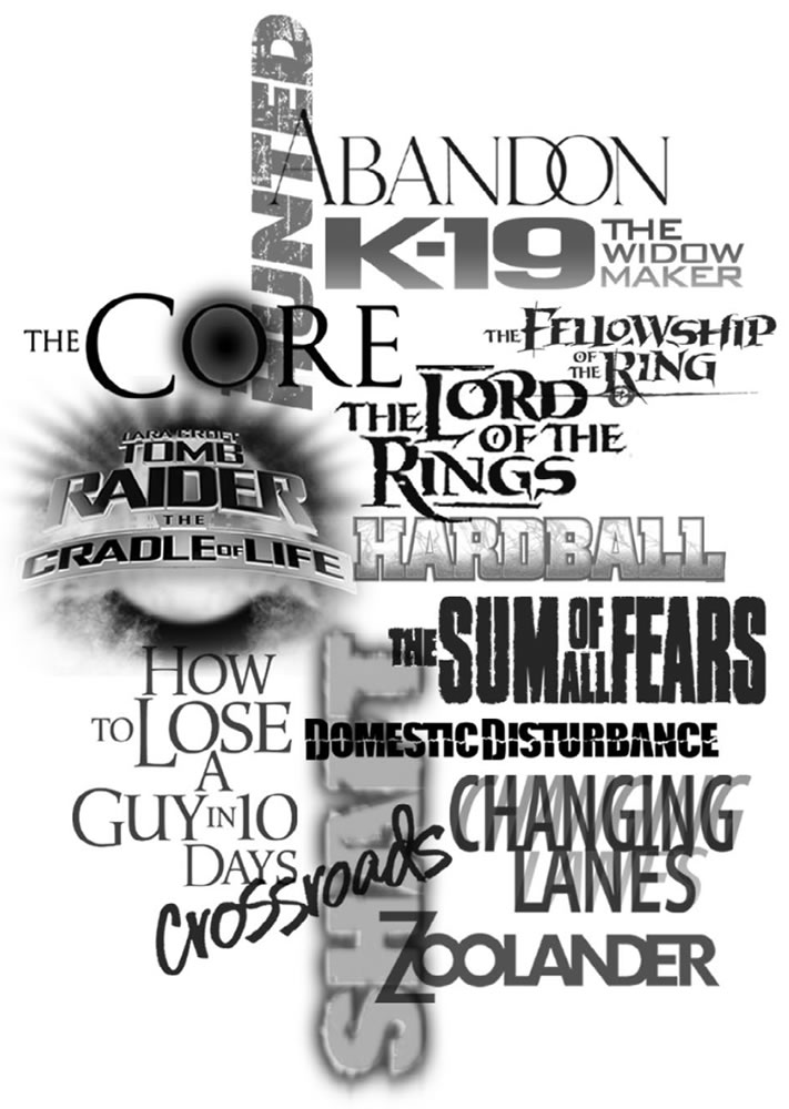
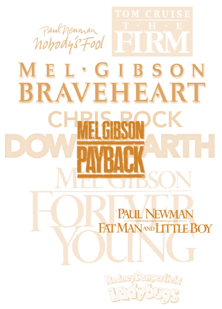
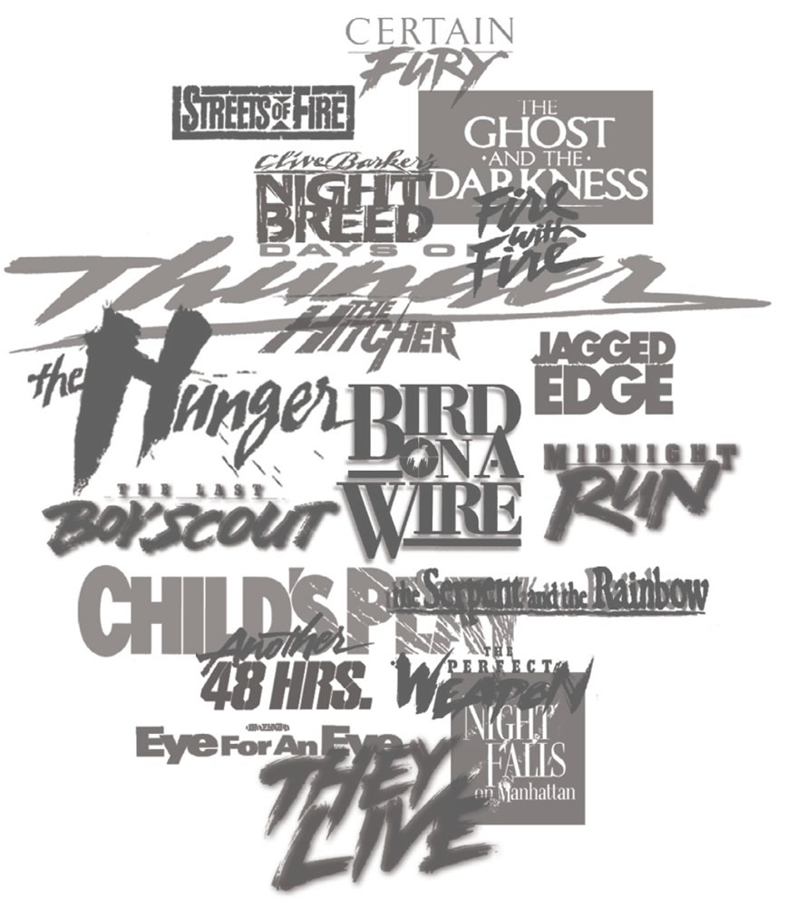
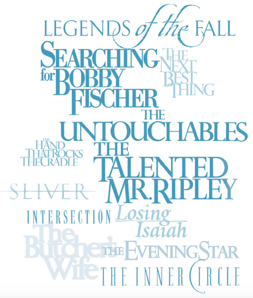
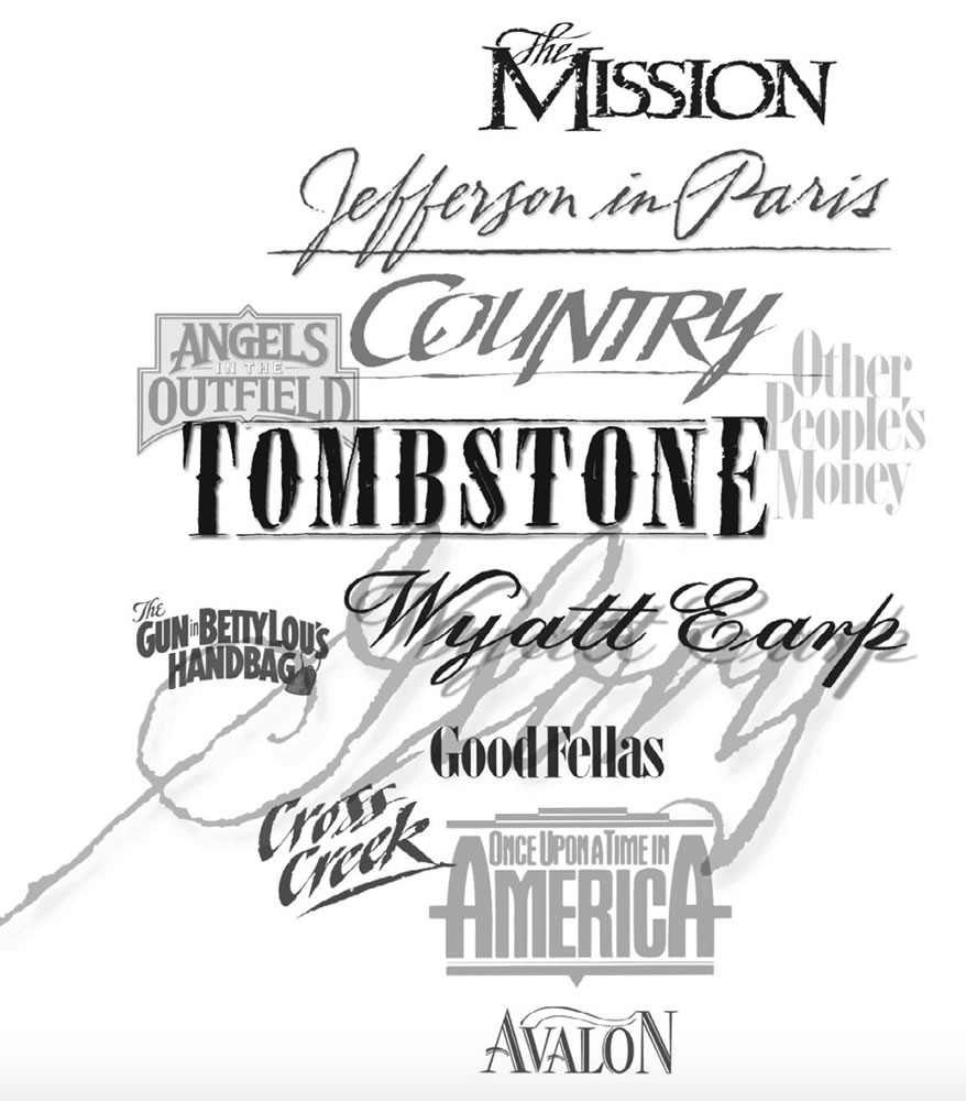
I was looking through that talk,
and noted these groupings of
concept arts for motion pictures.
The brand identity for a motion picture
Shall, in the very containment of its message, embody the character of the entire story experience. And, in this way, it becomes the most difficult part of the entire marketing conception.
Star treatment.
Some treatments feature a distinct relationship between the principal actor and the motion
picture title. It’s not unusual to see a contractual arrangement to link the two; in these cases, creating stylistic links between the main star’s name and the film nomenclature is a must.
Action, science fiction and horror
require a certain expectation of “illustration” that borders on the extreme. With the diversity of offerings that the motion picture studios provide, a more aggressive and vigorous treatment of these positions, from a visual standpoint, is required. A sense of the dramatic and the power-packed becomes requisite to capture a certain edge in the thematic visualization of the film.
Film identities must be understood by the viewer almost instantly, so exploratories of classic Roman letterform design, as well as later Renaissance interpretations, are frequent. These, after all, are the letterforms with which English speakers are most familiar. GIRVIN almost always builds customized design solutions for typeface use to explore these alphabetic forms, whose arrangement, weighting and proportions can convey a multiplicity of meanings.
Capturing history and temporal sensibility in a film
can be done through the treatment of its letterform. Films that speak of a certain time period or historical context frequently require paleographical relevance. Research can be undertaken to examine the systems of writing and graphic representation from a certain period to convey the sensitivity of time and place. Solutions are always hand-tuned.
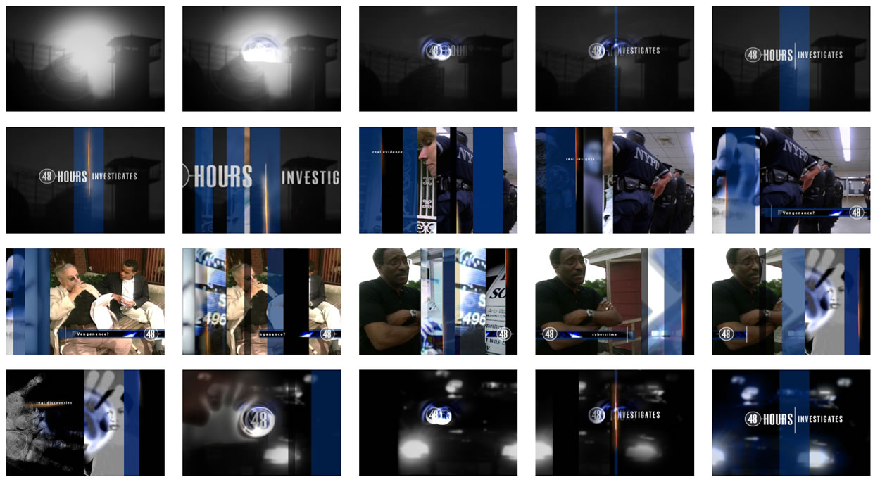
To the principles of font design and motion picture identity, since we link them—custom typographical reference—we have that storytelling in our work for Susan Zirinsky, before her presidency of CBS—as the ECD and EP: 48Hours.
You can see the alignment between identity and broadcast design and titling font

We designed the brand, packaging and titling for her Primetime Emmy Award production of 9|11 —
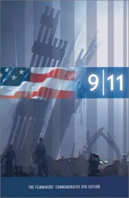
the font is a custom build,
a GIRVIN font.
The journey really is about craft, the detailing of design thinking, research, strategy, draft, context and framing the visual pathway, execution and outcome.
DRAW
IT OUT.
Tim | Queen Anne Studio
G I R V I N | DESIGNING MOVIES
THEATRICAL BRANDING + ENTERTAINMENT
IMAGINATION: AND THE TOOLS TO MAKE IT HAPPEN
goo.gl/BsoZ6y
Movie Storytelling design: The Scream Online