
EVERY JOURNEY HAS A BEGINNING—ITS END IS MERELY ANOTHER BEGINNING.
In my history with Dawn Clark, my best friend, design partner, consulting collaborator, surfing mate, it’s been a long evolution of watching her ideations of the Nordstrom store-wide redesign, from her initial creative brief for future-state store rethinking—opening up the stores to light and ever more detailed design thinking for merchandising store planning and layouts.
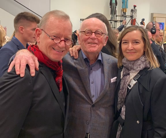
My original Nordstrom client, Bruce Nordstrom, with
Dawn A. Clark, AIA LeedAP
Our journey together—Dawn and I—some 15 years of collaboration—at a halfway point-7 years in—began with her thinking around rebooting Nordstrom design. My only role, towards listening, was supporting the design collateral of her kick-off, team-building presentations and strategic summit—a booklet of representing her strategies of layering, mineral concretions and material “sedimentation,”
Dawn Clark’s design thinking at Calgary, Canada, Nordstrom’s first international store
architectural details, ceiling heights and luminous openings into the store for more light, wonderment and spectacular engagement, all of which, directly express an experiential play towards extreme attention to customer service, shopping sensuality and committed support of all members of the Nordstrom team and guests of that retail retelling: a layered story of familial commitment and experience.
During that decade and a half of design collaborations, we worked in Osaka, Jakarta, Seoul and other locations in support of integrating brand, architecture, brand patterning and experiential thinking.
For me, our involvement on Nordstrom: it relates to this question posed decades back, about the logo—”which one is the real one?”
Coming from a shareholder, this set the motion in play to examine and develop the most quintessential Nordstrom brand identity—one which has savored the diversity of changes in the retail world for several decades, ongoing.
Our strategy was upscale elegance and we built three entirely different design systems in presentation of holistic design worlds—packaging, collateral and amenities, signing, and holistic identity in a contained presentation space—for all of the Nordstrom family members to study and vote upon—ranging from severe luxury, to classical modernism, to understated and disciplined design in the foundational look of a customized font
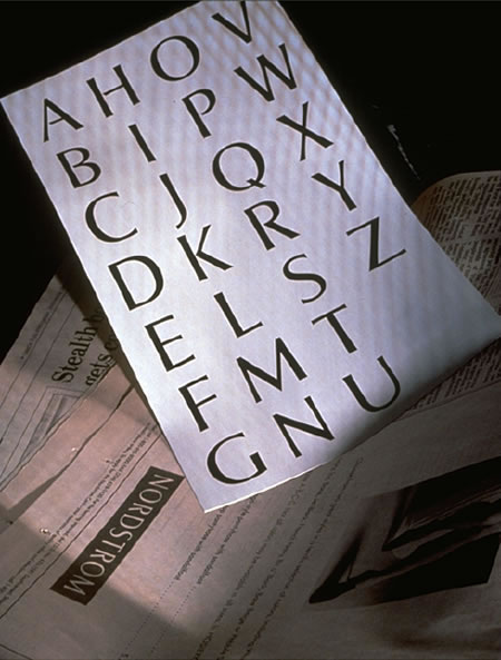
that takes its roots from nearly 3000 years of letterform history.
This treatment won out.
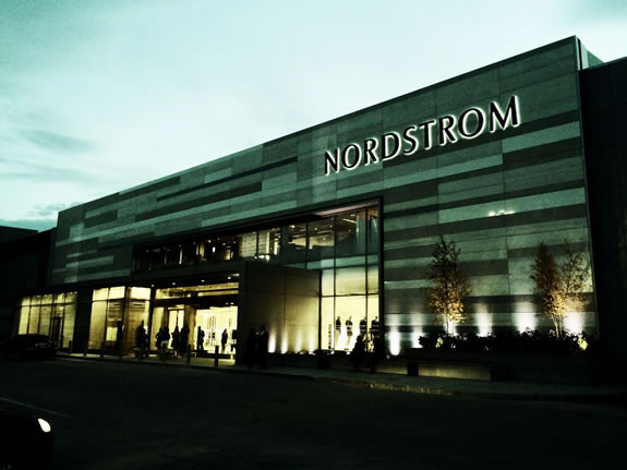
But opening in NYC was an entirely different degree of undertaking: a massively-scaled real estate gamble that has paid off in spades with their strategy of buying the land first, as a core founding investment, then building on top of that land as a strategy, along with a topping out of the tallest residential tower in NYC.
West
South
North
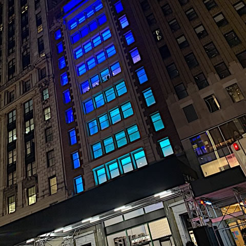
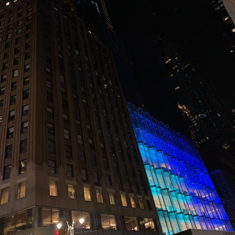
View from the south, Tower atop the Store
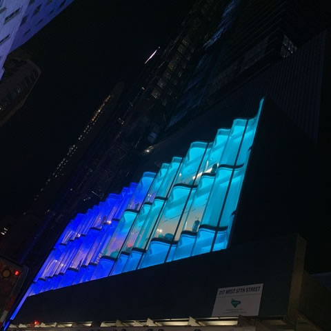
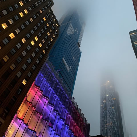
Dawn, along with her glass-strategist, world renowned designer James Carpenter, created a fabulously complex, sinuous
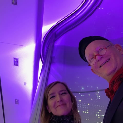
Dawn with her wave wall details
wave wall of glass on the north and south sides of the building, interiorly illuminated with variously sequenced LED light channels to bath the store in supernatural hues
of striking chromatic spectacles.
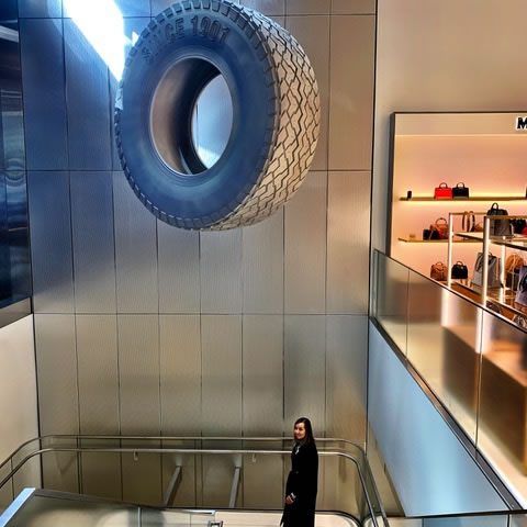
Dawn and the tire, south entrance, Nordstrom NYC
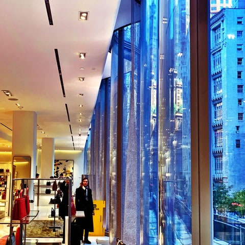
The interior is a store of spectacle, artful installations [like the legendary tire story “sure, we’ll take your tires in return, even though we didn’t sell them to you…”
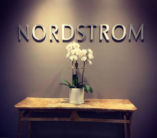
Our role in all this was foundational, while there are murmurings of change in the Nordstrom typographic system, the signage is still adhering to the core principles of our signage design program as delivered in our channeled, interiorly-lit, pin-mounted signage design manuals at our original of the Nordstrom font graphic identity patterning.
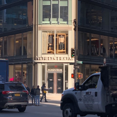
And at Men’s Nordstrom, across the street.
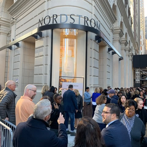
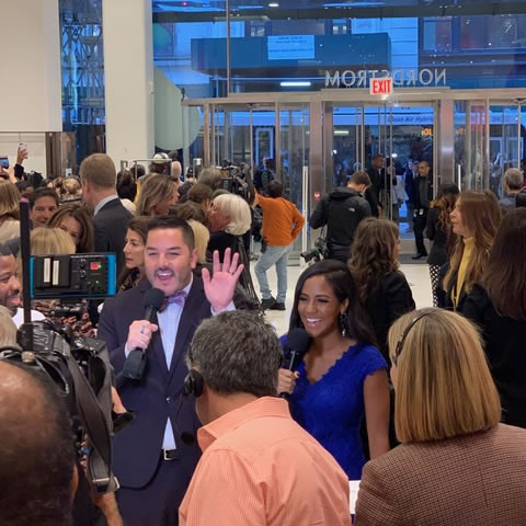
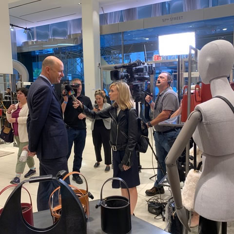
And, as well, this morning at the launch of the store and the Beauty Bash line-up on Broadway, where hundreds of participants got their first exposure to Nordstrom customer consciousness in a happy, selling celebration of free products, beauty treatments and early entry to the store from the Beauty Hall entry area, north side.
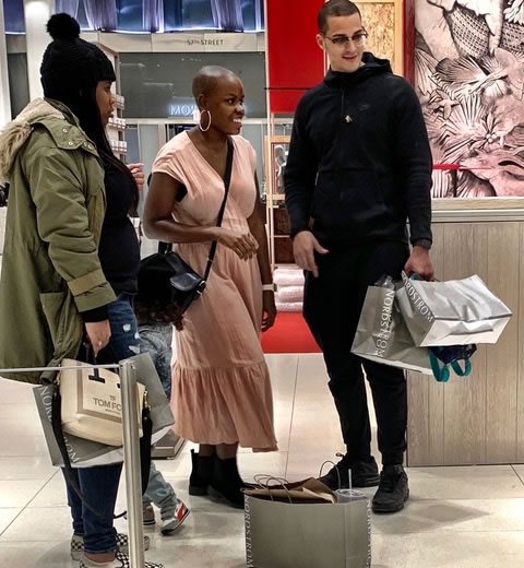
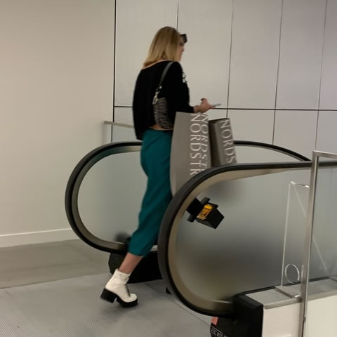
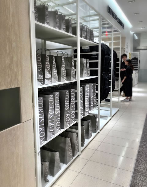
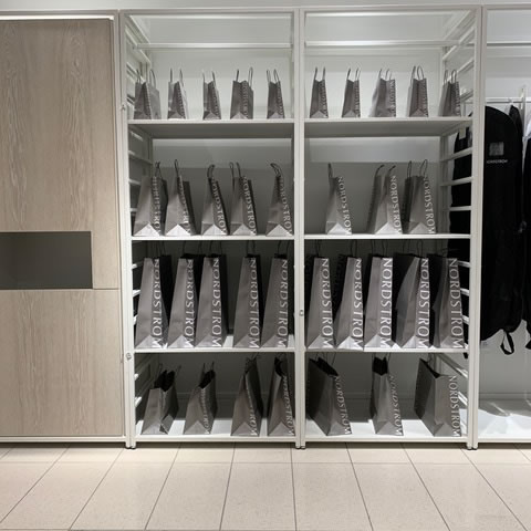
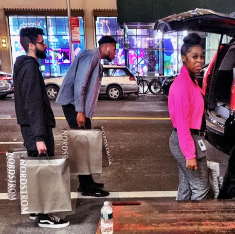
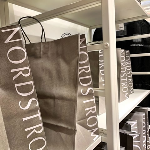
In opening sales, our silver bags circulated.
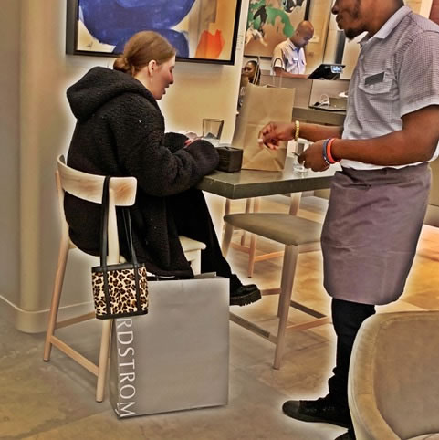
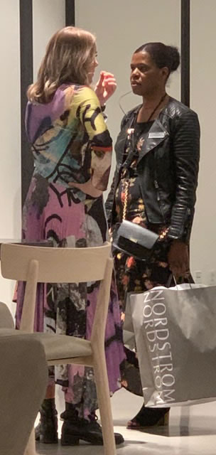
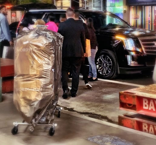
Every opening is, of course, a pulse-pounding celebration of Nordstrom energy—all the family is there, as well as thousands of others, in a happily danceable upbeat welcome to Nordstrom.
Design is about change.
We are happy to have been participants in this celebration.
Onwards to the new, the next, the more beautiful.
Tim Girvin | NYC Nordstrom
THE STRATEGY OF IMAGINATION +
EXPERIENCE = PLACE
DESIGNING ENVIRONMENTS:
PLACES | RETAIL | RESTAURANTS | SPAS + WELLNESS CENTERS
goo.gl/VU1Vcc