Yesterday, NYC, I had a meeting with a friend, client and global consultant to shopping and retail design trends. She and I worked together on her brand, client relationships, and have spoken together in panels for various summits
around the US as well as France.
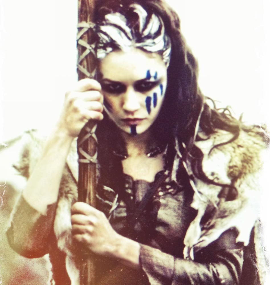
Image above: Olga Kurylenko | Etain of Brigantes | “Centurion” | WB
We talked about the notion of women’s well–care, and the potential retail experience for a person who is shopping and her journey from the street to the interiors to the shelf itself, and that measure of sequence timing. Metaphorically, you might think—“hmm…something at shelf, how it looks and feels, it’s possible that the same strategies of containment, look and feel, could be applied to a place that could be well-feeling, uplifting, positive and healthful.”
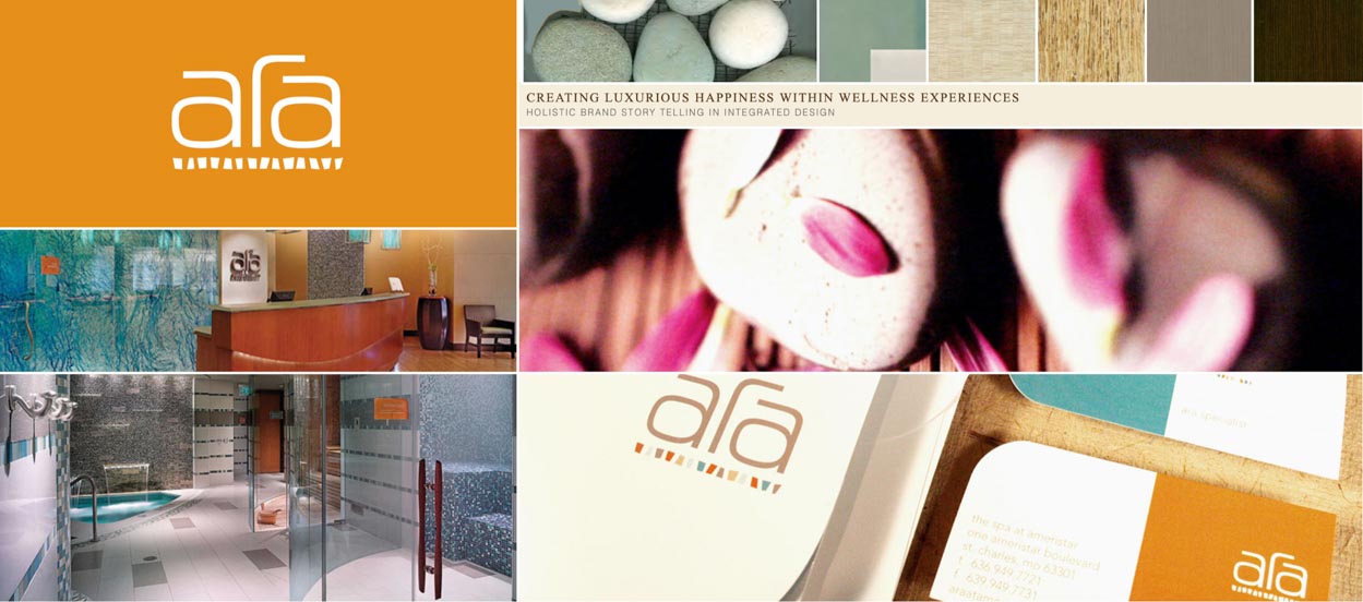
For example, our efforts on a well-making environment find their way into the design language of identity, packaging, placemaking and experience procession.
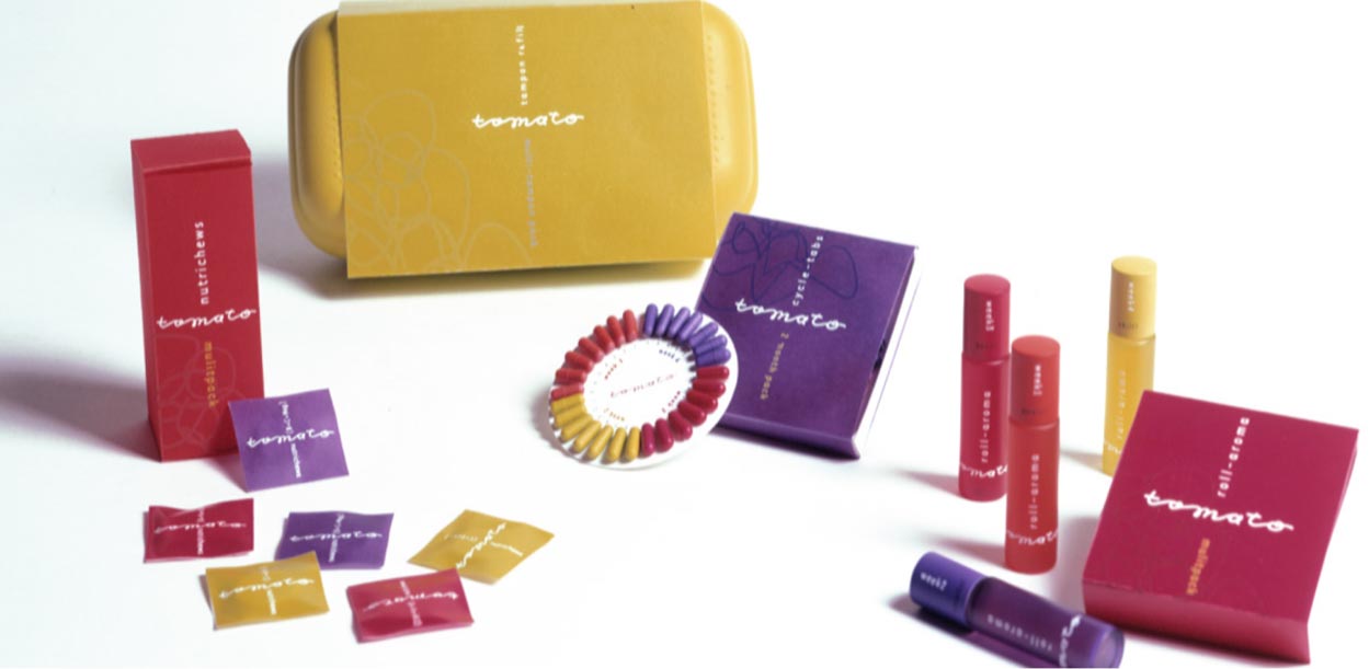
From a natural approach, you can walk that story in our work in developing NaturoMedica, with Jill Monster, ND., and her team; and, for example—
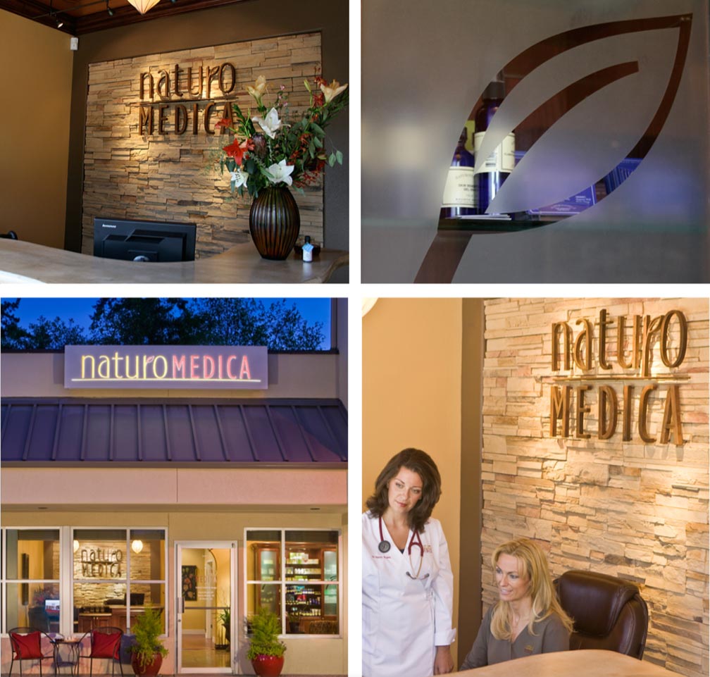
their packaged product,
NaturoMedica’s Naturologie.

There’s synchrony in experience design and packaged thinking.
Examine the holistic storytelling and allegory of our work on patient journey.
And this, predominantly, for women: for women, by women.
You can see the metaphorical experience strategy
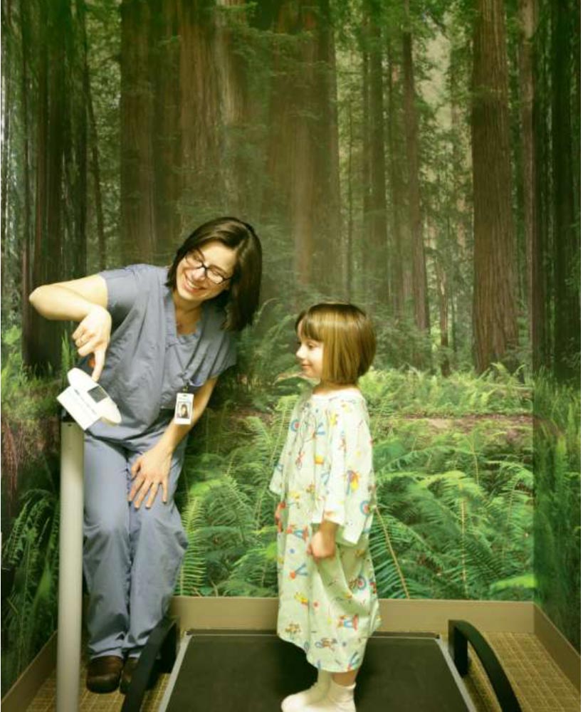
in a digital tour at Procure Proton.
For us, our strategic work, we look towards brand-related storytelling as synthesized ideals that cross all boundaries of experience design, along with packaging—each, a kind of placemaking. Experiential design strategies for built environments similarly apply to packaging. Each of them are about containment, storytelling, details of color in touch, sight, sound, and transformational impression-making.
Clearly, well-care design is a significant focus for many designers and place-makers, they’re creating towards an emerging trend right now—the examination of the power of the story and experience of place and shelf in the narrative of well care strategies. The epiphanic shift of shelf as a compressed presence of holistic brand storytelling is real estate—package or place, it’s empty space, made to become a place. The experiencer is in it, the place, or they’re holding it in their hands—the story is holistically translated.
At the moment of this writing, I’m on my way to make a presentation to one of those international grooming, well-care and health brand groups to discuss this very issue and our involvement in it. I pitched a bridge between all of these threads—and how it works, and how it’s worked for our brand works.
I was thinking, when we were discussing the concept of our efforts in the women’s well care channel, about the notion of a monthly subscription packet, and spending some time walking around those issues yesterday with a female physician—an OB/GYN. And ultimately, this packetized concept was built with consulting nurses and physicians for a supplement-based well product grouping for Procter & Gamble.
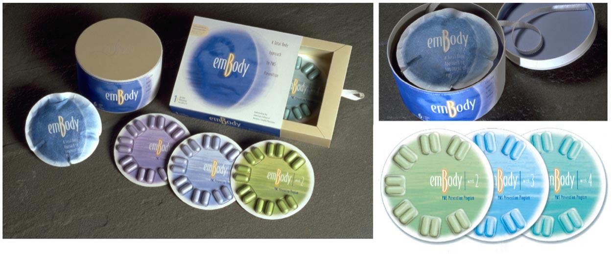
A physician notes, “the character of women’s sexual health relates, not only acknowledging her earlier years in a prepubescent context, but understanding pubescence, the menstrual years, but also her far later years as she enters menopause. That’s the spectrum that should be, could be, examined in the construct of branding, the full scale of a women’s life.”
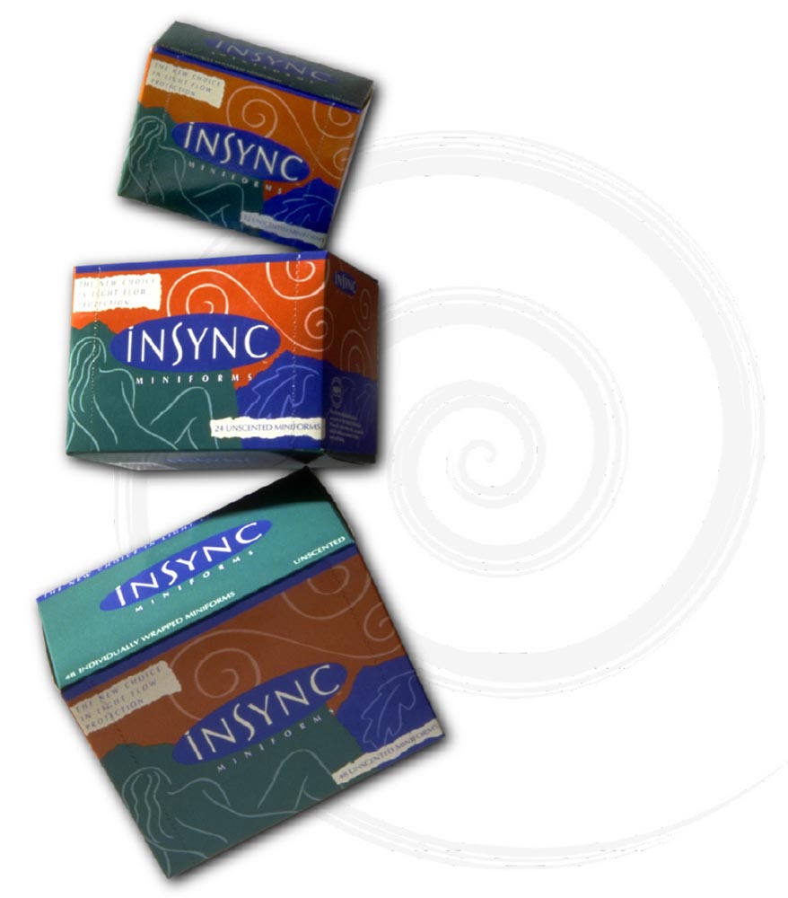
And working in this channel for a string of decades, and innovation in serving this market—and the span of the market—evolving age relevance—
as noted in this campaign by Dan Gross,
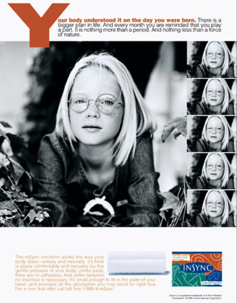
who was a GIRVIN partner on this brand, A-Fem Medical Corp.’s Portland, OR agency for promotion, and our side: brand and package. For us, the outreach was a brand language that speaks to distinction, naturality and patterning connecting physicality and comfort.
It’s interesting to think about that span of time—a relationship with a woman—and how it might be possible to develop a relationship with a customer that could be nurtured early in the earliest decades of the story sharing—brand storytelling and experience strategy—in
packaging and product creation.
And what about (W)health?
It’s a word I coined around women’s health—as an asset to be cherished, nurtured and nourished.
Like wealth, to be safeguarded.
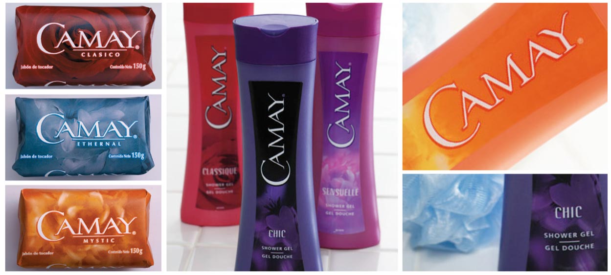
Some added exemplars to process—on the shelf front. Our global work for Camay—focused on an internal sense of wellbeing, the wellness of self presence, in this instance, strategically built around fragrance—globally tuned for Eastern Europe, Latin America, the Middle East and Asia. This brand is a widely grasped brand for women, a 60 country kind of brand, and to P&Gs operational expertise, it is deeply distributed.
We focused on listening to women—exploring their persona, personal presence as ways of reflecting on the self health of their relationships and personal stance—worldwide, all markets, in trial and testimonials. And asking,
“what’s my most beautiful secret?”
And well-making isn’t just about supplements or femcare, but it’s also about self esteem, personal impression, and a sensation of personal right-ness, “how I look is how I feel—about myself, who I am, my personal stance in my life, my relationships with others—my wellness stands with my beauty sense, and my wellness; that is—my personal esteem.”
Also, we did this by gathering-up a group of customer consultants—so-called “Beauty Junkies”—women who engage in self care, and appearance shifts, numerous times during the course of the day. That’s a change-up, mood and self impression. As participants, they gave us anthropological insights into their sense of personal wellness and appearance responsiveness.
Love how you look. Love yourself.
As designers, and creators of brand experiences, we have always been focused on the power of design to influence behavior and shape experiences. And in women’s health care, design can play a crucial role in creating design languages and environments that are not only functionally illustrative as well as comforting and empowering.
In designing women’s health care—as branding developments—whether shelf presence and built environments, consider the unique needs and experiences of women. This means creating brand treatments and places that are welcoming, warm, and inviting, and that take into account the emotional and physical needs of women.
You might ask—“you’re a man—how can you know anything about that?”
Mostly research, which comes down to on-site retail, shelf and place interception, group meetings and interviews. Of course focus and testing sessions with outcome evaluations coupled with purchaser and participant discussions. And being a father to two women.
What are the observations?
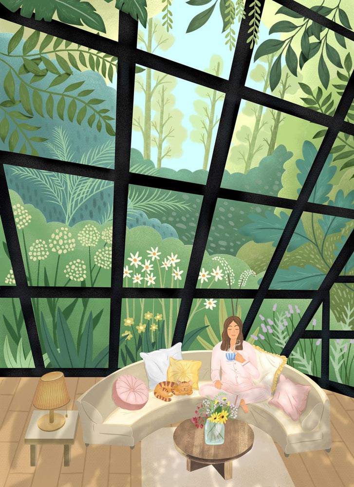
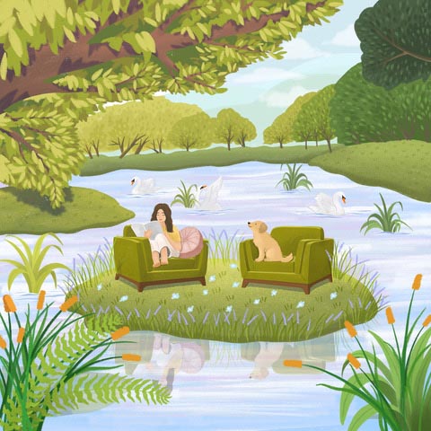
One tactical underpinning in designing women’s health care is to draw inspiration from nature. Nature—as all of us know—has a calming and restorative effect on the human mind and body. Incorporating natural elements into the design can support a sense of calm and serenity.
For example—in all of our discussions and site reviews— incorporating natural light into the design can help create a warm and welcoming environment. And naturality—integrating natural materials such as layers of wood—even stone can create a sense of grounding and connection to the earth. Plants and greenery can also be incorporated into the design to help create a sense of tranquility and serenity.
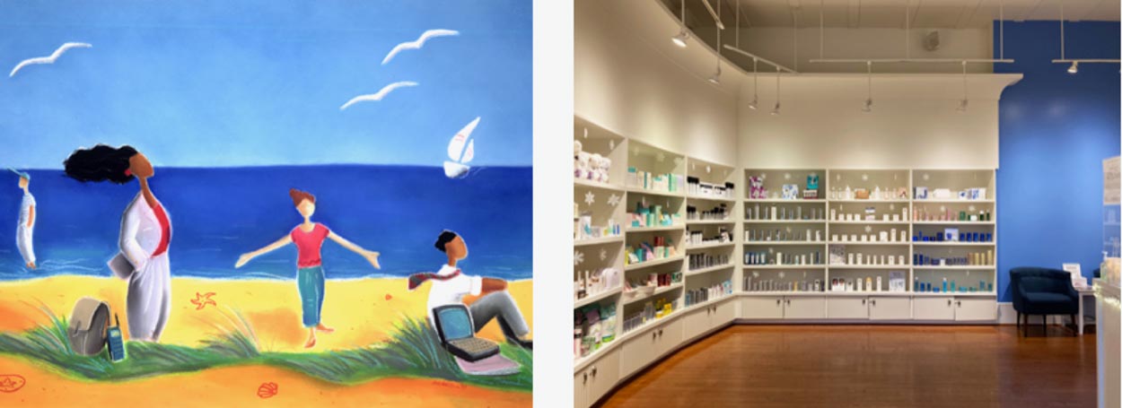
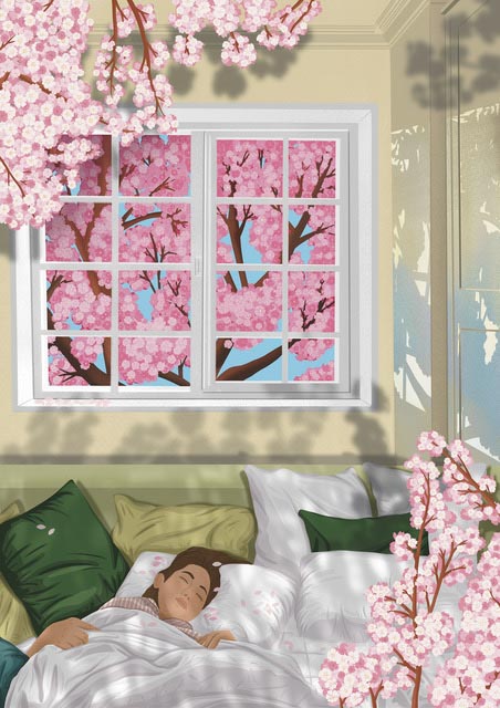
Studying exemplars and visual references, I spoke with Helen Biles and her global agency, Artistique-Int to explore the representation, from extant artists in her repertoire, to utilize one of her illustrators in expressing the characteristics of women-based, health-related design strategies. In color, materiality, and light—these illustrations—from her artist in LA—Kylie Kim, artfully captures the nuances of all of the aforementioned details.
Grateful to Helen and Kylie for their help.
These renderings play to warmth, light, materiality and color—and they’re in sync with our explorations.
Kylie Kim’s work, used with their permission.
It’s exquisite work—and too, plays to another important consideration in designing women’s health care. Privacy and comfort. As we and many others know, in interviews
and customer interceptions, women may feel vulnerable or exposed during medical exams or procedures.
Designing-in safety—creating places that feel safe and secure—private exam rooms that are spacious and comfortable, with soft lighting and soothing colors—gravitate towards the sense of privacy and intimacy. Comfortable seating for supporting relationships—designing-in the potential for a sense of community and connection. Many women may feel isolated or alone during their health care journeys, and creating spaces that facilitate connection and support can be immensely helpful. In addition, consider the needs of women with disabilities or mobility issues—create spaces that are not only functional but also nurturing and empowering for women—movement design is respectful.
Obviously, some added conclusions could be considered—obvious, but relevant.
As each of us of walk around the notion of designing for wellness [brands on shelf, brands in placemaking]—and in this instance, for women, tweens to later years—
it’s significant to realize these added goals and considerations, as in: design thinking for women’s well-care brand environments and products requires a strategic analysis of their unique needs and designing bespoke preferences.
A summary of key insights on designing for wellness-conscious environments:
1. | COLOR+MATERIALITY:
We know, from trial, that women tend to be more sensitive to colors than men. Colors have a significant impact on mood and the implications of well-being. Colors that are calming and soothing, such as blues, greens, and purples, enable a relaxing atmosphere. Using warm and vibrant colors, let’s suggest oranges and pinks, intimate uplift: a cheerful and welcoming environment—align mood and purpose of the space when selecting colors. Obviously, this is a generalized gesture toward
[w]health-related palettes.
2. | LIGHTING+VISIBILITY:
The presence of light—or its absence—draws the journeyer in. Or keeps them out. Lighting can have a significant impact on women’s well-being. Bright, natural light can help to boost mood and productivity, while dim lighting can create a more relaxing atmosphere. In creating luminous channels—folios of light tiers of experience—design enables a variety of lighting options that can be adjusted to meet individual needs.
3. | PRIVACY+SAFETY:
Chambered protectiveness, as in theories of cocooning, women can feel more comfortable in spaces that provide a sense of privacy and security.
—curtains, screens, or partitions that allow for private areas within a larger space.
4. | COMFORT+CARE:
Comfort is key in well-care environments, and this includes everything from seating to temperature control. Women may appreciate softer seating options, such as padded chairs or couches, as well as temperature control that can be adjusted to their personal preferences.
5. | ACCESSIBILITY:
It’s important to consider accessibility when designing well-care environments for women. This includes making sure that spaces are easy to navigate and that there are no barriers to access for individuals with mobility challenges. Additionally, providing amenities such as changing areas and accessible restrooms can help to make the space more inclusive.
Reading this, you might say—“hey, as a man, I can relate to this in my own well-seeking experience;
I mean—I like privacy, I like warm colors, I like plants and nature.”
Yeah, but different.
What this comes to is the very nature of the humanistic sensation of comfort, care—self or otherwise—the inherent biophilic qualities of nature—are broadly attractive to many; uplifting palette groupings are similarly embraced, a lean towards natural materiality is better perceived than obviously machine-made interior components.
Want to know more, see more of our women’s work—drop me a note:
girvin@girvin.com
Looking forward
Onwards with the journey
Tim Girvin | Principal, Founder and Chief Creative Officer,
GIRVIN | Strategic Branding & Design
www.girvin.com
S I T V I S V O B I S C U M
MCMLXXVI
IBI FUNDATA
Follow Us:
Facebook LinkedIn Instagram Behance
OSEAN | B R A N D + A R C H I T E C T U R E
A new [10 year old] collaborative partnership with GIRVIN’s teams.