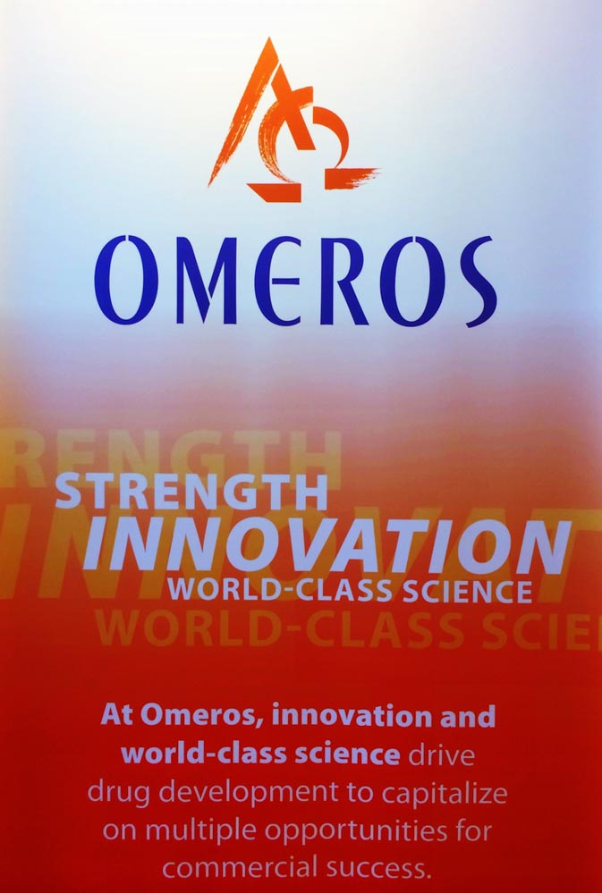
Logo design stylization in scientific experience
strategy and guest journey.
When you think about identity, brand identity—the principle expressed with integrated, comprehensive design, message and color systems—a logo can represent a storytelling device that is, one, seen from afar—
as the first stage of brand expression.
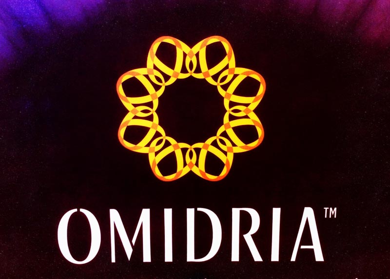
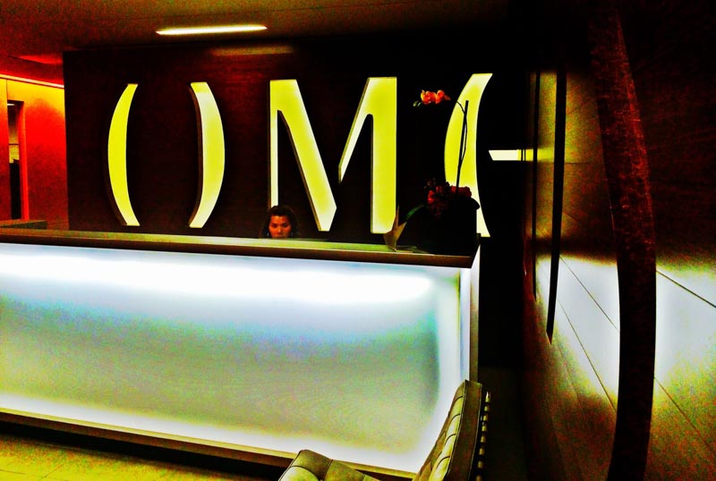
And two, could emanate a message at the door way; three, the lobby and reception while marketing the scientific offerings of the property, as in this ocular product identity that is actually built from the core design language of the logotypography
—as an iris—Omidria.
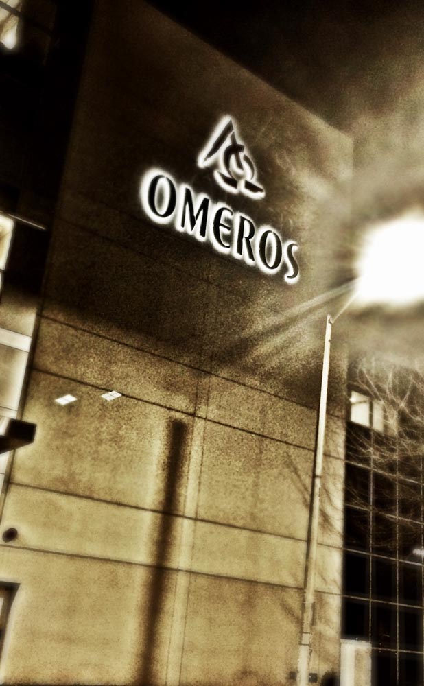
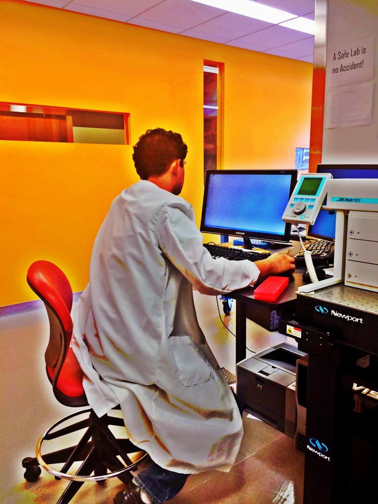
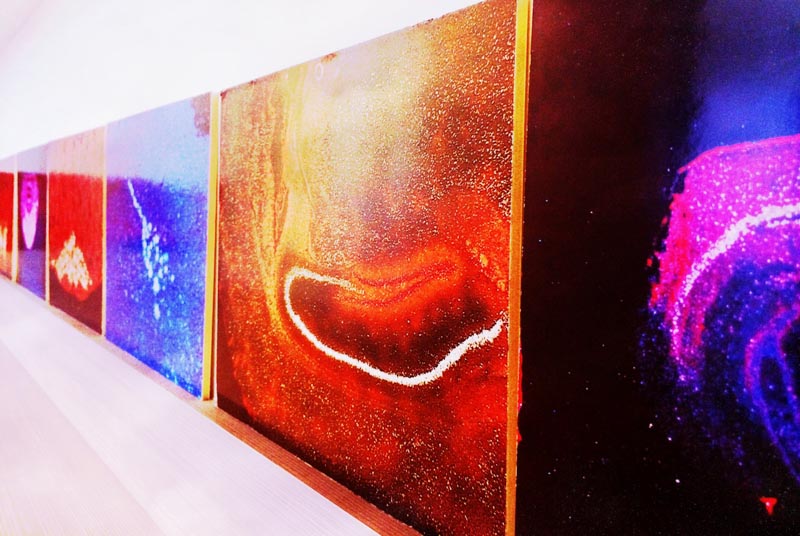
Our core palette for Omeros is built on a striking vermillion, blacks, grays and a Prussian blue. These chromatic expansions are created with the working laboratories in mind
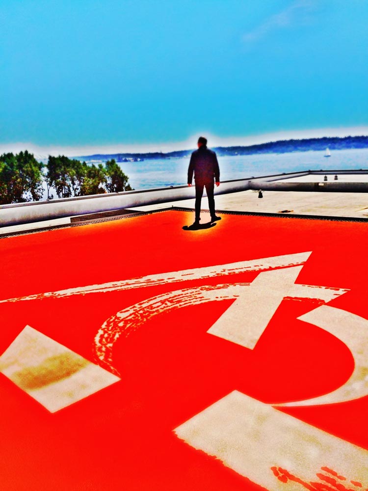
—inspired by the work. with palette, dramatic ties to tiers of visual cues, all the way to the rooftop helicopter pad.
Any visitor will see the labs—and identity and working experience intertwine, the color of the science.

Spending time in the labs, I wonder, is the color an influence for me, how I think about the brand, or does the brand evidence itself in the brand place, story told, and well made.

Brand color, placemaking and experience color resonate—as a tiering of palettes in the laboratory stations as well as guest visiting rooms, hallways and conference spaces.

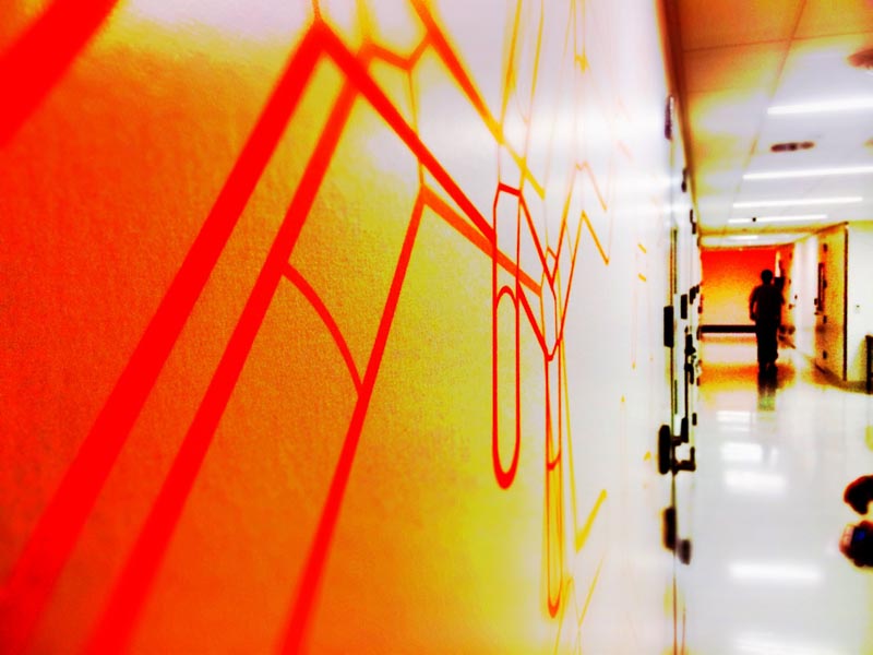
When we worked on the processional sequence for PNNL, Richland WA, the high security nature of the research compounds were forbidding and somewhat scary. Then, we looked for ways to ameliorate the tension in storytelling about the science, as patterning. The team at Omeros utilizes, palette-responsive graphical arrays of molecular diagrams.
Brand patterning is a long GIRVIN legacy of brand experience development.


The entry lobby area of Omeros features an incised logo rendering, internally lit as a reception backdrop.
Art, also palette-aligned plays to the rigor of scientific analysis—selected by the scientific staff at Omeros.
And, in a flyover—landing at the helicopter, a massive incised and brush drawn portrayal of the mark that I created in concert with Dr. Greg Demopulos, the founder, CEO and Chairman of Omeros, captures the core mission—start at the beginning, Alpha—and follow that inspiration to the end, Omega, and the doors of perception will open to innovation.
To tell the story of a brand, the enclosure of the core brand, its fire, can act as a sequential unfolding that layers texture, color and graphical patterning, from the farther reaches of airspace and the streets below, into a sequenced entry—moment to moment—in the revelation of the story as a explication to curiosity and inspiration, scientific rigor and persistent engagement to reveal the answers of the original dream and inventive pathways to discovery and outcomes, through the clinical trials and the culmination in medical utility and the renewed health of the community it serves.
Tim
I collaborate
GIRVIN | Strategic Brands
––––––––––––––––––––––––––––––––––––––––––––––
Follow Us:
Facebook LinkedIn Instagram Behance
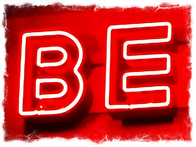
Be what you can be.
Bold, bright, brilliant.