Obviously, the question of beauty
doesn’t propound solely a complicated design—
instead, it could be profoundly simple—so delicately balanced and
restrained that it catalyzes disciplined elegance.
But when one calculates the etymology—in reverse—of beautiful graphics, the word that comes to mind is calligraphy. καλλιγραφία is the foundational, original use of the word—in the original Greek form of kalligraphia—literally,
kallos + graphein: “beautiful writing.”
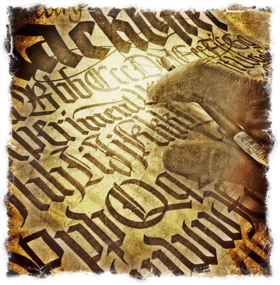
In my personal explorations of calligraphic standard—beauty-bound principles of letter design—around the world—I’ve traveled for adventuring, which too, has an adventuring in type, lettering design and calligraphy.
It’s been suggested that “lettering” is a multi-stroke composite—as in sign-writing, for example, while type design is specifically focused on the translation of a visualized letterform as a systemic font development. As in “type to set in an movable arrangement,” originally produced in porcelain,
as moveable print blocks created by Bi Sheng
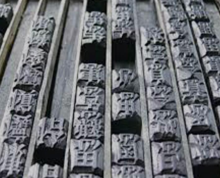
in China—hundreds of years [1040 AD]
before Gutenberg’s innovation [1455.]
There were other pre-Gutenbergians, also East Asian,
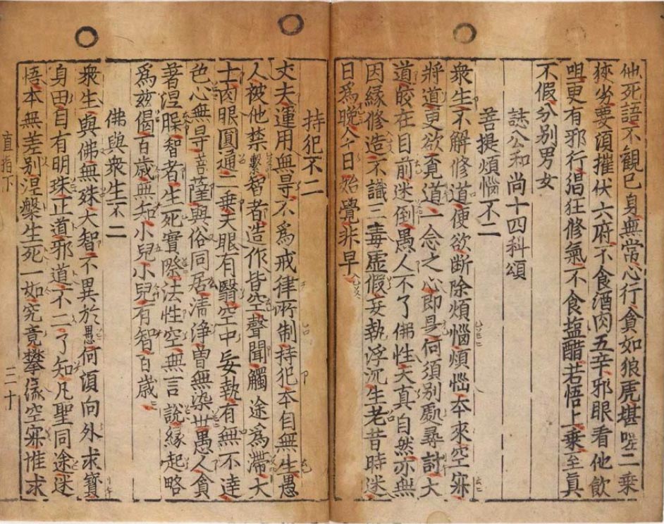
particularly the Buddhist document, Jikji [as above, and printed in Korea, a collection of Buddhist teachings by Seon master Baegun and printed in movable type by his students Seok-chan and Daijam in 1377.]—which, similarly predated Gutenberg’s “civilization-changer,” as Mark Twain commented in 1900: “What the world is to-day, good and bad, it owes to Gutenberg. Everything can be traced to this source.”
When I started, I was, like many, ignited in a fascination with the beautifully drawn letter from a summer encounter with Lloyd Reynolds. He and I hit it off.
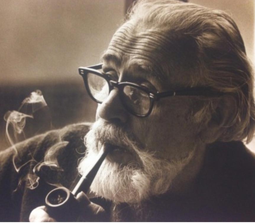
Lloyd—who as I’ve noted in other blogs was also a profound inspiration for Steve Jobs. In fact, it was my connection with Reynolds, and Reed, that interlinked my legacy with Apple Computer and working wth Steve [“hello, Steve”] on the Mac. That genetic educational link—the beautifully made letter—was how I met Steve. Which then led me to work with him on Macintosh, college workstations and educational hardware, WWDC for several years, Apple’s early web and digital café concepts
and finally, post Apple,
NeXT.
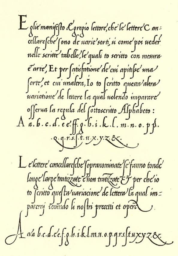
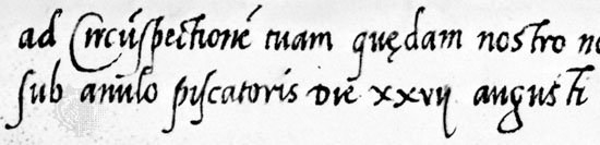
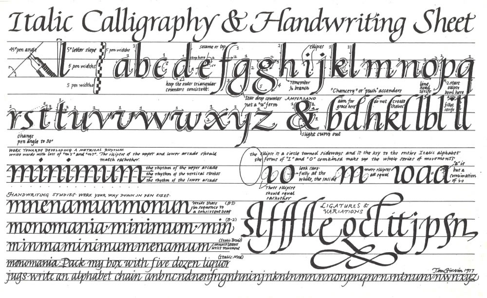
Reynolds elucidation of the spirit of calligraphy was wrapped around the legacy of his studies of the calligraphy of the Italian Renaissance [as above, the 15th century workbook of Giovanni Antonio Tagliente—the particularly fluid, Lateran order handwriting of the Apostolic Chancery] as scripted expressions—littera cancellarescha of Papal missives, proclamations and “intrastate” communications between the leadership of different provincial counsels of the communes. It was also used in missives between countries—as in Papal expressions to heads of state.
It was marked by a particular rhythmic precision that allowed complex documents to be quickly drafted and transmitted with such skill that they were difficult to duplicate. That “flow”—a particular rhythmic vitality—led to the notion that this form of handwriting could be learned by anyone of the present era. That is, Renaissance italic calligraphy as a base hand for all, a commonly accessible “handwriting”—and surely, it formed the beginnings of my awareness about learning calligraphic hands, but as well—teaching them. It came to the philosophical principle, a manifesto, of energetic design, drawing and illustration—
and a kind of alphabetic dance in the staggering of characters, their baselines, x-height or minuscule letter scale and the movement of the ascending and descending strokes.
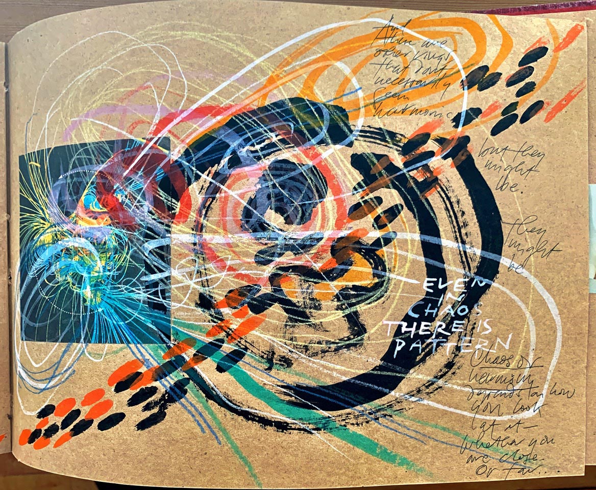
Everything can dance.
Words, ideas, expressions, intertwine in energetic confluence. Flow.
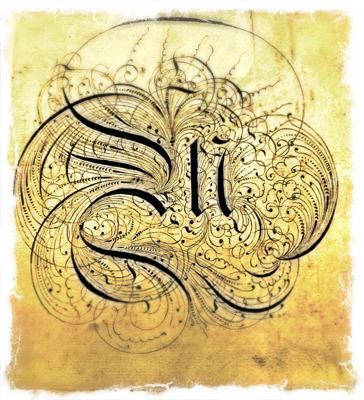
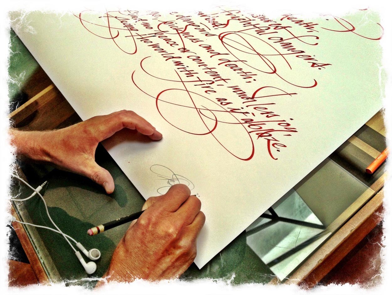
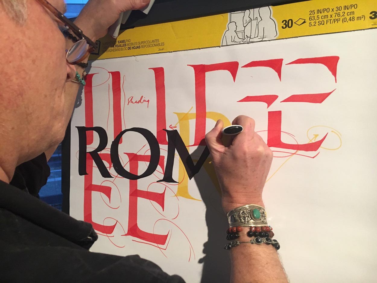
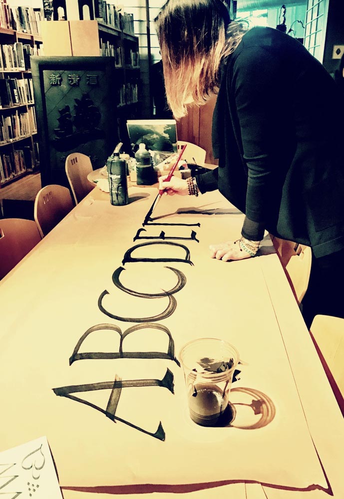
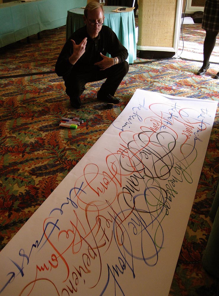 Tim Girvin | Las Vegas | Workshop demonstration
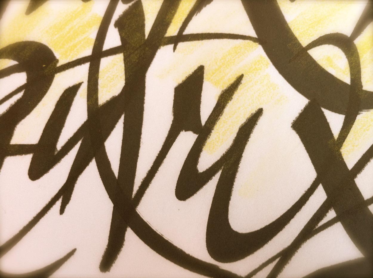
I even began to do, and to teach, this type of drawing as a movement to music—exploring the theory that musical tenor could effect the rhythmic dynamism of the alphabet—and the interweaving of its movements and interplay of words, the spiraling quality of the flourishes and their intersections. The alphabet, drawn in time, in rhythm, with the calligraphy of the alphabet.
It’s all metrical, there’s a beat and the characters emerge in time: rhythm.
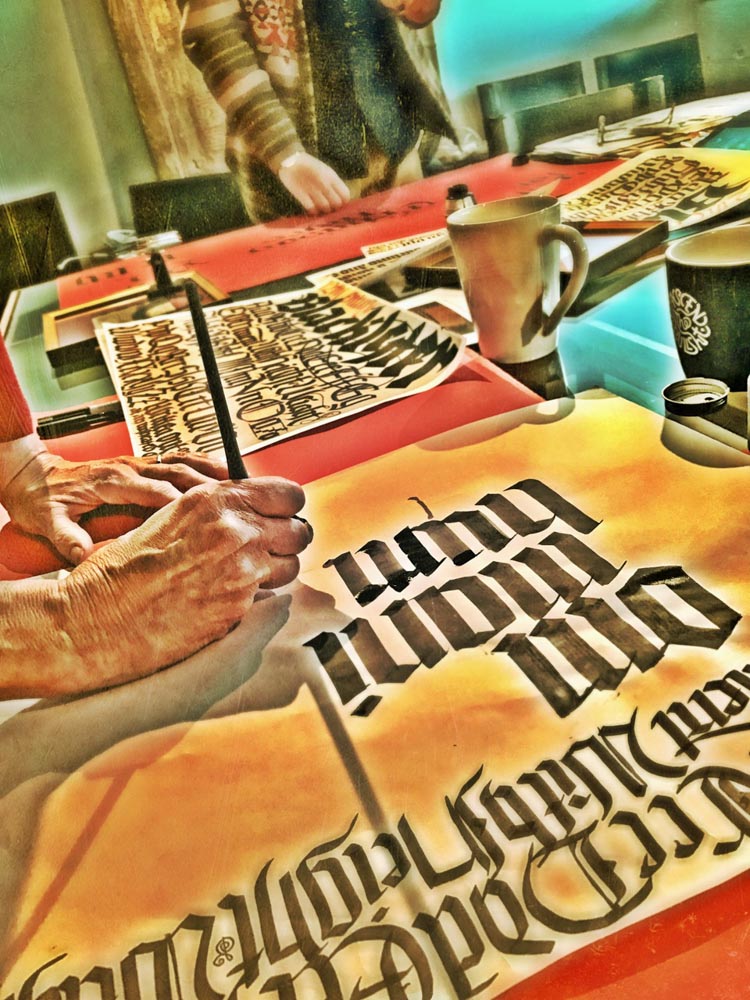
To my thinking, the best way to engage in the challenge of comprehension—that question of the quest for beauty-making—is to teach it. And I did, early in my career—back then, the 70s. I also bolstered the teaching with live [paid] applications in sign-painting, shopfronts, banners, trucks, boats, broadsides, book designs, illustrations, murals and wall treatments, tattoos and pin-striping on motorcycles—
all for a little extra cash, here and there.
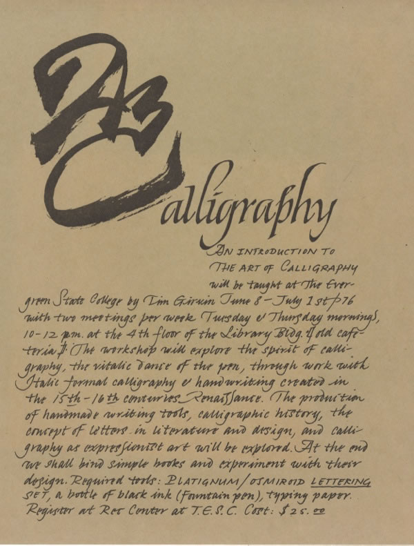
And I taught how to make beautiful letters, for dozens of students, tiers of classes in paleography—walking the scripts of time—and matching calligraphy and basic book design thinking with simple bookbinding. Starting in 1972, it was extra funding for tuition. And, most particularly, books, which I bought discounted from Richard Abel’s bookshop at Reed College.
The insight is this: a movement forward oftentimes means you need to go back.
And that the beauty quest of today, might find roots in lines of design thinking
that have existed for hundreds of years.
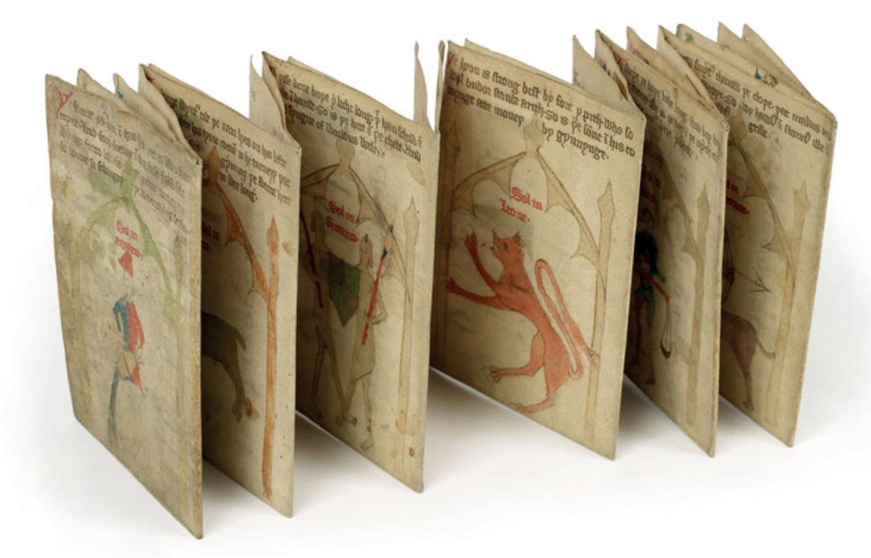
Like a folding planner, from 1389, the Bodelian—handmade, drawn and built from the imagination—and the visualization of ideas.
And, from the same library, this collaborative design project—with notes below on the image from the library:
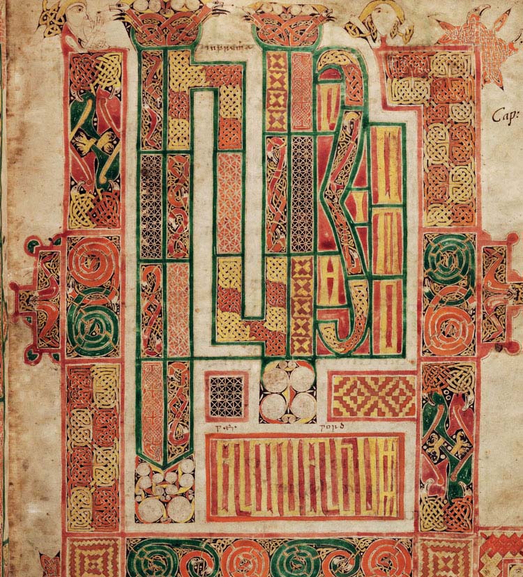
‘In the beginning was the word’ – A late-eighth-century or early-ninth-century Latin Gospel, painted in Ireland by Macregol, possibly abbot of Birr, County Offaly (d. 822), and glossed in the 10th century in English by two scribes. English translations were added to the original Latin text by medieval scholars.
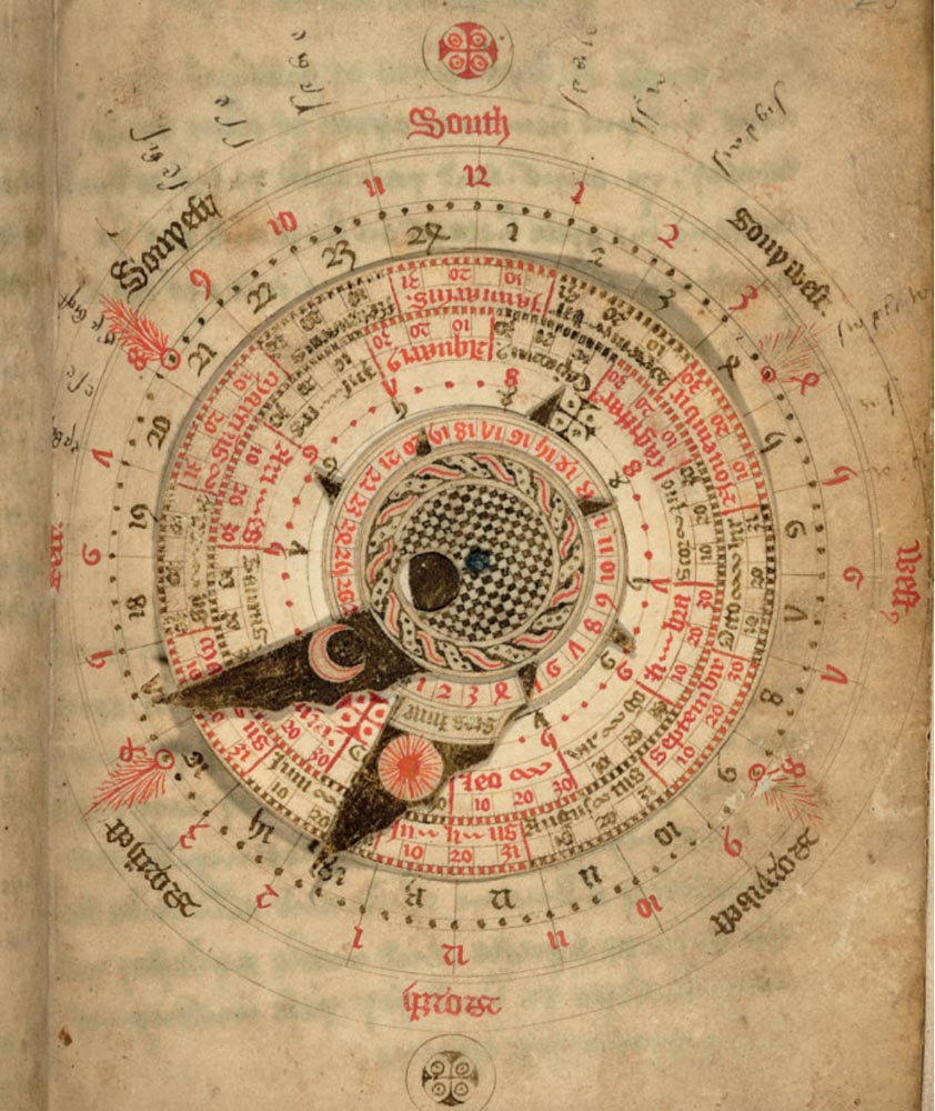
And perhaps an interactive book—for your personal calculations for lunary movement and nighttime chronology—in a complication of formats for study and self synchrony. From the University of Oxford, the Kalendarium of Nicholas of Lynn, created 1386.
The quest for graphical beauty for me likely began in earlier expeditions to the UK—which, incidentally, is where these medieval graphical wonders came from—and I spent time there, Oxford, trying to wildly broaden my graphic vocabulary, and the grasp of beauty.
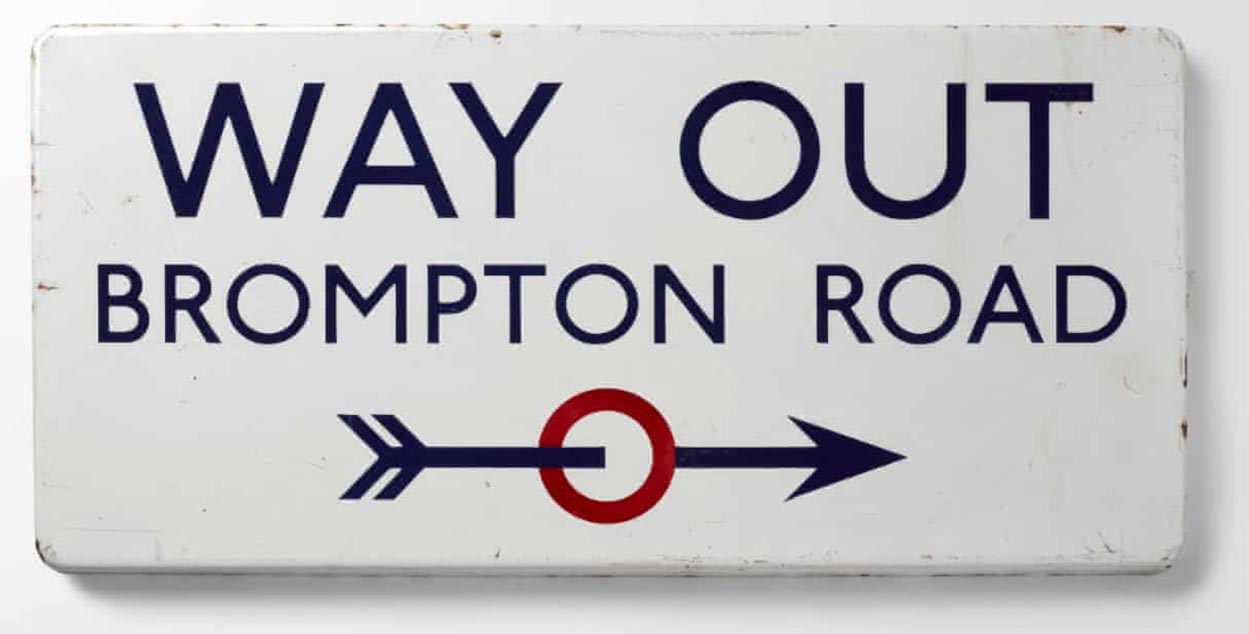
That could be, easily estimated in elegant and understated clarity of the Tube, the London Underground.
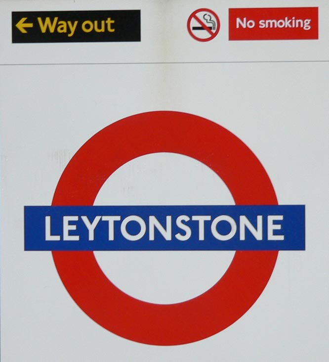
Speaking of going back, to going forward, the design of that system, exemplified above, was built around beauty, in the hands of an artist craftsman, Edward Johnston, whose creative brief in building the graphical system of the Underground, was “a typeface that would ensure that the Underground Group’s posters would not be mistaken for advertisements; it should have ‘the bold simplicity of the authentic lettering of the finest periods’ and belong ‘unmistakably to the twentieth century’—considered a sans-serif best suited to transport use.”
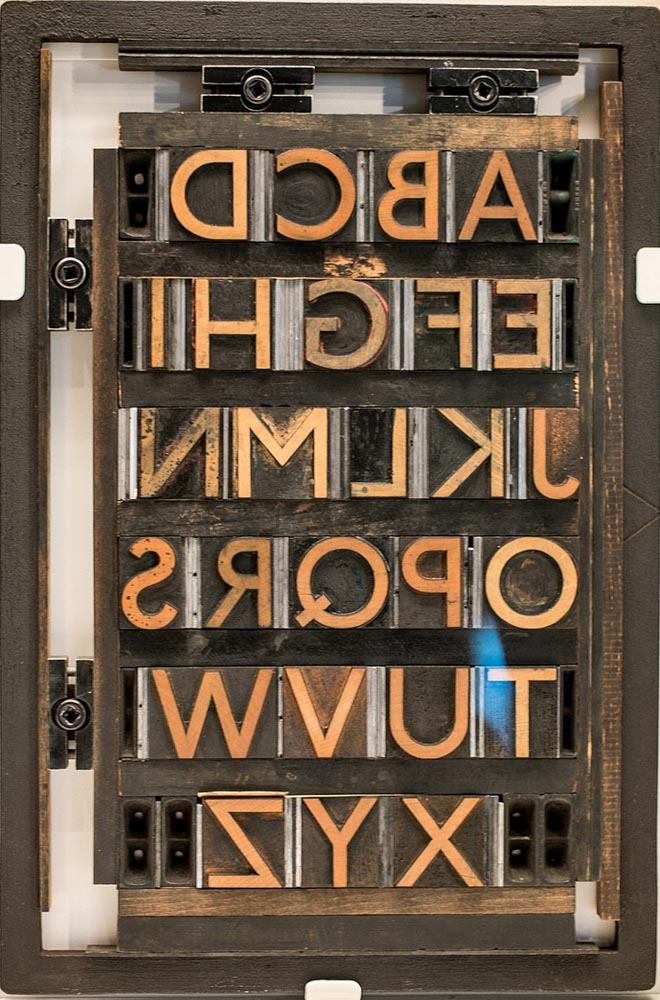
Here, simple reversed elegance in the lock-up letter blocks of the font that Edward Johnston designed for the signing and alphabet system of the underground—back then, an innovation in beautiful made utility, and a stark leap away from the “grotesques” of the period and their invention during the Victorian letter.
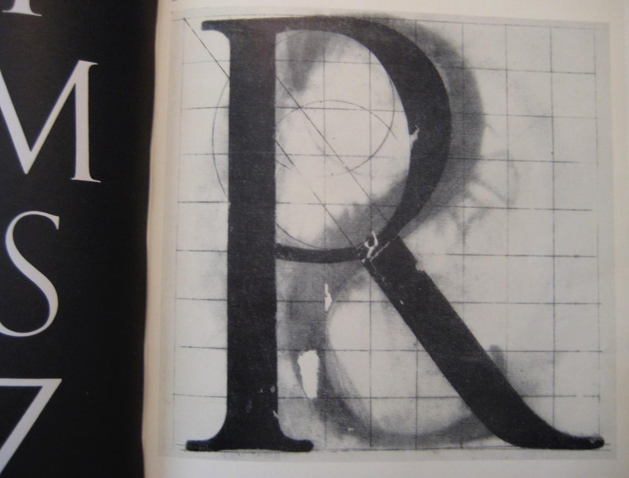
Below, his notes on the font.
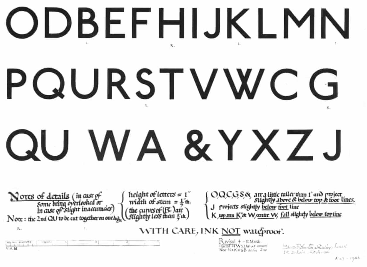
Johnston’s Design for an alphabet (1916) with his original ‘W’. Photograph: Victoria and Albert Museum, London
Instead, Johnston went back in time to an earlier principle of graphical beauty, in the array, letter spacing and structuring of varying capital, height and width relationships.
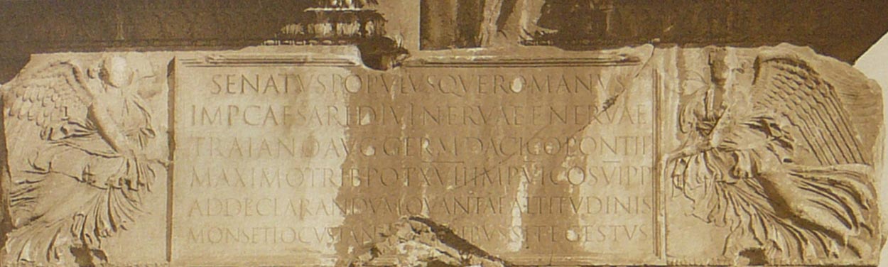
At the below, on the left, a disciplined and letterspaced 2nd century BC, lapidary incised lettering, a serifed stroke finish from brush-drawn pre-cut letters, 1st century, Imperial proclamations in stone—and, far right, the Trajan exemplars, from the Forum in Rome, Italy.
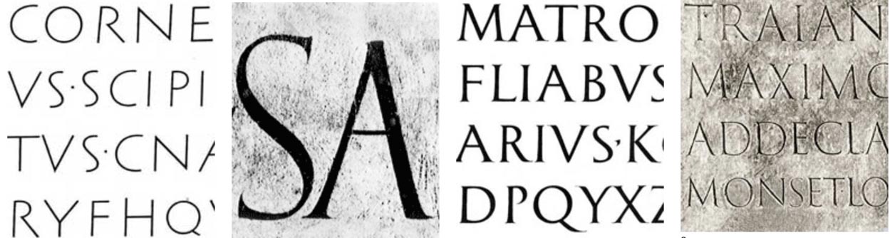
That modularity was essentially created in Imperial Rome signage standards, as below, the roughly first century inscription of Emperor Traianus, a lettering form seen by many artist craftsman as the most beautiful ever created.
A section.
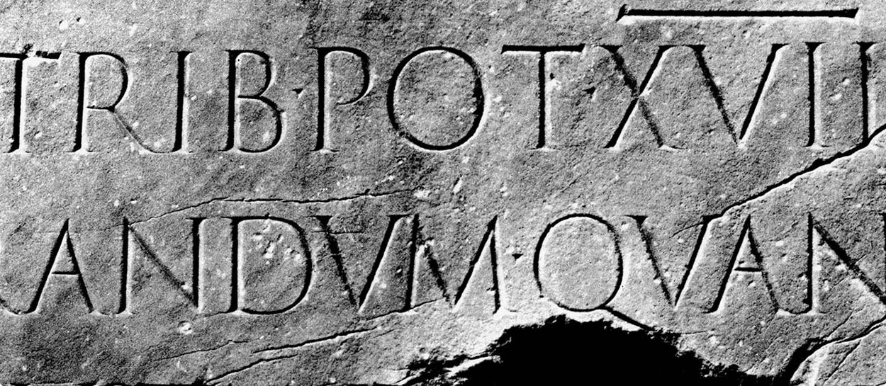
And the entire inscription.
Contemplating that notion of beauty—who does that?
There’s a noun, also an adjective, used in contemporary parlance about people who make things—they’re called: “creatives.” It is a description for those that work in creative and maker spaces of enterprise and commerce.
It’s an interesting idea, using an adjective as a noun, but it works.
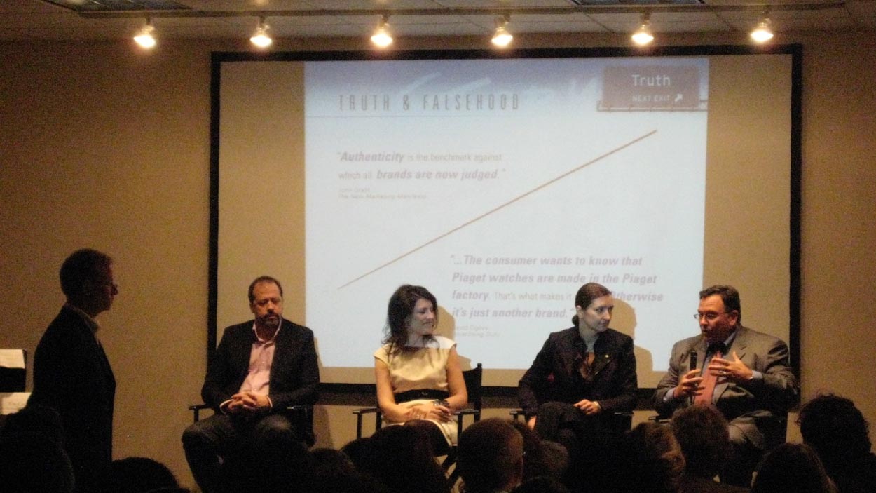
In a group meeting, I was leading the panel at the “creatives” table—it was a conversation that I’d built to talk “True Brands, Authenticity in Brand Storytelling” for the NY Fashion Council. Those “creatives” were Anthony Battaglia, Design Director, Dior; Claudia Cividino, CEO Loro Piana, Dawn Clark, AIA, Director of Store Design and Construction, Amazon and Paul Terlizzi, then CEO of Capezio Brands.
I looked to my colleagues and wondered—
“these people here, they are creatives.No question.
So in what manner and how—they’re the ones in front, as are all leaders.
Yes, all creative strategists and leadership.”
I talked to each of them to learn more—share brand storytelling, truth telling, authentic tiering and layering—as creatives, makers that lead towards beautiful brands.
a designer, a president, an architect and a CEO.
Creatives—and, to each creative, their own pathway of creativity.
And, to each make something beautiful.
Beauty, itself, is about 5000 years old, since its core sound is a PIE expression, an ancient group of linguistic roots—*dw-en-elo-, a diminutive of root *deu– “to do, perform; show favor, revere.” And famously—as Phil Harper notes—defined by Stendhal as la promesse de bonheur “the promise of happiness.” From the ancient sound, deu—which forms the sound roots for beau, bene, belle, bonjour, bonus, boon, bounty, debonair and embellish. Latin bellus “pretty, handsome, charming.” Graphical beauty might be thought of, then, as a kind of blessing, a giving, goodness-making gesture.
Not ugly.
It made me wonder about this proposition of making, and the engagement in the
creative journey and curiosity.
In the quest for beauty-making, there is a presumption of continuing exploration, journey making, curiosity.
In the storytelling of our lives, we look back to the points of inspiration and magical points of inception—collisions of ideas, people, good fortune and open-minded exploration and expansion, when things began to click in a way that sparks the ignition of a new universe—which could be one of beauty. For me, that would be the shock of Lloyd Reynolds— and time with Harold Balazs.
These were two ignitions in high school, highlights in an otherwise mildly stumbling succession of less than startling points of discovering.
They were there, points of epiphany. But they had to be found. Sometimes, the quest for beauty is an inward exploration—things are uncovered.
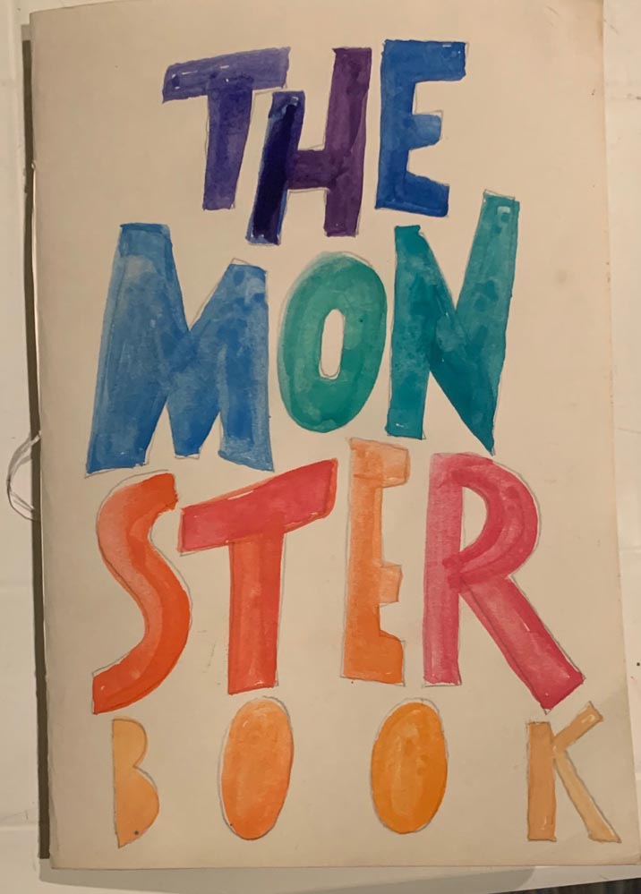
As a child, as a budding draftsman—like my grandson in this shared workbook we built together [on Monsters, of course]—I practiced along with another stellar TESC graduate, Jim Cox.
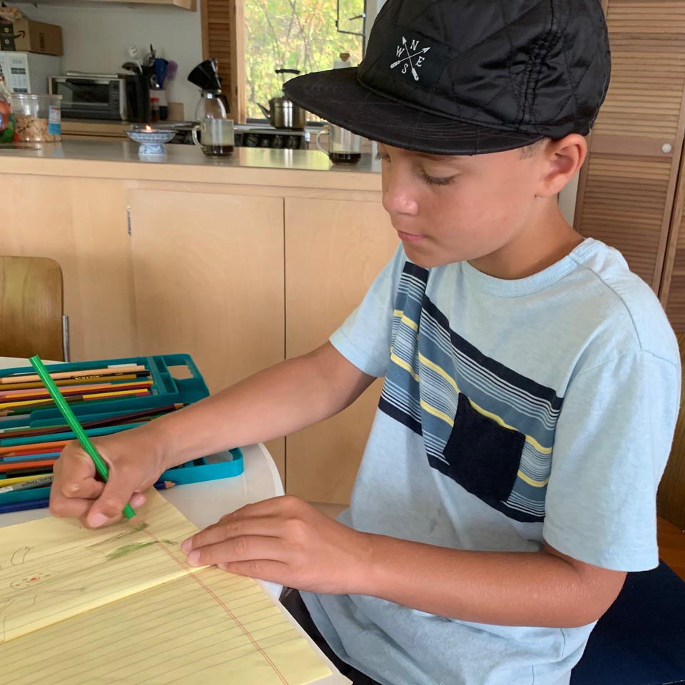
My grandson and I draw with sound, precisely the way I did with Jim Cox. He and I used to draw in my basement in Spokane, on the floor—inspired science fictional visions—
each scribbled drawing accompanied by sound effects in its making.
“If you can draw something,
you should know how it sounds —
and make these sounds while you’re drawing.”
I did that last summer from my grandson—and I honestly think he was surprised by me drawing things and making noises while I drew them.
And the quest for beauty—it would be sensate, transdimensional, it smells beautiful, touches beautifully, sounds beautiful—it could taste, wow—beautiful. And it looks beautiful.
Could that be the drive to set a course of the hand for me, the hand-made, and that which the mind can dream and the wrist can bring forth to a state of personal aliveness. Could starting with the hand be more beautiful?
My answer—beauty for humans, that which is human made, would be from the hand. My answer—Yes. In my history, I kept at it. And even later, I continued drawing—my assignments and reports in school mixed with text and illustrations, shining stories and ideas. That idea of linking text—words in storytelling with pictures in visual narration continued to evolve. Curiosity lent direction—I’d keep moving out, to new stories, new worlds
and historical re-imaginings.
These became books.
But they needed to be beautiful books, striking books. From the books came other studies.
Like—“what is the history of how these were made?”
As I walked back down those pathways—
the ancient libraries, the mystical corridors,
the misted boulevards of scholarship—
my heart opened.
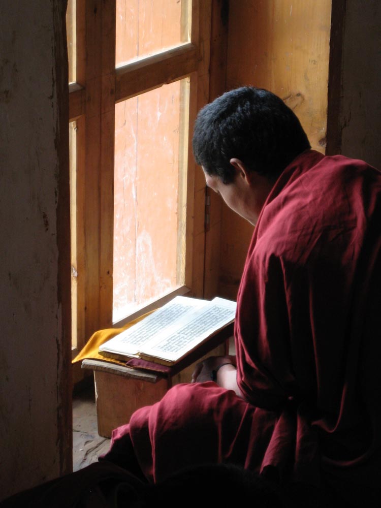 A monk in a Himalayan Monastery,
That was one opening.
And there were others—
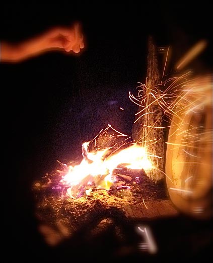
cairns of stacked ideas and fires setting them alight, then aloft.
And that’s the point—there are moments in your life when your heart flowers, it opens up to a learning, an idea, an inspiration and it pulses—opened—and forever altered.
You reach out with mind and hand.
That link for me—words and drawings, combined, led me all the way from high school, then college.
And onwards— 50 years later, to now.
At New College [Sarasota,FLA,] before Evergreen, I studied marine, invertebrate biology and comparative physiology.
I made science project journals—drawings and lettering—interplayed. To make the science more beautiful. It was weaving—the journey of idea, calligraphy, illustration, intertwined as one integrative offerings.
Storytelling the theory, but imaginatively arraying the beauty of the idea. In a book—
handmade, bound, framed contemplations, ideations bound.
And I kept playing on that idea—how to integrate thinking, illustrative matter, textual content, repurposed in a new construct.
With a sidebar in medieval History.
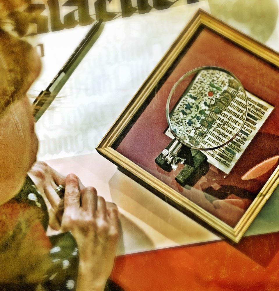
If you study the history of the book, then you examine the palæography of the evolution of the scripted word, then you reach further—you’re reading ancient languages and diciphering their draftsmanship. What, of that time, made that writing; what cultural influences made the writing this way?
You might ask, as did I:
“what tool created these ancient words, and what is the meaning of these distant voices—
what is the history of this word?”
With that, knowing more, I made that other flowering point—an impactful crucible—that meeting as I’ve told, Lloyd Reynolds, a mystical maestro of the legends of the letter, typographical beauty and the principia calligraphia. This was a weekly foray, I’d drive down there in Ruby, my 1959 Red Dodge Pickup—hang out at Reed College, Lloyd’s house, Portland, browse his fabulous library and talk calligraphy, mysticism and mythology, symbology and palaeography.
My time at Evergreen—I was focused on one liquid craft—I was supposed to be studying graphic design, but I never got around to it. Instead, I was looking for something else, something more beautiful, something shining: the lustration of calligraphy. The polishing of words well drawn. And that arrival came at the transformation of hundreds of hands, a beauty-riven lexicon of hand-crafted scripts—calligraphic handwritings—that coursed from pre-Christian Greece, through Imperial Rome, through the Carolingian Renaissance, the dark ages of Medieval Europe, the age of the Italian Humanists—and finally, the Italian Renaissance of the 14th-16th centuries. I drew them all on great rolls of butcher paper from the Graphics Lab at TESC.
But I wasn’t looking for duplication of paleo-scripts—I was reaching to illustrate language, to make it shine. To bring that beauty back—from base graphic design, to a higher principle, a deeper philosophy.
Engage more, go deeper, farther, get out there?
What is the truth of that beauty?
I went to study: Paris, Bremgarten bei Bern, Frankfurt, Offenbach am Main, Salzburg, Oxford, Cambridge, NYC, to Moscow and Tallinn, looking, exploring, learning and sharing—at the feet of masters of design, lettering arts, fine printing,
calligraphy, type design, book design and signage.
That journey was a cumulative catapult that spoke to rekindling and teaching small workshops at The Evergreen State College, as a way to help with my student expenses.
How that journey might be extended lies in the notion of what, and which, opens the heart of the flowers of discovering.
Now, decades later, I teach other students,
designers at Girvin, the brand strategy and design firm.
This year, for GIRVIN, that’s coming on 50 years of work.
Making beauty, to a legacy. Beautiful brands, graphical beauty.
And reiterating The Evergreen State College, for me: it was, and is, about discovering—and recovering—those flowers of discovery,
the foliation of ideas, and in the instances of opening.
Life changes — forever.
What happens is that once
that cultivation starts, it continues,
if you’re listening.
I go back,
I go forward.
Looking for the patterning of flowers
that have opened my heart.
Tim | Osean Studios
brand mysticism > Deep Journeys to Team & Enterprise
The Quest for Beauty