HERITAGE BRAND DESIGN AND SYSTEMIC PATTERNING
More than four and a half decades ago, 1976, I pitched the idea of integrative branding to the Creative Director at Nordstrom, Dan Holland, and I presented again—this same thematic strategy, later to Claudia Milne, then again to Bruce Nordstrom, then Cheryl Fujii—a lineage of Nordstrom creative and familial leadership.
And the principle of my offering, in the beginning, was the idea that one could build a memorable advertising campaign—a promotional program—that could be unforgettable, imaginatively transporting for a customer. Core to this manifesto was building a holistic naming and identity solution—with nodal componentry [banners and street presence, signage and interior store amendments, specialized packaging design, handtags, windows and interiorly disposed merchandise and display] that could be specially named, branded and wholly packaged, storewide, as an integrative entity—a logo which could reach to everything manifested in the store, street, outside and in-store
—an everywhere event.
I think about it in the context of weaving—obviously, I’ve written about this with some frequency. There are the threads—the narrative itself: the core principles of visual characteristics; there are the lines of warp and weft, the chromosomal qualities of the detailing of the visualization—how they intertwine and commingle—which, in the metaphor of the loom of seeing, are detailed in the shuttle, which transits the warp and weft and lays-in another layering of contrastive detailing—hence: tapestry.
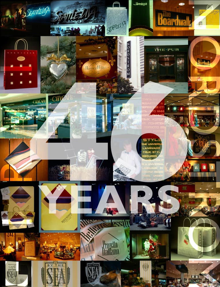
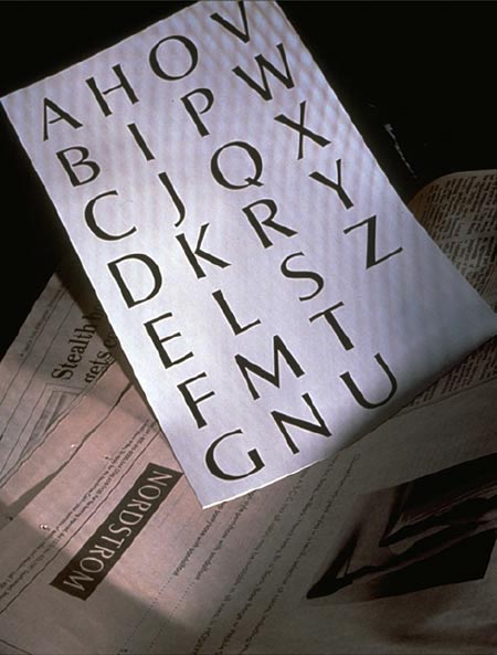
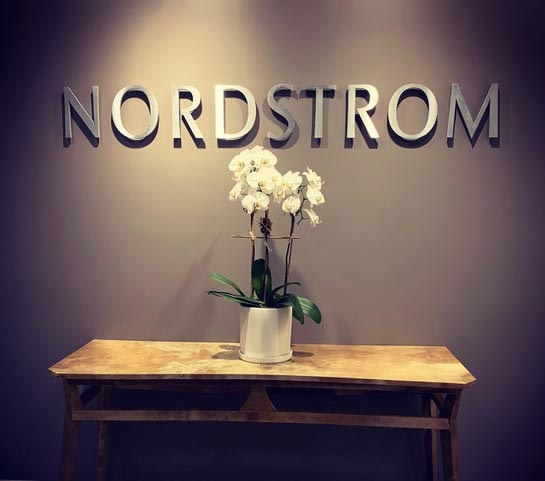
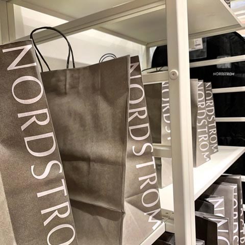
That journey began with a simple contextually buildable name, campaign logotype, usually a customized and thematically-aligned hand-built bespoke font, as evidenced in the sample imagery gather at the header of this blog.
The notion of the evolution of the Nordstrom brand was first evidenced at a stockholders function in the 80s—a investor decried the inconsistency of Nordstrom’s branding, back then—which was one sign on one building, another mark on another, and downtown San Francisco, still another.
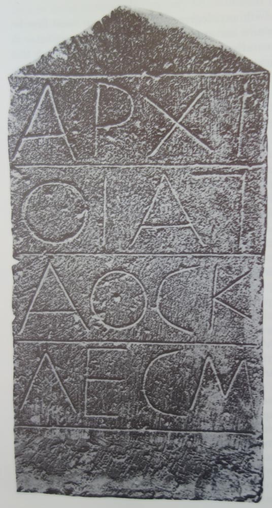
GIRVIN was called in to listen to the Nordstrom family—which was ensconced in two camps—one, as above, a commonly available font—classically motivated: the drawing of Palatino, named and drawn after a Italian Renaissance calligrapher, Giambattista Palatino by Hermann Zapf in 1949. The other, something more elegant, restrained and luxurious, yet characterized by a san serif motivation. We designed two pathways, two complete systems for presentation to the family, in an ensuite portfolio of two systems of stationery, signage, all gift packaging, shopping bags, cards and customer amenities. As an alternative, GIRVIN built a custom font, founded on ancient Greek Stoicheidon epigraphy—a 5th century BC rendering of a font concept that—as scholar Stanley Morison [the Milos stone] described it, was the quintessential leap from ancient Greece letter design to Imperial Rome’s stonecutting evidences.
It was what I was looking at, as a contrastive solution. As defined, an ancient discipline of open framing, as in: “the shapes of its letters are those upon which all others depend. It will be seen that they are ‘square’. That is not to say that the letters are all perfectly square, but they may be said to be generally ‘square’ in comparison with handwriting. This is the only sense in which it can be said that Greek, and for that matter Latin, letters are ‘quadrate’. It must be noted that, although in the still earlier inscriptions this could not be said, from the sixth century and throughout the classical period it became the rule.
“There are four primary characteristics of early Greek letter design in the classical period. First, the apparent squareness of the shapes; secondly, the unformity of the stroke; thirdly, the consistence of the complete structure; lastly, the rationality of the shapes in having no unnecessary parts and nothing supurfluous. Thus the script is square, uniform, rational, and perfectly functional. . .”
This key stone represented the best-of, contrary, classical clarity of lettering design—and while it was roughly 2200 years old, it worked.
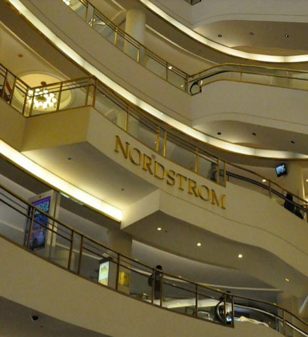
That became, with a thicker stroke rendering, a core typeface that we built for signage, print, packaging and everything Nordstrom—including the business communication materials and credit cards.
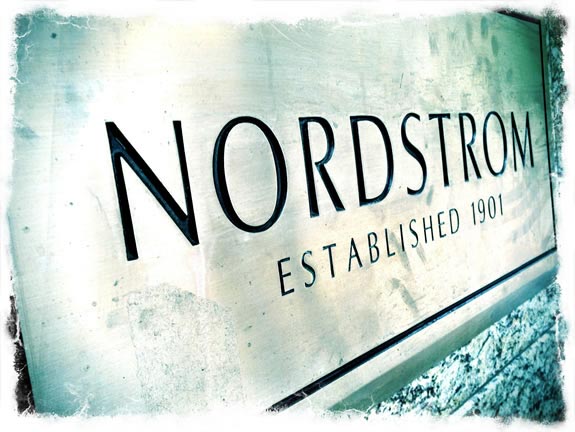
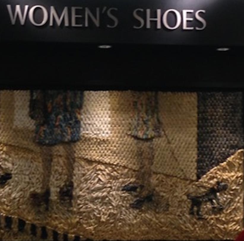
That signing rendering found applications throughout all interior signing and shop-in-shop signing for shopfront brands inside Nordstrom.
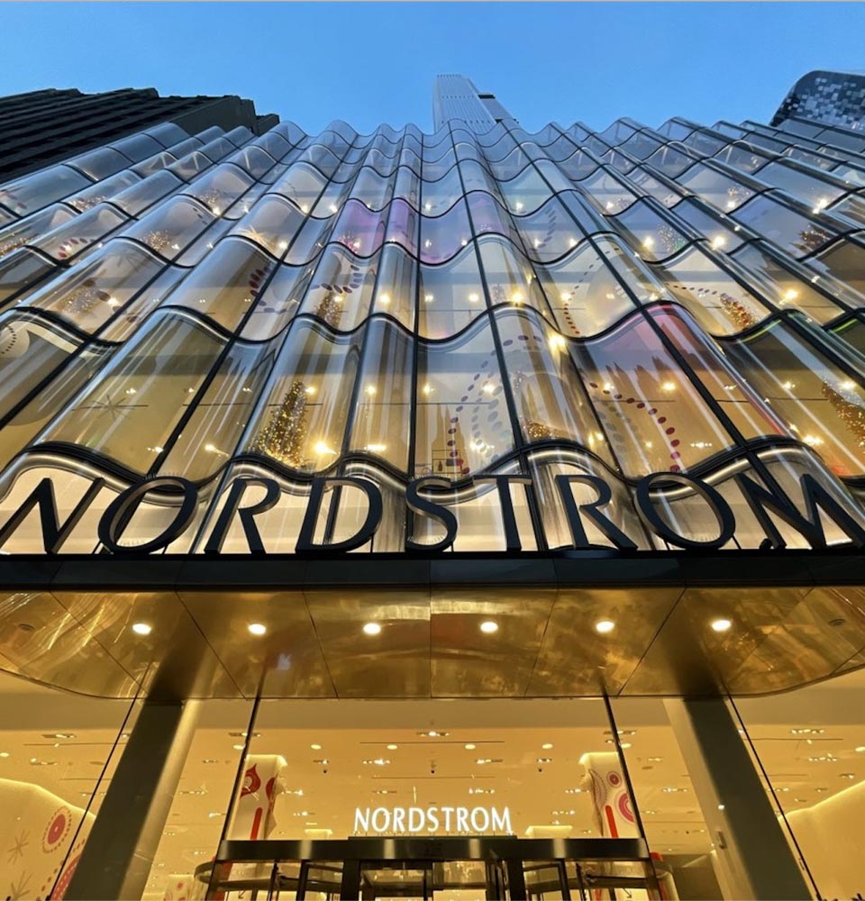
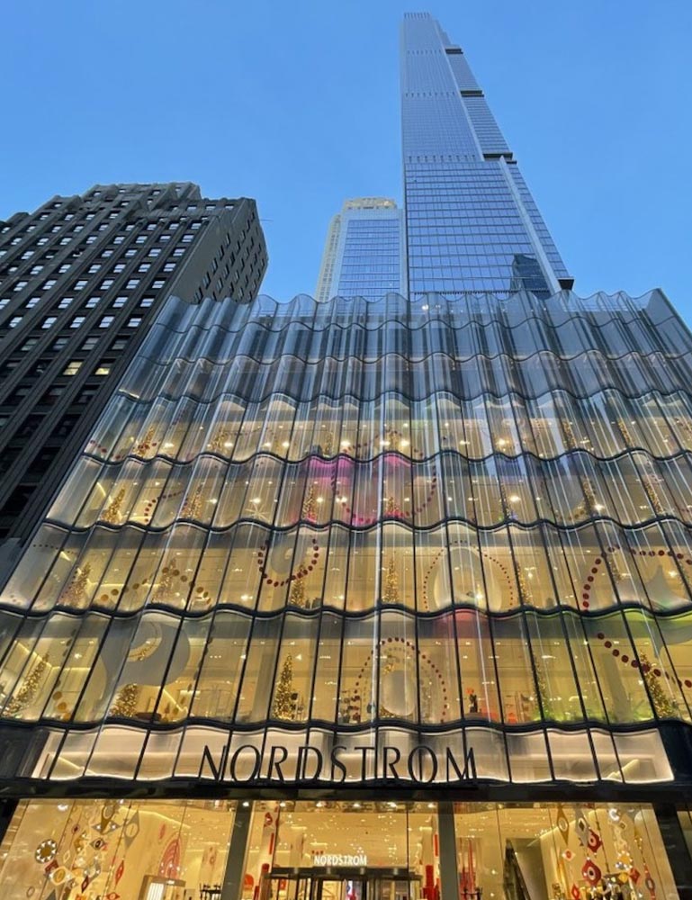
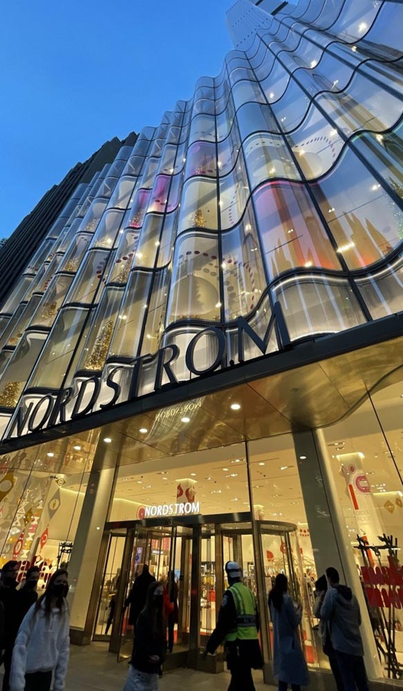
It’s profoundly simple, yet entirely bespoke—and while there are changes now in the print and internal online renderings—still, for signage, we integrated it horizontally, just like our foundational strategy in our beginnings at Nordstrom—decades ago. To the first international store, Calgary, Alberta

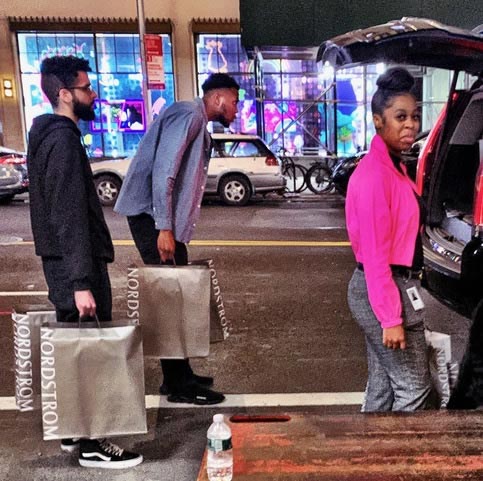
to the present, below—NYC.
And being built-in, and built-on,
it lasts far longer than digital impressions.
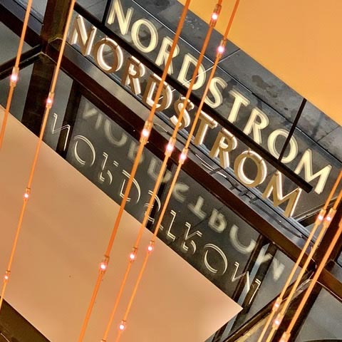
A mark and architectural brand recognition system holds on, given the scale of the signage throughout the exterior emplacements and interior locations in dozens of stores throughout the US and Canada;
there is staying power.
And happily, to the notion of legacy of creative collaborations, and the inventive imaginations of design leadership in store thinking, the wave metaphor with James Carpenter [notes here from Girvin at the launch event] this shows in a string of signing applications, to our original signage systems master documents, at the greatest Nordstrom store in the US, the 2019-launched NYC Nordstrom now awarded the stature of the best of the best, worldwide. the number one department store in the world, by ICSC.
Our logo and signage design package is part of the number-one-ranked department store in the world, Gold Award, Best of the Best, 2021—as awarded and acknowledged
by the ICSC global design committee.
And what is ICSC, exactly?
Shooter Michael Young, a NYC photographer, essayist and design documentarian of all things wonderful and beautiful, being designed and built in Manhattan—his shopfront imagery below. See his site—Yimby.
Learn about his work,
check out Michael’s IG.
These were passed to me by another, from another share, yet another —and it took me a while to find the source.
And even now, there’s take out.
As in the original strategy—store “field” marketing—it’s not just a “shopping thing, it’s more to a complete string of destination touchpoints” 101 UX, sense-based marketing experientiality* designing integrated event promotional events, that tidal movement forward, outreaching to community, like a wave on a wave, coming forward, drawing in the experiencers like swimmers at the beach, journeyers at the crossroads.

The work that I did at Nordstrom led along to other encounters, like my first meet up with John Jay and Marvin Traub at Bloomingdale’s, Target [Dayton] Minneapolis; which, at the same time, went on to Neiman Marcus in Dallas; Target [Dayton] Minneapolis; Wanamaker, Philadelphia; JordanMarsh, Boston; Breuner’s, BullocksWilshire, LA; even Rich’s of Atlanta.
As everyone well knows, the only permanence is change—nothing lasts, ever.
Keep
moving.
Wander to the wishing well | make one | 2022
Tim GIRVIN | Strategic magic | www.girvin.com
S I T V I S V O B I S C U M
MCMLXXVI
IBI FUNDATA