by Tim Girvin | Brands, Cool People, Motion Pictures | Mar 31, 2017
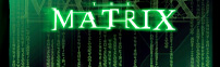
CREATING AN ALPHABETIC CODE THAT BRIDGES THE DIGITAL WORLD OF THE MATRIX Most know about our history on The Matrix, it began with a call, 19 years ago. The agent from Warner Brothers offered that Joel Silver wanted me in his offices, the following morning, to talk to...
by Tim Girvin | Brands, Motion Pictures | Feb 11, 2013
Design studies for the LOTR and Peter Jackson The process of film identity and brand development is intensely competitive, there are a series of talents, team and agencies whose sole enterprises are focused 100% of the time on theatrical advertising — for an...
by Tim Girvin | Brands, Concepts, Cool People, Designers, General, Motion Pictures, Storytelling, Trends | Mar 26, 2012
Powerful ideas, invention and brand re-alignments, newly imagined. I’m looking for surprise, beauty, spectacle — designing it, looking at it, seeing it, extending that story — the telling of it. To tell anything, there has to be another — the...
by Tim Girvin | Brands, Concepts, Cool People, Places, Storytelling | Mar 20, 2012
Any restaurant brand follows a sequence of dream, to visioned story, a name — articulation in space, made to place. Space = cavitation + emptiness, silence and aloneness. Place = warmth / humanity / beauty + containment / story [and possibly: spectacle] Our...
by Tim Girvin | Concepts, General, Storytelling | Nov 27, 2011
THE LAYERING OF TEXT | ALPHABET RHYTHMS | GALLERY V THE STATE OF WOWNESS* AS A PERPETUAL STUDENT OF THE ALPHABET, I’M PRONE TO EXAMINE THE MYSTERIES THAT LIE IN ITS STROKING — ONE STROKE, THE FIRST, IS A LINE. ONE LINE, BEGINS THE MARKING OF THE WHO, THE...
by Tim Girvin | Artists, Concepts, Cool People | Oct 24, 2011
The Legacy of Type Studies | Reaching Back “It’s been said that the first stroke of any alphabet is the vertical, drawn with the finger — from heaven, to earth. In the mysteries of the origin of writing, it is the first stroke that cracks the light...
by Tim Girvin | Artists, Places, Storytelling | Jul 29, 2011
I got a note from some friends at the Oxford English Dictionary. It was about this word, “abracadabra” — and perhaps you’ve got the same one, since you might have friends there too. Earlier in my life, studying the history of the word, the real...
by Tim Girvin | Concepts | Mar 23, 2011
The impressed letterform: elegance, beauty, sensuality At the beginnings of my career, I’d studied with a letterpress jobber — first in Denver, then an old Linotype operator and finally in Olympia, at the Evergreen State College. I’d count that time...
by Tim Girvin | Concepts | Mar 1, 2011
The evolving legacy of type design — the honor of the MOMA typographic collection Customized type design: the big screen, the building, the book. “Typefaces — the building blocks of information printed or displayed onscreen—are design in and of...
by Tim Girvin | Concepts | Jun 21, 2010
Notes on signing, wayfinding, alphabets and recognition. When you are lost, where do you go, what do you do? You can, metaphorically, look for a sign. That might help. Or you can look at a map. They are the same thing. A sign is a map. A map is, in fact, a grouping of...