MOTION PICTURE PRODUCTION DESIGN
FOR THIR13EN GHOSTS.
BRAND DESIGN AND PLACEMAKING.
THE USE OF SIGILLIC GRAPHICS
AS A PLACEMAKING DESIGN THEOREM.
What about graphical contexts in making place[s]?
I think about it as a pattern language, a place storytelling—especially if that language could have the underlayment of meaning,
tiered layers of context—just like the larger principles of the architecture and its movement, pathways and processions, its designed footprint on the earth.
With a long history in environmental graphics and signage, since college days, making signs on campus at The Evergreen State College and for shopkeepers in Olympia, WA, I used to think about signage—and sign-making—as a kind of placemaking marking system. As a storytelling journey, evincing foundation narratives—and their founders—and brand offerings.
Signing, patterning, graphical devices are
transformational in the detailing of experience.
It was a building, then marked, it has a name, it has a story and its patterning language that’s now emboldened—what people read, and experience, tells them more.
Obviously, we’ve written a lot about production design—for films.
An acquaintance of mine in NYC, Mr. David Rockwell, runs a large design and architecture firm in Union Square that also does set design for theatre, in addition to its work in architecture and interiors. We talked—when I presented our work to him and his team— and I’d asked him about set design principles—and the creation of spectacle. We talked of truly knowing—digging deep, of inquiry in depth, focused listening for points of inspiration, looking for an empathic alignment with the story and the best way to research that—to create outcomes.
“Pay attention to light—that’s the voice.”
Later, we partnered with his team, and Arquitectonica,
in the brand-work around Canyon Ranch Miami | Living
[now, after 2008, CarillonWellness.]
Later, I was talking to another friend about complex, motion-capable production design—he’s a writer from Hollywood that I’ve known since high school—and we moved in our conversations to architecture, and theatricality. “There’s a story, then there’s the place in the story—a story has to have a place that people can settle into, it’s a landscape, it defines their relationship to a site. Deepens the grasp of imagination.”
I’ve been fortunate enough to have had the chance, over time, to get pretty close to Production Designers, always on-site at motion picture lots. And, whether there are digital effects or not, production design plays to dramatically giant gestures—and too, very tiny details.
And, there is God—and the Devil—in the details.
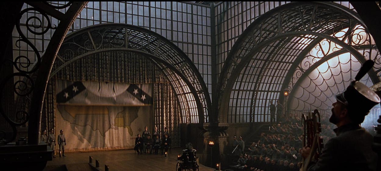
I was kind of shocked—for example, being on set for “A Series of Unfortunate Events”—size does matter in a L A R G E way. If the approach suggests dynamically huge scale, then building it…could be better. The sheer scale of the architecture, interiors, train trestles, roads—astonishing.
And the symbolism of those architectures—and what
graphical details might be integrated into that storytelling.
I kept looking for ways to understand more about theatrical production design, branding and graphical interplay in set contexts. Best way, get on set.
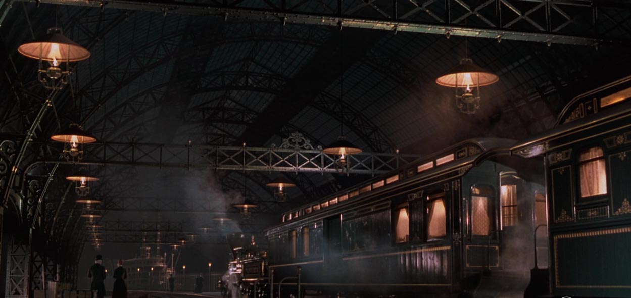
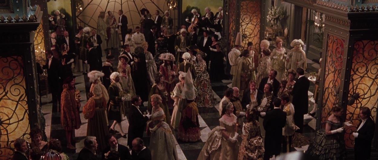
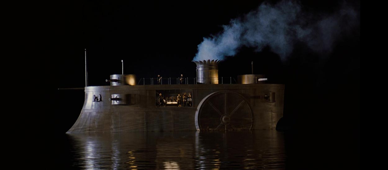
Another onsite set visit [I didn’t work on this film, but was on the Lot and went to check it out] during our Warner Brothers years, the 90s, were the built environments of “The Wild Wild West”—huge spaces, cavernous ballrooms, baroquely detailed trains,
and complicated glasswork constructions.
Star Trek, too—which we did work on—with sets designed by Scott Chambliss to JJ Abrams directorial orientation—clean, modern, hyper-luminous, complexly-lit—everything: , gloss white. I met JJ and pitched him on that identity and brand work, given our creative history on M:I:III. Starting that work, I met on-lot at Chambliss’s production trailer to review his drawings and talk creative strategy.
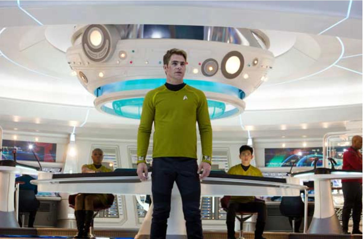
Paramount Studios
To architecture—and our conversations with Coriander, and the idea of GIRVIN’s Talismanika™ as a kind of symbolic interior design and furniture language, I was thinking about the talismanic uses of marks, or amuletic architecture. Each of these marks has a symbolic value, as in a movement of a mark sequence from the nothingness, to the everything, marks of a destination.
Designing marks with meaning into
the place-making construct of architectural places.
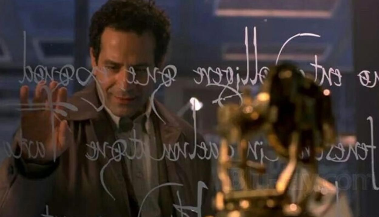
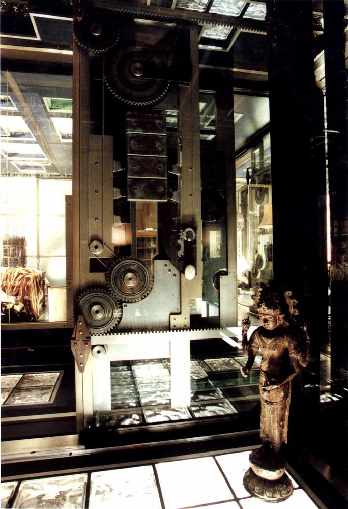
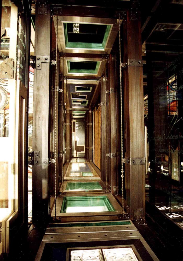
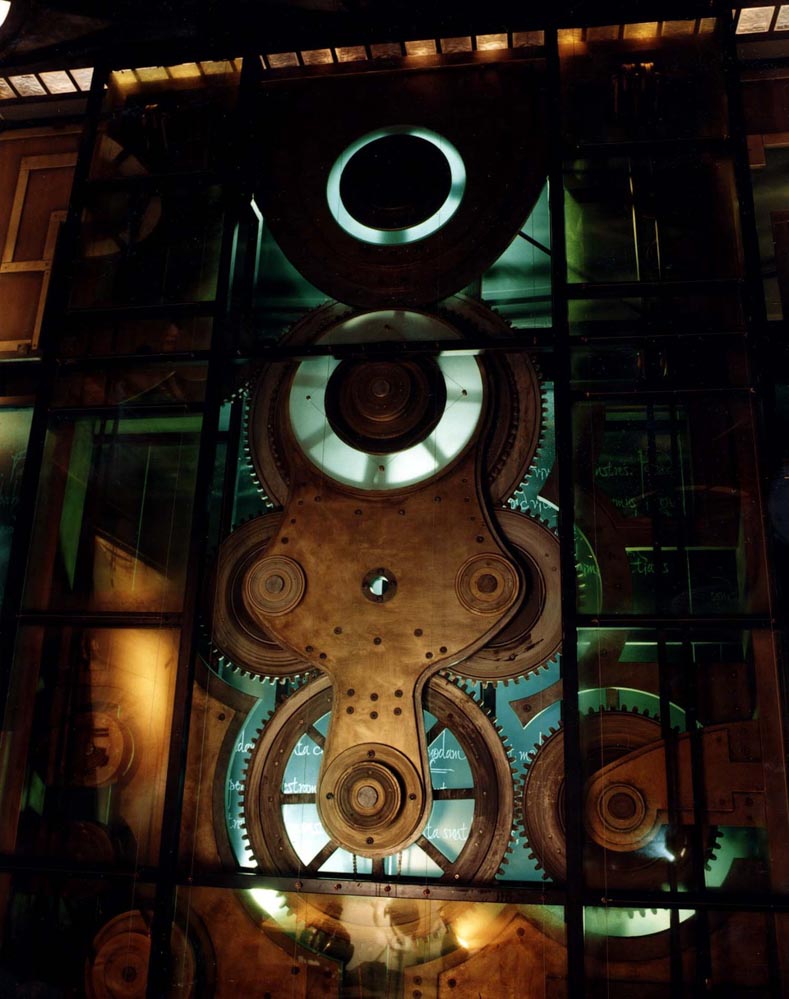
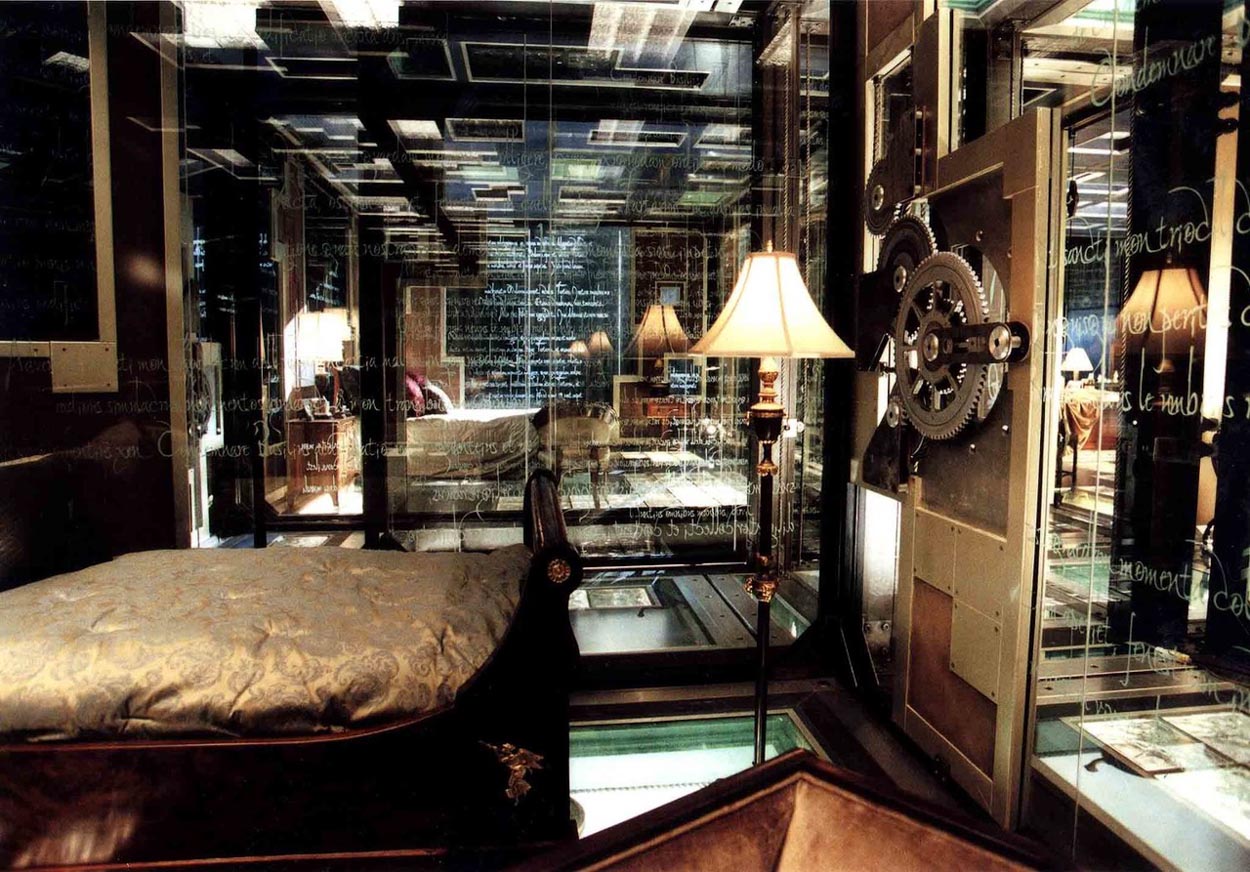
There’s one film—albeit a scary one—“Th13teen Ghosts”—about a “ghost collector” who builds a house that is mechanically protected with walls, ceilings, doors, floors made of glass, covered with protective sigillic markings—to keep the ghosts “in” the house.
I was curious about who designed it.
He did.
Sean Hargreaves.
It’s an ingenious production design, let alone
a standing structure of labyrinthine complexity.
Explore more:
https://www.seanhargreavesdesign.com/feature-films

Design details are noted
below the imagery:
Orrin Grey:
“The most incredible thing about the film is the design of the house, designed by production designer Sean Hargreaves, based on the architecture of the the New York Science Museum. During the three months that it took to design the set, Hargreaves and his production team worked closely with Director Steve Beck to ensure that the remarkable structure would be both visually compelling and function as a practical film set.
Another important aspect of the house’s design is its relationship to a key element in the script. “In the story, an ancient book known as “The Arcanum” contains the blueprint which Cyrus used to build the house,” Hargreaves explains. “It’s filled with writings and drawings and sketches, almost like a Da Vinci notebook, and it’s illustrated with pages of Latin inscriptions.
These inscriptions are actually containment spells for the ghosts trapped inside the house, which we transferred onto the glass walls of the set.”
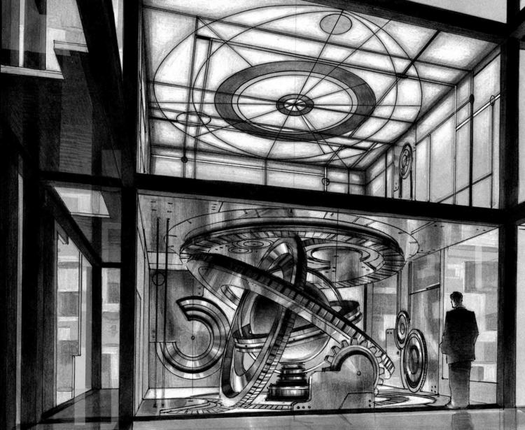
Sean Hargreaves Concept Art
BrothersInk:
“More than 3 miles of etched glass walls and a total of 8,500 square feet of glass were used to construct the set. The Latin “etchings” were actually rendered on a plastic overlay and adhered to the glass walls to achieve Hargreave’s “Arcanum” design motif. Bridge welders were brought in to fuse the house together, using nearly five tons of steel in the process. The construction of the centuries-old Arcanum book itself is another example of the attention to artistic detail evidenced throughout the production of the film.
A great deal of painstaking effort went into the materials and design needed to make the book look authentically ancient. Propsmaster Dean Eilertson reveals that three people worked for a week just to age the parchment paper used in the four books that were eventually created.”
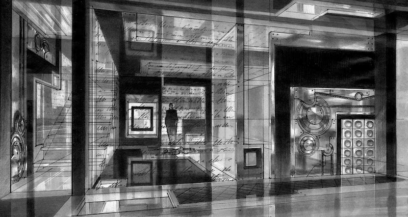
Sean Hargreaves Concept Art
Actors—F. Murray Abraham, Tony Shalhoub, Embeth Davidtz, Matthew Lillard, JR Bourne, and Shannon Elizabeth.
The closing vantage of this examination is about the link between writing, design and magic—and the craft of designers and brand people. As I’ve noted below, the traditional links between design, writing and magic is ancient.
We noted this in an earlier conversation on Dr. Strange.

From a brand designer’s point of view—the undefined plane is an absence—it’s a “space,” a piece of white paper—with a mark, a design, it becomes transformed,
it migrated from nothingness
to somethingness.
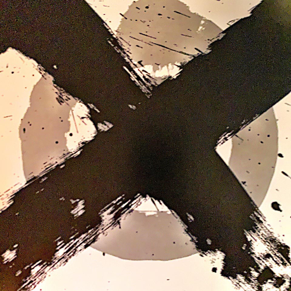
So, to that, X marks the spot could be just a mark, or it could be a marking for a portal, a crossover point, a planar opening—as early bluesman, 20th century Delta guitarist, Robert Johnson sings in his 1936 song “Crossroads” which achieved another larger exposure in
Cream’s song of the same name.
Just saying—this is likely more of a horror film than most would not consider watching—as a closing forewarning. Roger Ebert, who, peculiarly, I met standing at a urinal in Dallas film launch of “The Road Warrior” hated the film; “Ghosts” was rated one of his “worst ever.”
I knew about “13 Ghosts” because I had previously collaborated
with Joel Silver, the producer of the film—
I worked with him on “The Matrix.”
I would imagine that the point here would be that entities from the other side can read—since the point of apotropaia and protective markings is often alphabetic—the spells are written in capturing phrases as subduing forces, the writing is, literally, spell-binding.
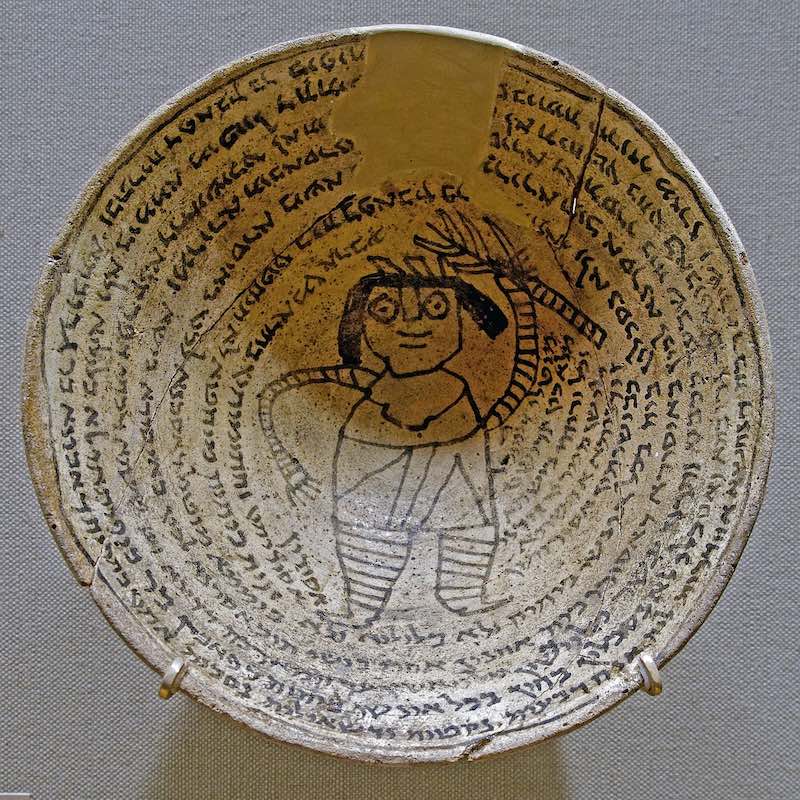
Incantation bowl demon Met L1999.83.3
Tim Girvin | GIRVIN Osean | Brand Magic