2001: A Space Odyssey
IN 1968, I WAS FIRST STRUCK BY THE NOTION
OF INTEGRATED DESIGN.
I WAS 15.
When I think about powerful moments of design discovery, it was likely Stanley Kubrick’s film, 2001: A Space Odyssey that taught me about the idea of thematic consistency, crossing from one discipline to another, particularly in storytelling built space. There were, of course, many striking visual moments, which became an emblematic stylistic reference for Stanley’s filmic art and actor direction—but I remember being struck by the present day to future analogues in currently understood experiences, metamorphosed into a future state impression of hotel lobby interiors.
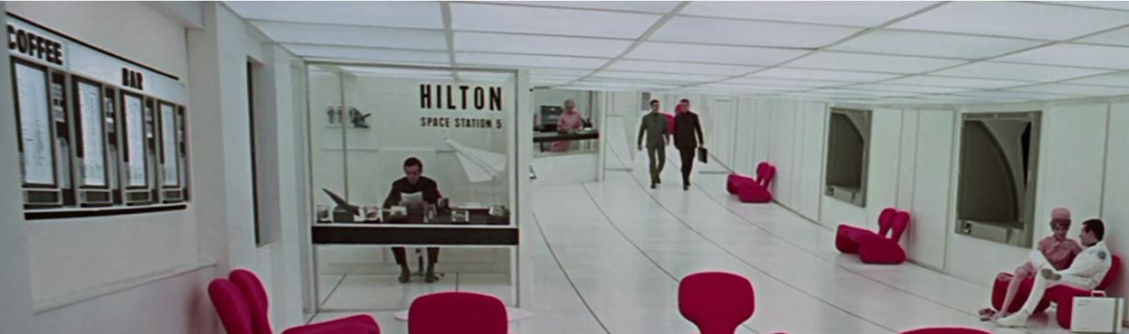
2001: A Space Odyssey | The Hilton Lobby
Obviously, I never saw anything like that. Neither did most of us—except those working for NASA and the Apollo program. Later, I had the astonishing experience of heading to Cape Canaveral for the launch of an Apollo Mission 13, 1970.
But, in a manner, the idea of integrating design messaging in an interior design construct has to get to typography—and this too was an early inspiration—the intra/extra graphics
on the interiors and livery of the space ships.
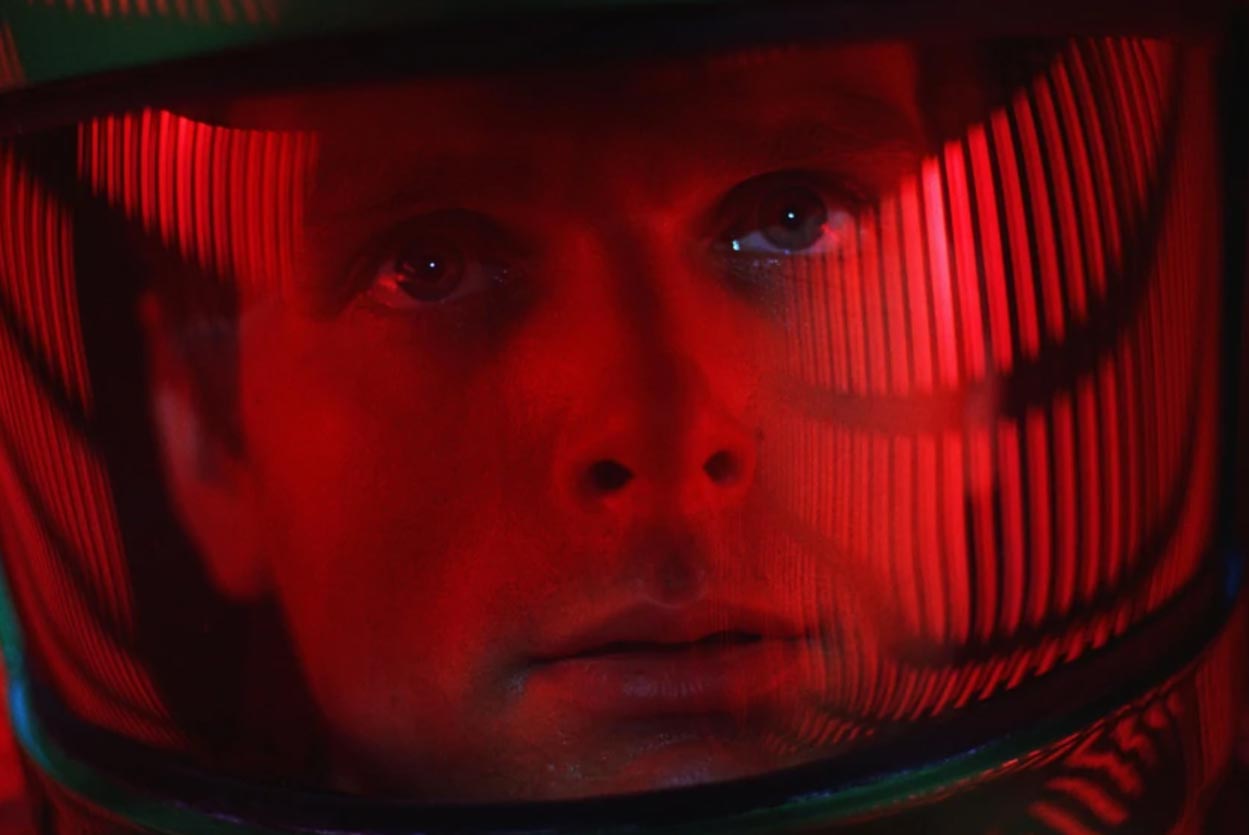
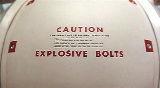
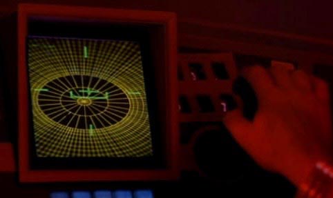
2001: A Space Odyssey | HAL 9000 in the guidance center
I was struck by the disciplined precision of the set design systems,
from the stark, almost retro-modernist take on furniture to the subtle insinuations of typographic language and early interpretations of UI in the context of guidance—or the unforgettable “exploding bolts.”
But, as ever, to the cinematic collaborations of Stanley Kubrick [another note @girvin.com]—lensing and industrial design production strategy with Doug Trumbull—[who GIRVIN worked with later;] for me, it all speaks to detailing typography in placemaking storytelling—
cinematic and otherwise.
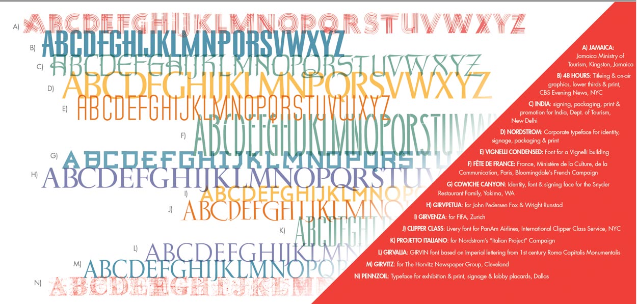
For GIRVIN, this speaks to the alphabetic treatment of placemaking, to my thinking, building custom fonts particularly for buildings and architectural or brand-related renderings, a proprietary font,
built specifically to align with the design spiritual intention of the building.
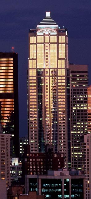
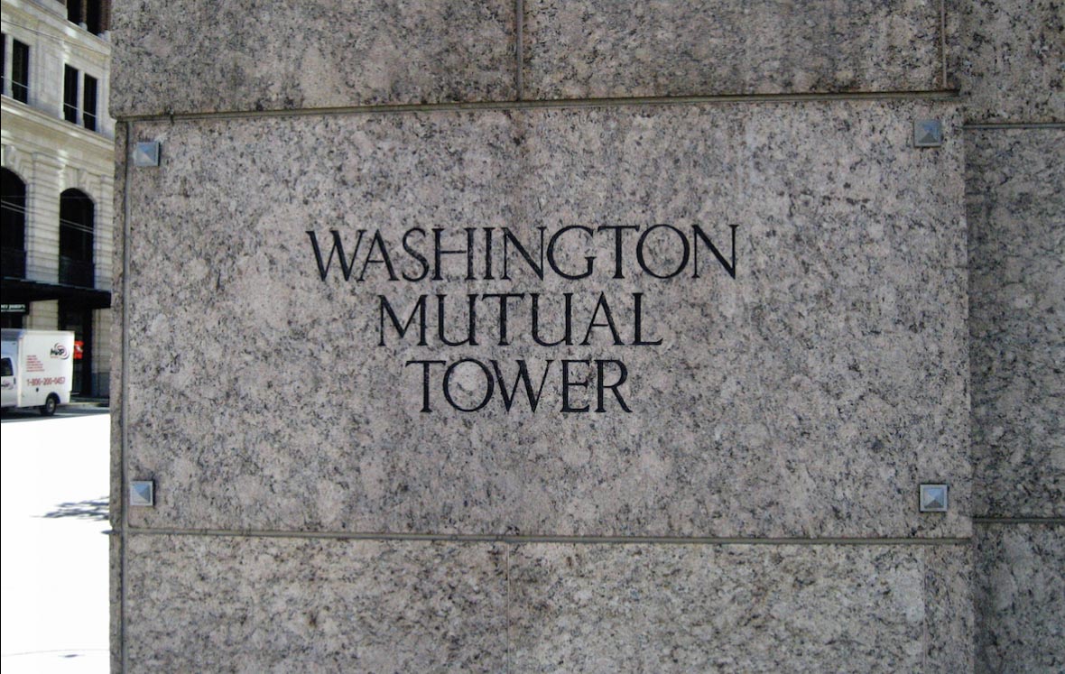
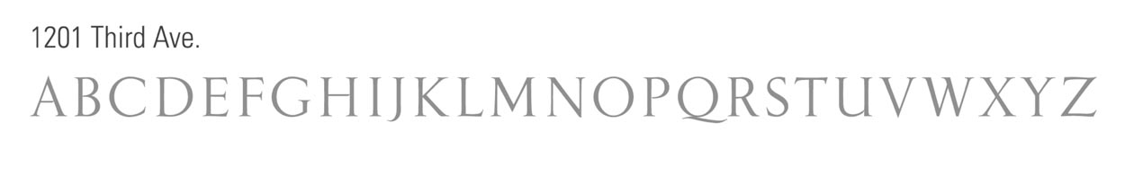
For KohnPedersenFox’s building in Seattle, that’s passed through a string of corporate hands, working with their firm and Jon Runstad’s team at Wright Runstad Development, we designed a hyper-classical font in support of their classically derived expressions.
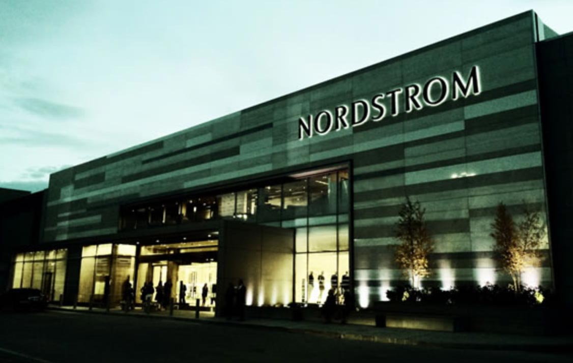
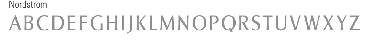
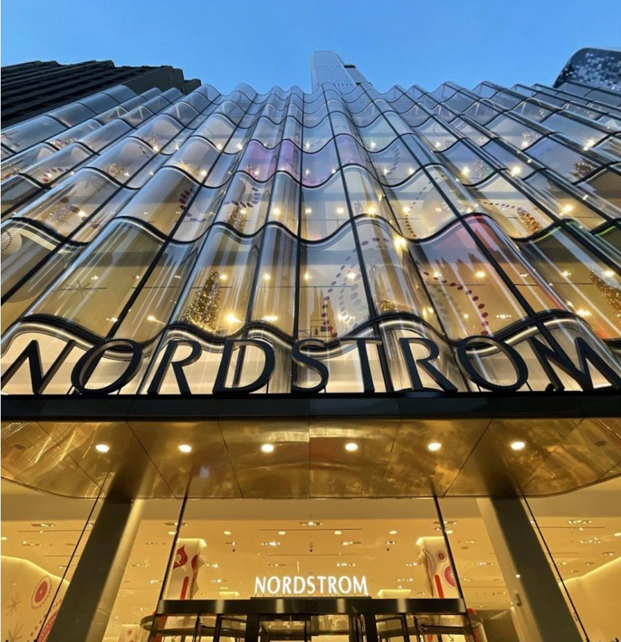
We designed a custom font for the Nordstrom family and their international identity obviously with a deep bow to Hermann Zapf—in a newly customized expression—slightly taller, with an expanded curvature, as in exterior signage,
interior departmental signage and a string of print and packaging applications.
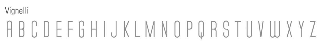
For Massimo Vignelli and his then studio design director Michael Bierut, we designed a font specifically for a building signage project—customized to match a particularly disciplined deco-condensed and industrial rendering, as in:
Of course, we’ve designed others that cross from signage applications
to print and broadcast, as well as set design for CBS Studios in Manhattan.
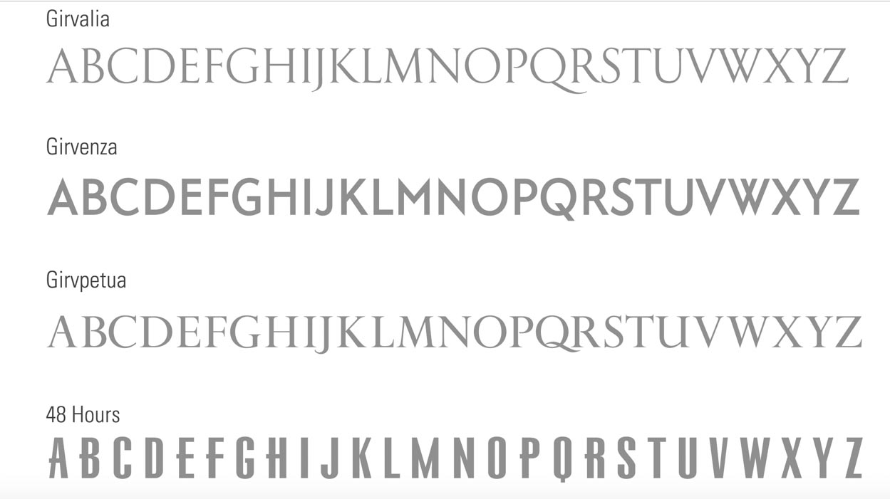
What drove me to looking at typographical alphabet systems for signage came from years of working in retail—naming and designing campaigns for Bloomingdales, Neiman Marcus, Jordan Marsh, John Wanamaker, and Nordstrom.
For a multiplicity of identity-related assignments, GIRVIN built-out font systems, for products—like bikes, restaurants, motion pictures, [Sliver,] even special airline applications.
People
read.
And when people come to a place, the thoroughness with which it’s made,
could influence every little [or large] touchpoint—including the tuning of the font.
1968.
2015.
Simple. Industrial. Extraterrestrial.
Designed by NASA
–––
G E T
O U T
T H E R E.
–––
Tim Girvin | Queen Anne Studios | Seattle
Brand linguistics, bespoke brands
GIRVIN designs custom typographic systems