Modern Clinicality, Emotional Heritage and Blandism
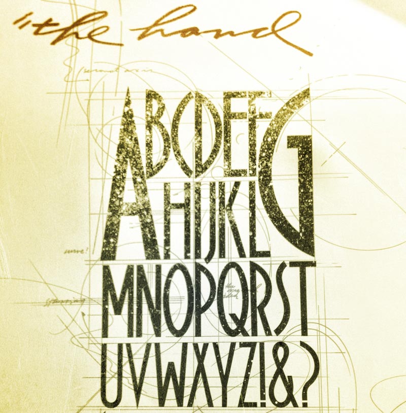
In my history as a designer, lettering artist and calligrapher, I’ve spent decades studying the history of the alphabet, from pre-Christian Greek letterform development, cut in stone and inscribed in pottery, to early Roman traditions.
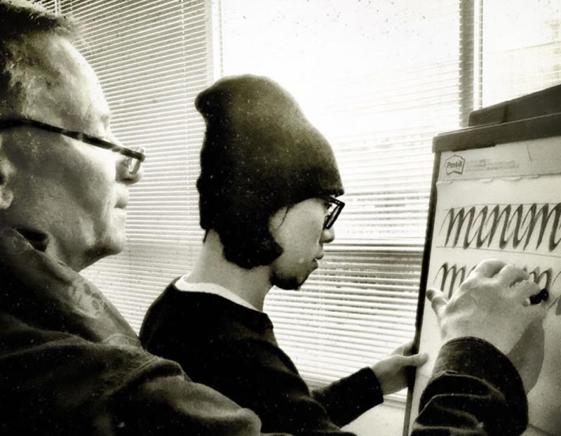
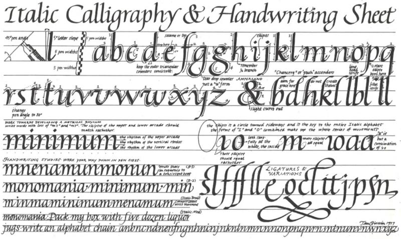
Our team calligraphy learning sessions and explorations reach-back in this same framing, starting with the epigraphy of ancient Greece, then Roman Imperial stonecutting, early papyri cursives—later Roman, the scripts of the post Roman period, rustics, uncials and square capitals—the emergence of speed in the Carolingian innovations, the 12th century compressed scripts of the medieval time periods, the light airiness of the pre-Renaissance and Neo-Humanist classicism, on to the lively scripts of the Italian Renaissance and in a latter embellishment industrial zeal, the steel-penned flourishes of 18th-20th century. In that overview—as a calligraphy practicum, check out this overview of GIRVIN’s calligraphy classes.
A broadsheet from 1979
This premise, to the education of designers, is exemplified in this GIRVIN dictum, “go back to go forward—what was, is—the patterning of the past repeats the future.”
In a half century of practicing design, collaborating in the development of design for 1000s of brands, work seen by billions of people, I’ve seen trends come and go—modes come into play, modalities shift, styles emerge, rise, disappear—and then return. But the classical intimations stay—evidences from 2000 years ago, threads from the past, rewoven into the now. When I consider the work in this space, the serifed experiences, they place a naturally-inspired geometry that configures arcs and a grace of movement that is proven in centuries of aesthetic exploration.
Like architecture.

It reminds me of working with architects Jim Olson and Robert Venturi on a pitch in design strategy for the proposed Seattle Art Museum. And what should that font be?
At first, I recommended a custom-font in the 1st century tradition—an edifice-like typology. “Too complicated, this customized craft”—so I recommended to Jim, the onsite architectural trustee who was linked to the project in downtown Seattle, and Robert Venturi, the principal in charge of the design of the Museum’s site for Venturi Scott Brown, the architect of record for the Seattle Art Museum—a classical, lightly letter-spaced letterform. I was looking for a solution for the engraved signage on the south facing edifice off 1st and University—something to cut into the striations of the concrete impressions—and, later, a design solution that would be campaign-worthy as an integrated print communication system.
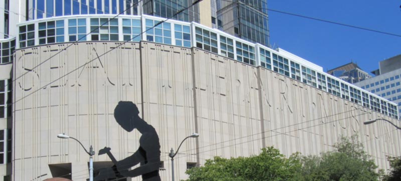
Having studied with Hermann Zapf, 1976, at his studio in Darmstadt, I’d recommended Palatino as a solution, which I designed and was implemented. After this deployment on the building skin, I worked with SAM PR in supporting its expression in print for campaign development.
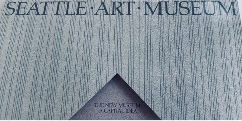
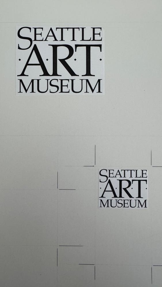
That shows as a print mechanical program, as below.

Some wonder, “why would I reference this typographic contemplation?”
Personality, emotionalism, elegant grace, but so too, an examination of the “trend” for what I call clinicality—a modality of bland brands–generic san serif solutions that speak less to soul and craft but more to precise modernity that is, in fact, a legacy that runs back generations to the time when san serif fonts first found their appearance as “Grotesques,” or, to the Italian etymology of the usage, grottesco, or
“belonging to the cave.”
The idea of serif-less letterforms isn’t new—it’s more than 2000 years old, as expressed in this transitional stone, from Italy, an Etruscan epigraphic borderstone from the linguistic and artistic borrowings from Greece to Rome—3rd-2nd BCE.
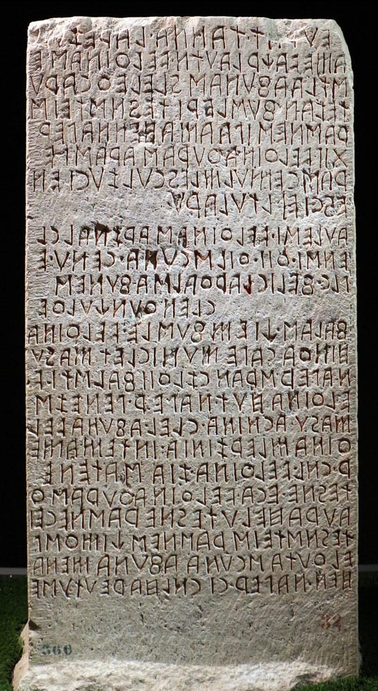
By Sailko, Licensed under the Creative Commons Attribution-Share Alike 3.0 Unported
And the earliest “without serif” font, by William Figgins, 1834.

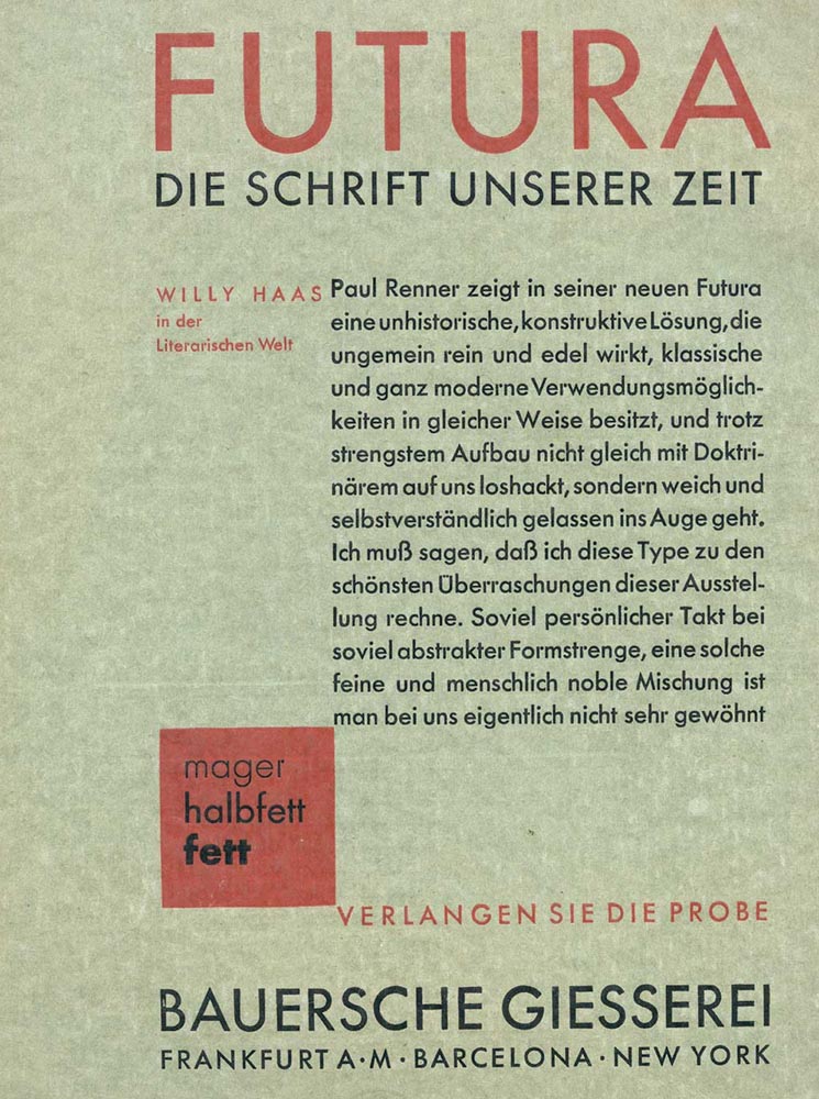
And decades later, another play to modernism in Renner’s launch of
his futurist font—“Futura,” promoted in 1927.
While it might be said that the current hipness of san serif brand expressions is de rigueur to the implications of technology, the challenge might be that—in the minimalism of expression—some of the soulful implications might be lost in the journey of brand warmth—if there is any.
The question is distinction, a stand in bespoke and illustrative relevance,
and community resonance and memorability.
That treatment in recent discussions in design schools around the world lends itself to “fitting in” with a homogeneity of presence. They were once distinctively “unique,” and now they fit the mold. It’s been suggested that speed plays—“get it done, craft is no longer necessary, only technology builds art…”
It’s not that we don’t recognize the art of the san serif—you could look at our work for Nordstrom, Tableau, Bad Ass and plenty of others as signatures of respect and admiration. As to san serif studies, I spent time studying, sharing my work, with
Adrian Frutiger, near Unterseen, Switzerland.
Even, for us, san-serif art, a rendering—
a font for a restaurant…
Tim
Collaborate. Co-create. Connect.
GIRVIN | Strategic Brands
–––––––––––––––––––––––––––––––––––
digital: girvin.com
built environments: oseanstudios.com
––––––––––––––––––––––––––––––––––––––––––––––
Follow Us:
Facebook LinkedIn Instagram Behance
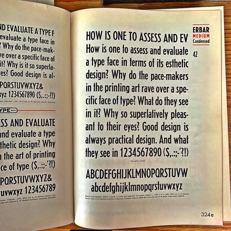
What’s new? Not this—yet all the rave, last century 1922.